Project Neon introduces new design changes to Windows 10’s UI
![]() 3 min. read
3 min. read
![]() Published on
Published on
Share this article

Read our disclosure page to find out how can you help Windows Report sustain the editorial team Read more
Back in November 2016, Microsoft revealed its plans to refresh the Windows 10 user interface with new design under the codename “Project Neon”. The changes will bring better integration to the many new mixed reality experiences coming to the OS along with a new updated design that everyone will notice.
Microsoft claims that it is now trying to improve the way its newest OS looks by melding stricter design guidelines with greater consistency. However, the company also plans to develop a richer visual style for Windows 10 starting by introducing updated animations, new design elements and more use of the “Aero-Grass” style blurring in applications.
Some screenshots that were published by MSPoweruser give us an idea about the directions Microsoft is taking. According to reports, the images were captured from internal concept videos which have not been revealed to the public yet.
A major element of the new design is known as “Acrylic” and introduces a translucent blur effect to applications. At the same time, the interface is more fluid than before, visually reacting to what is happening onscreen. The same feature is linked to “Connected Animations”, where application interface change and flow as you use them.
Some of these elements have been spotted in the latest public releases of the Microsoft’s Groove music application as we’ve noticed blur effects and panels that resize as you scroll.
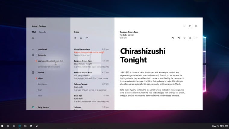
Outlook will also receive a design overhaul, something which will surely please many users. The application’s interface now reacts to interactions. For exampl,e while hovering the cursor over a menu item, the item now glows. The new design is less cluttered than before, as well, with some new icons. We can say that the new Outlook design looks awesome and below you can take a look at it:
Microsoft also worked on the Windows 10 taskbar and changed the design for the clock/date indicator. Unfortunately, it is not sure if these changes will be implemented as part of the final designs.
The “Project Neon” design changes will not arrive until Redstone 3 update, which means that it will take a while until we will see it. Currently, Microsoft is working on its Redstone 2, also known as “Windows 10: The Creators Update”. It’s expected to be released sometime in the next few months.
RELATED STORIES TO CHECK OUT: