New update on Spotify desktop app brings the Jam feature & other changes
Look like people are not happy with the changes
4 min. read
Published on
Read our disclosure page to find out how can you help Windows Report sustain the editorial team. Read more
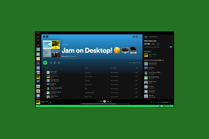
Spotify recently added a new feature, Jam, to its desktop app. This feature allows you to share a synced listening experience in real-time with others. The Jam feature is better than sharing links to your favorite songs or playlists with your people.
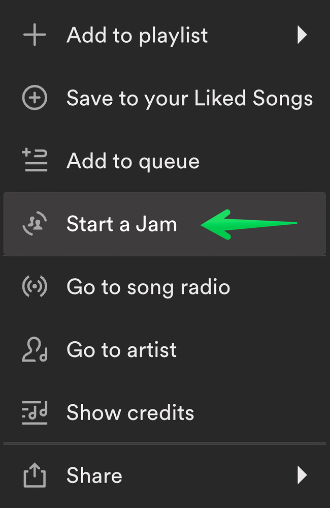
The feature is rolling out for Spotify Premium members on a desktop app. To use it, right-click the song or playlist and choose the Start a Jam option from the context menu.
Once you start a jam, the Queue will open on the right sidebar. Click the Invite button to copy a link and share it with people no matter where they are. If you want to share the playlist or sing with the person in the same room, ask them to scan the QR code.
Remember, only Spotify users with premium subscriptions can join your Jam remotely. However, free and premium Spotify users can jam with you in person. Free users can also join an in-person Jam via their mobile app.
If your friend shares a link to join the Jam, click on it to open the Jam invite link in your web browser. A pop-up will then enable you to open the link in the Spotify desktop app. Once the link is in the desktop app, you will get the pop-up to join the Jam.
All participants in the Jam session can change songs, albums, playlists, or podcasts from anywhere in the app. However, the Jam host can turn off the Let others change what’s playing feature, which allows participants to change the song.
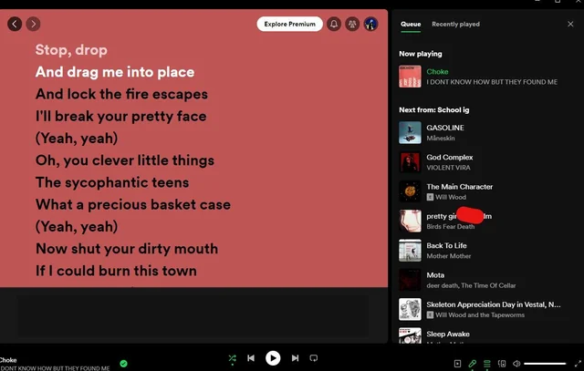
Another change introduced is the new Queue experience. With the latest update, the Queue now opens in the right sidebar, enabling you to browse content in the main area while watching the current Jam session or what’s playing.
While in Jam, the Jam options will show at the top of the Queue in the right sidebar. You can choose to keep the Now Playing View or click the Friend Activity feed to check what your friends are listening to.
Once the update was rolled out, many people complained they couldn’t open Now Playing and Queue together, which frustrated them. Here is one of the users Charbreon mentioned on Reddit:
The queue is showing up on the side bar where I almost always have view on (I like being able to see the info sometimes so I leave it on). It wasn’t doing that earlier when I was using Spotify. I’ve tried to restart everything and it’s still happening. Is this happening for anyone else? If this is a new update it kinda sucks not having the queue in the bigger area.
Another one commented:
There’s already four pages of negative feedback about this on their shitty “community forums.” It would be incredible if they actually paid any attention to user feedback, especially from paying customers, but I will eat my hat if anything actually changes.
Edit: WOW, to add insult to injury, you can no longer click on album art, whether small or in the oversized “Now Playing” sidebar, to jump to the currently-playing playlist. They have now literally removed all of the features I used MOST OFTEN on their app.
Unrelated, does anyone have a recommendation for porting Spotify libraries over to a different platform?
After the update, you will see the homepage whenever you launch the app. You can now use the right sidebar to switch between the Queue and what’s playing, but you can’t see track length in the queue sidebar.
You can hover over the song playing and click Expand, but it opens the now playing on the right side in a limited view, hiding most of the queued songs. To check the queued songs, you need to expand the queue.
The Jam could be helpful for those who would like to jam with their friends; however, it is not an essential feature and might not be used as often.
Spotify made many changes to introducing this feature, claiming it would help us to browse quickly, but instead, it has cluttered everything and even removed the important things.
This is not the first time Spotify has made a controversial move. However, to avoid backlash like this, we think companies should get user feedback before making major UI changes.
What are your thoughts on the matter? Share your opinions with our readers in the comments section below.


User forum
0 messages