New vertical layout comes to Office app for Windows 10
2 min. read
Published on
Read our disclosure page to find out how can you help Windows Report sustain the editorial team. Read more

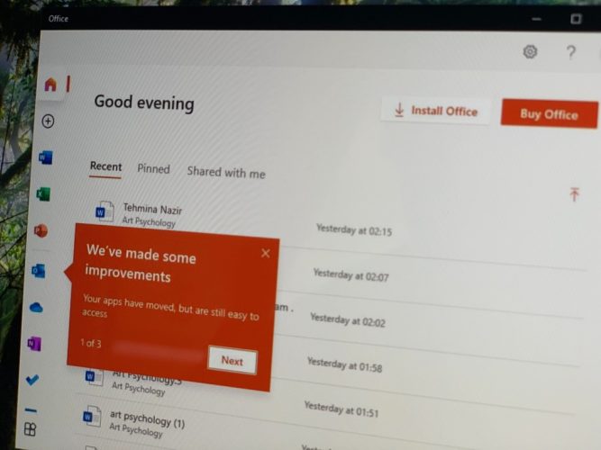
Microsoft recently delivered a new design for the Microsoft 365 Office dashboard, but part of that is now expanding to the Office app on Windows 10, too. Spotted by Windows Blog Italia, a new vertical layout is coming to the Office app on Windows 10.
Currently, the feature is rolling out on a slow basis, and we’re only seeing it on one computer on our end. However, once it is made available, the experience of the Office app changes quite a bit, as seen in the featured image above.
The links to the core Microsoft 365 apps move from the middle of the app to a sidebar, making it easier to reach. There’s also a new clearer “all apps” button, too which makes it easier to see all the Microsoft 365 apps. You’ll also find a nice, clean looking “new document” button, as well.
It appears as though this is coming by way of a server-side update, which means you don’t need to go to the Microsoft Store to update the app to see this new layout. It should be coming to you automatically. We’re still hoping that this feature rolls out to more users soon, as it fits great with Windows 10’s overall design.


User forum
0 messages