Hands on with the improved Windows 10 Calendar app: This is how it always should have been
4 min. read
Published on
Read our disclosure page to find out how can you help Windows Report sustain the editorial team. Read more
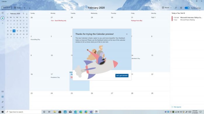
For the first time in a while, Microsoft has given the Windows 10 Calendar App a new look, and Windows Insiders are invited to test it out by toggling a “Try the Preview” switch at the top of the app. The new and improved Calendar app in Windows 10 is different from before and is much cleaner, easier to use, and so much more efficient. We spent some time with it over the past week, and here’s a hands-on look at the experience.
Choose your theme
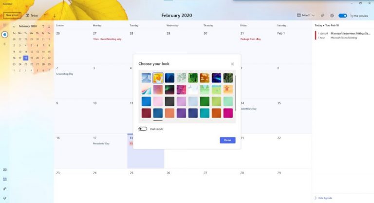
One of the first things you’ll experience when opting into the Calendar beta is the ability to switch between themes. In the beta version of the Calendar app, selecting one of the preset themes will change the image you see in the background of your calendar. You’ll get a default image with some mountains, but there are many others to choose from. There are 34 total images, and the positioning of these images is much different from before. Now, the image you choose will show up in top left corner of the screen and will appear in the background, with an acrylic effect inspired by Fluent Design. There’s even an option to switch to a dark theme if need be.
A clean user interface
Another thing you’ll notice with the new Calendar beta is the cleaner user interface. The sidebar, which has previews of your calendars, now features more touches of Fluent Design, and you’re able to see more of your background image behind it. Microsoft also introduced a new option in the sidebar for you to add more accounts and switch between them with the click of a button. Before, this ability was hidden beneath a settings menu.
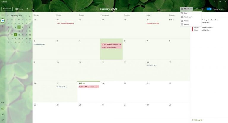
The top of the calendar app has also changed, as the buttons for Today, Day, Week, Month, and Year views are now gone. Instead, Microsoft has replaced it with a drop-down menu, leaving more room for you to see the imagery in the background. There’s even a clean “New Event” button right above the calendar, helping you create meetings more quickly.
Finally, the search box has disappeared, slimming up the top of the app a bit. Search functions have apparently been removed in this early beta. Instead, you’ll find a new agenda view, which can be summoned from the sidebar on the right side of the app. This agenda view will show you some of the items on your list for the day, including meetings and reminders.
A cleaner pop-out menu for creating meetings and events
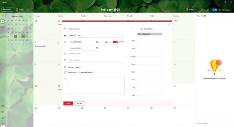
The final aspect to note in this version of the Calendar app is the pop-out menu for creating events. Much like the rest of the calendar, Microsoft has given it a redesign. When creating events directly from the calendar by right-clicking in an open space, you now can add more information. You’ll be able to choose which calendar you want it on or have it repeat.
Additionally, clicking the “More Details” link at the bottom of the create event space no longer opens up a full-screen view. Instead, you’ll now get a slimmer pop-out menu, still showing your calendar underneath. This, too, has changed, as it now offers you a slice of time from your day on the right side, showing you when the event or meeting will take place. It’s so much cleaner and concise when compared to previous versions of the Calendar app on Windows 10.
A change for the good
It is important to note that this beta version of the Windows 10 Calendar App is still a work in progress. Microsoft will continue to add more features to it over time, and it is much appreciated. Overall, it now fits in well with the rest of Windows 10, and we really do hope the mail app and other inbox Windows apps can get a similar redesign as well. From the clean and concise look, to new personalization options, this is how the calendar app should have always been.


User forum
0 messages