Microsoft wants users to label their apps with the new Category View in Windows 11
It looks quite practical.
2 min. read
Published on
Read our disclosure page to find out how can you help Windows Report sustain the editorial team. Read more
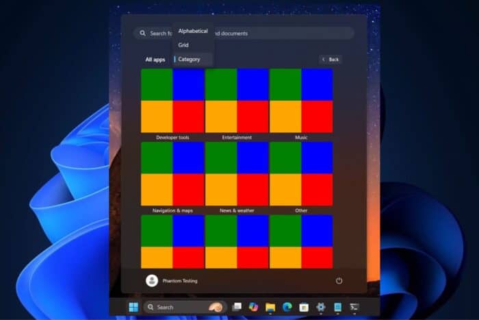
Windows 11 is about to get one of the most significant changes in all its history. It may give some iPhone users a feeling of nostalgia. Imagine a Start menu that is not just an app list but also shows categories, similar to how the App Library looks on iOS. Pretty cool. This is what Windows 11 users can expect shortly.
Microsoft is experimenting with a new Category View option in the Start menu that arranges apps and games into groups in Windows 11. The popular Windows Insider, @phantomofearth, spotted it in the recent preview version from the Beta Channel.
You can imagine how convenient it would be to have all your applications automatically sorted into categories such as “Productivity,” “Entertainment,” or “Games” without any effort required. The aim is to make your digital life more straightforward and cleaner.
The Category View in Windows 11 is eye-catching, but it’s not yet ready for tasting. The first version of it – which you can see in build 22635.3930 – may be a little rough here and there.
Yet its possibilities are quite clear to see. The future of customization looks bright, with the classic alphabetical list, a new grid view, and this upcoming categorized view all available for selection.
So, what are your thoughts? Does this iOS-inspired change in the Windows 11 Start menu make you feel excited? It’s a daring move towards a more orderly and user-friendly interface, and we’re all in for it.


User forum
0 messages