
Opera Turns Vertical Tabs Upside Down After Admitting Its First Design Was a "Mistake"


 2 min. read
  Published on
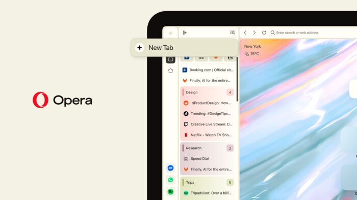
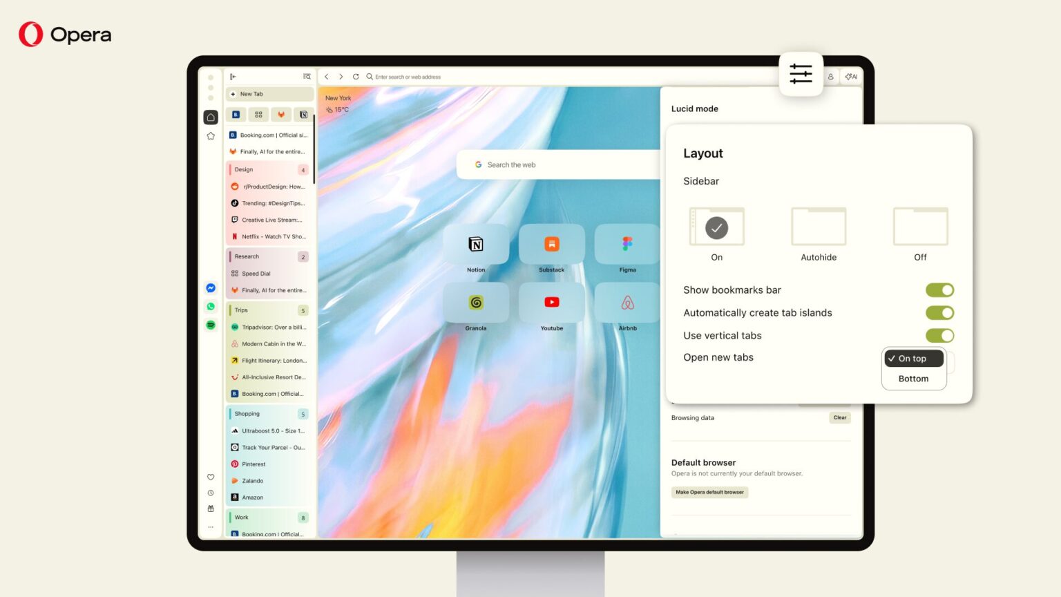
Opera is reversing course on how Vertical Tabs work in Opera One (Review). In a blog post from earlier today, the company has openly admitted that its original design got one important thing wrong. Starting with the latest update, the New Tab button moves from the bottom to the top, while newly opened tabs will also appear at the top of the vertical tab strip.
Opera has fixed what users didn’t like
Opera says the decision is influenced by user feedback after Vertical Tabs launched in July. With the old layout, clicking New Tab could mean moving the cursor hundreds or even thousands of pixels down the screen before returning to the address bar. The company says more than 73% of surveyed Vertical Tabs users open new tabs by clicking the button rather than using a keyboard shortcut.
The redesign now puts the button at the top, with newly created tabs appearing directly underneath it. Opera is also making the active tab easier to identify, adding a “+” button for Tab Islands, improving tab closing in collapsed mode, and allowing users to drag one tab onto another to create a new Tab Island.
Opera is giving users the final say
Opera isn’t completely forcing the change, either. Users who prefer the original layout can switch back through the Easy Setup menu. Well, Vertical Tabs is still relatively new to Opera, so allowing users to switch between the old and new layouts makes sense before those new browsing habits and muscle memory really set in.
If you use Opera as a daily driver, what do you think about the change? Let us know in the comments below.

Read our disclosure page to find out how can you help Windows Report sustain the editorial team. Read more



Improve this guide

User forum
0 messages