
Chrome quietly tests redesigned Tab Search with Tab Groups front and center
Chrome Canary adds Tab Groups to the panel and tests a roomier layout with a redesigned search control.


 2 min. read
  Published on
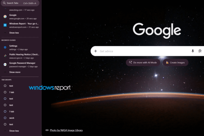
Google Chrome is testing a redesigned Tab Search interface that gives Tab Groups a more prominent place in the browser.
Chrome introduced Tab Search in 2020 to help users find specific tabs more easily when they have numerous tabs open. The feature lets users search through tabs across Chrome windows instead of checking them manually one by one.
Google is now expanding Tab Search in Chrome Canary to include Tab Groups alongside the open tabs and recently closed pages already listed in the panel.
The current Tab Search interface focuses on Open Tabs and Recently Closed. In the Canary version I’m testing, however, a new Tab Groups section appears below Recently Closed.
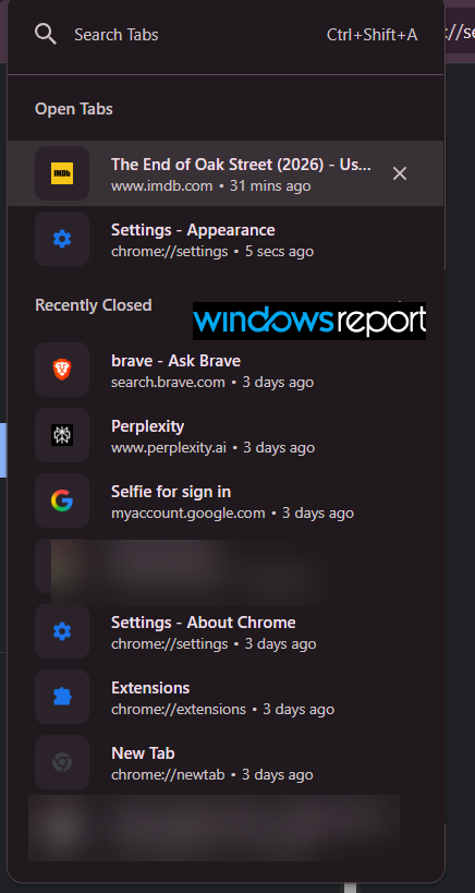
It shows the tab groups currently available in the browser. If you have more groups than can fit in the panel, you can click Show more to see the rest.
The interface has also received a visual refresh. The Search Tabs control now has a rounded, pill-shaped design, while the panel has more spacing and rounded elements than the current version.
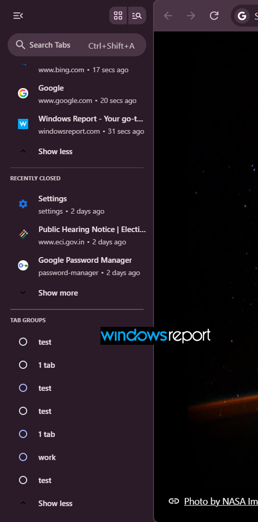
The tab rows also appear roomier, and Chrome displays the colors assigned to tab groups in the new section.
The redesigned Tab Search also works with both horizontal and vertical tabs, with the same interface appearing in either layout.
With this change, users can access their tab groups from the same panel they use to find individual tabs, so groups have a more visible place alongside individual tabs.
The redesigned interface is currently appearing in Chrome Canary, so it is not yet clear whether Google plans to bring this exact layout to the stable version of Chrome. The design could also change as development continues.


Read our disclosure page to find out how can you help Windows Report sustain the editorial team. Read more



Improve this guide




User forum
0 messages