How to use the new Settings homepage coming to Windows 11
3 min. read
Published on
Read our disclosure page to find out how can you help Windows Report sustain the editorial team. Read more
Key notes
- The new Settings homepage now has interactive cards.
- There are 7 cards available, but Microsoft will add more in the future.
- These cards will take into account your activity.
Right at the end of June, Microsoft announced Windows 11 Insider Preview Build 23493, and it’s coming with some exciting features. Windows Copilot is finally here and you can experience it and leave your feedback. Just hop in the Windows Insider Program to use it.
A new volume mixer is also available, and it has a lot of features, including the ability to set up spatial audio. You can access it in Quick Settings, on your Taskbar.
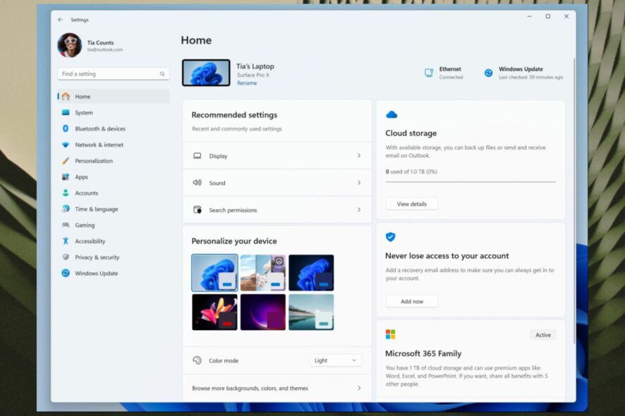
But also there is a big new improvement in this build: a new Settings homepage, looking all fresh and very intuitive to use. It comes with a new design focused on cards.
These cards are the settings that you access the most, and now Windows 11 will put them right on the homepage. This way, you’ll be able to access them in seconds.
Since the new design might make it a bit hard to get around at first, this article will help you understand how to navigate it easier, and how to make the best of it.
Here’s how you can use the new Settings homepage
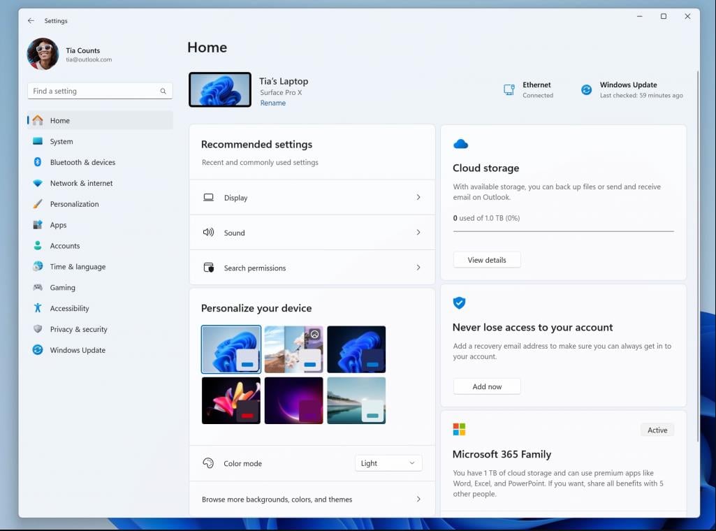
As you can below in the picture, the Settings homepage now has interactive cards. Each of them represents various device and account-related settings. Each card is also optimized to offer the most relevant information and controls at your fingertips in seconds.
Microsoft says Build 23493 comes with 7 cards, but more will be added in the future. These 7 cards are:
- Recommended settings: This card adapts to your specific usage patterns, providing timely and relevant settings options. It’s designed to streamline your settings management and save you time.
- Cloud storage: Gives you an overview of your cloud storage use and lets you know when you’re nearing capacity.
- Account recovery: Helps keep your Microsoft account more secure by helping you add additional recovery info so you never get locked out of your account, even if you forget your password.
- Personalization: Brings customization to the forefront by offering one-click access to update your background theme or change your color mode.
- Microsoft 365: Provides a quick glimpse of your subscription status and benefits, along with the ability to take some key actions right in Settings instead of going to the web.
- Xbox: Similar to the Microsoft 365 card, you’ll be able to view your subscription status and manage the subscription from the Settings app.
- Bluetooth Devices: To simplify your Bluetooth device management experience, we’ve brought this to the forefront so you can quickly access and connect to your favorite Bluetooth-enabled devices.
You are able to take swift actions directly from this page with just a click, and the whole experience becomes far more manageable.
As we mentioned earlier, this homepage it’s more than just a landing page. It evolves and learns with you. As you use your device, it’ll adjust to provide the most relevant and useful information based on your usage and preferences, Microsoft says.
You can also check all the features coming to Build 23493 here, but get ready. There are a lot of changes and improvements, and some might surprise you.
What do you think about the new Settings homepage? Let us know in the comments section below.

User forum
0 messages