Want to see Microsoft's Mica effect on Chrome? Here's how
The strings had previously been spotted in Chrome Canary for devs.
3 min. read
Updated on
Read our disclosure page to find out how can you help Windows Report sustain the editorial team. Read more
Key notes
- Microsoft's Mica effect brings a smoother browsing experience.
- Now, imagine this effect, but on Edge's competitor, Chrome.
- Devs on Chrome Canary have started seeing this effect on their browser.
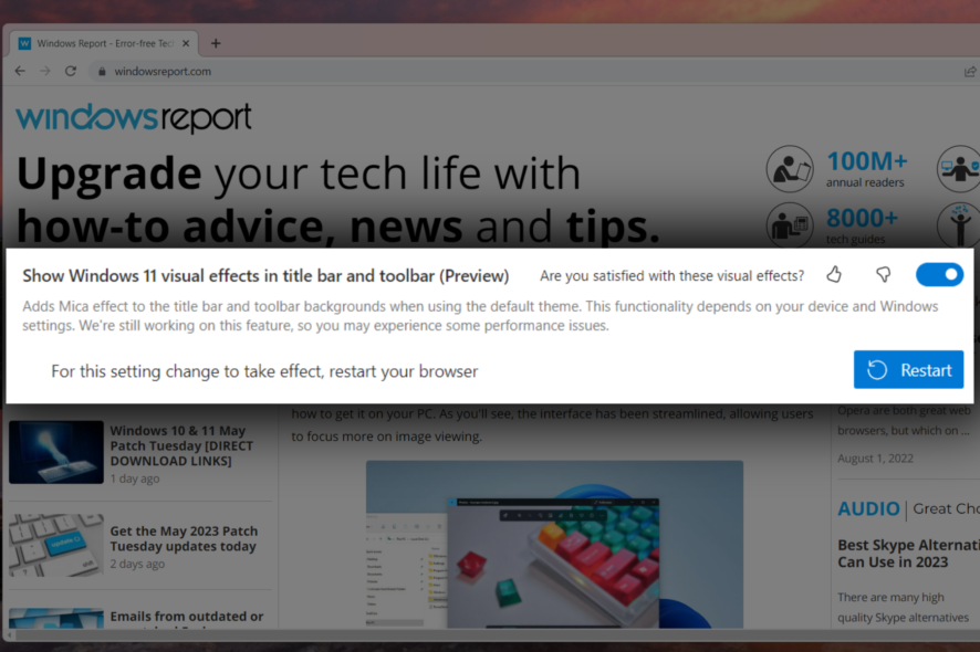
Microsoft is set to bring a new feature to Google Chrome in the form of the Mica effect, which is designed to enhance user experience and productivity.
The move came a year after Redmond officials rolled out this fluent design UI on Edge Canary back in 2022. In the same month a year later, as previously spotted by Windows enthusiast @Leopeva64, a change list (CL) has been submitted by an engineer who is not affiliated with either Microsoft or Google, which aims to enable the Mica effect in Chromium, and it includes a sample code for Windows 11 22H2 Mica title bar.
Now, it seems like we’re going somewhere with this. The same insider also spotted less than two weeks after the CL discovery that users on Chrome Canary can see the effect in play on their browser.
Even more, it seems that @Leopeva64 also discovered that Chrome only uses Mica Alt on windows with visible tab strips, and otherwise, it uses Mica.
For those of you who don’t know, Mica Alt is a variant of Mica, with stronger tinting of the user’s desktop background color. You can apply Mica Alt to your app’s backdrop to provide a deeper visual hierarchy than Mica, especially when creating an app with a tabbed title bar.
If you’re unfamiliar with Mica, it’s a visual style similar to the Windows 11 design language, featuring a translucent layer on top of elements such as buttons and menus, giving them a more modern and sleek appearance. This effect will be applied to the tabs, address bar, and other interface elements of Chrome.
As mentioned above, however, this feature is only currently available for those in the Chrome Canary channel for developers and insiders. If you have issues with finding the option, you can also try the Surfshark browser extension to change your location because in some cases, Microsoft releases features in a localized manner.
But, if you’re curious how it works, here’s how to see the Mica effect on Google Chrome.
How to see the Mica effect on Google Chrome
1. Open your favorite browser
2. Go to the Google Canary download page & hit Download.

3. Once completed, double-click on the file and let it install
4. You’ll be able to see the Mica effect by default. Here’s the difference between Chrome Canary (with Mica) and default Chrome (without Mica)
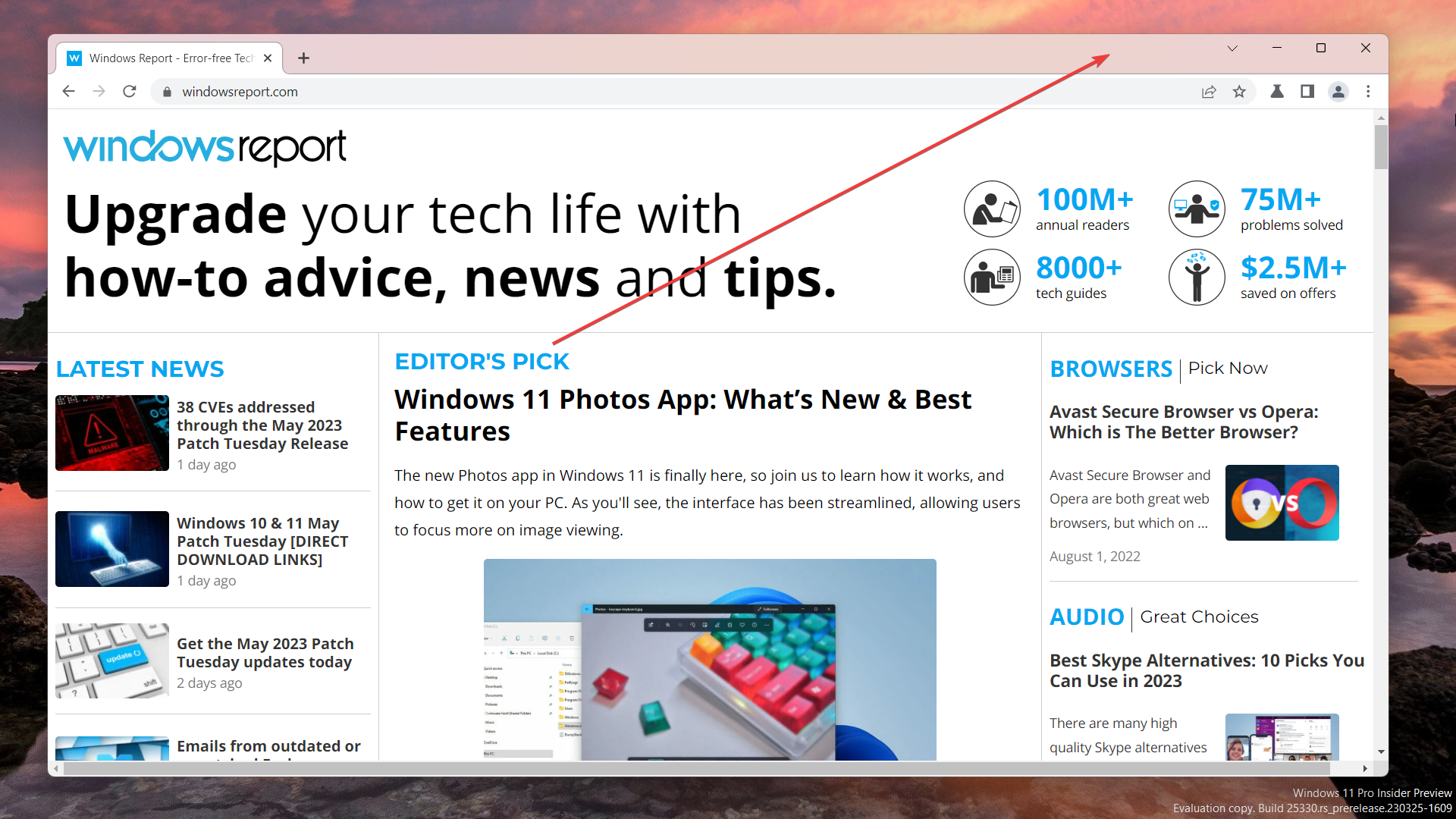

With that said, it may take a while for general users to see the effect in their native browser. Plus, being a Canary insider-only feature means that you may experience a few hiccups here and there regarding this effect.
Chrome also changes the way the Mica effects interact with custom themes in Windows 11
Update: Windows enthusiast @Leopeva64 also discovered that Chrome changes the way Mica effects interact with custom themes in Windows 11.
In Chrome Canary now the theme color is only applied to the active tab, while the rest of the tab strip retains the Mica effect. You can see the differences below.
What do you think about Microsoft rolling out the Mica effect for Chrome users? Let us know in the comments!

User forum
0 messages