[Video] Hands-on with the leaked “One Outlook” Windows 11 client: A glorified PWA?
![]() 7 min. read
7 min. read
![]() Published on
Published on
Share this article

Read our disclosure page to find out how can you help Windows Report sustain the editorial team Read more
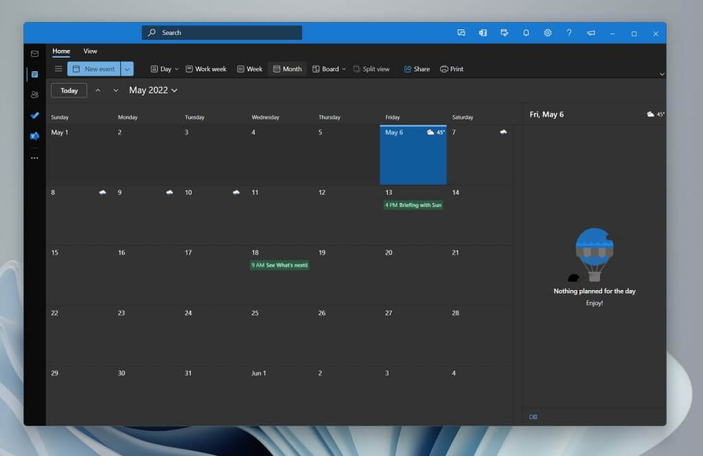
It’s no secret that Microsoft is working on a new desktop version of the Outlook app on Windows 11, known as “One Outlook,” or the current internal code-name of Project Monarch. We’ve seen leaks in the past, and today, a fully working version of the app has shown up online (warning, direct download!) as shared by the folks at Windows Central. This working version of the app only supports work / school accounts at the moment, but it offers a great first look at what we can expect when Microsoft fully reveals the app when ready. Yet, is it just a glorified PWA? Let’s dive deeper with this hands-on look.
The interface & first boot
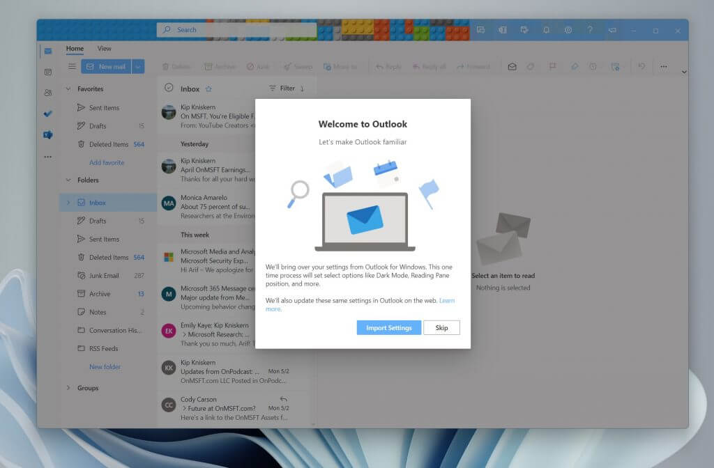
When you install the One Outlook Client on Windows 11, you’ll be guided to import your settings from the existing Outlook app on Windows. This could be a confirmation that One Outlook isn’t meant to replace anything, but rather live alongside the desktop app for the time being. Our theme settings, and density settings were just a few things that were imported from the existing Outlook app. Changing the theme in the One Outlook also changes it in the Outlook Web App too, so there seems to be some cloud syncing going on here.
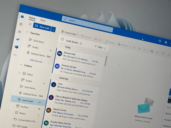
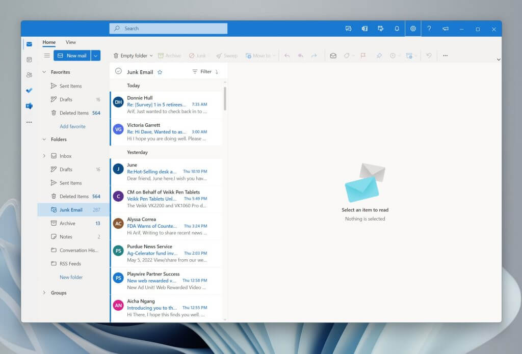
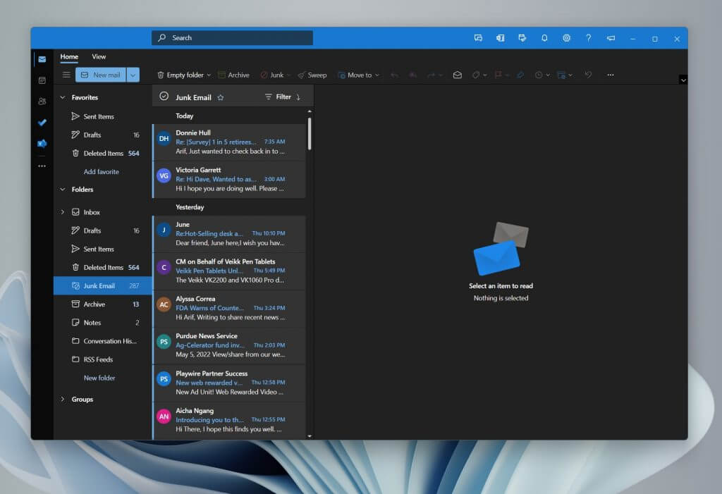
Once you boot up into this One Outlook client you should notice that it is basically the same as Outlook.com. The only difference we noticed is a ribbon at the top, which looks more like Outlook desktop with a “View” and “Home” buttons. It also carries the theme color you choose. Additionally, the “Chat” button in the One Outlook doesn’t work just yet either and it doesn’t open Teams as it does on Outlook.com
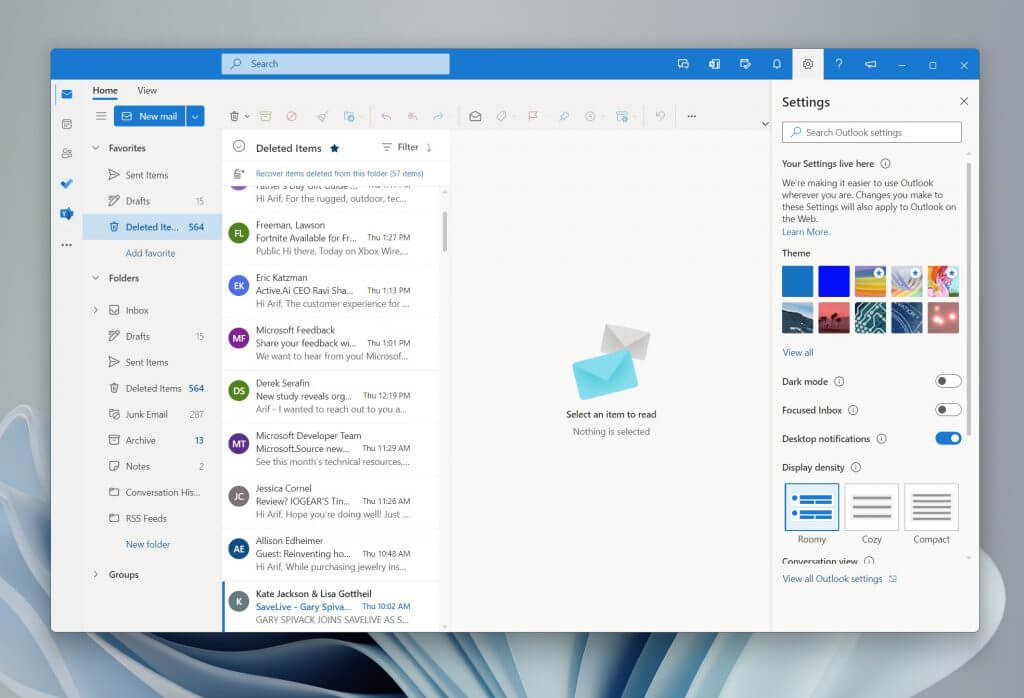
In other areas of the interface, there are the usual theme settings, as well as notifications, To Do, and OneNote links at the top right side of the app. Settings has a toggle for dark mode, focused inbox, desktop notifications, conversation view, a reading pane, and everything you’d expect from the Outlook web experience. There’s nothing different there.
The performance and creation emails
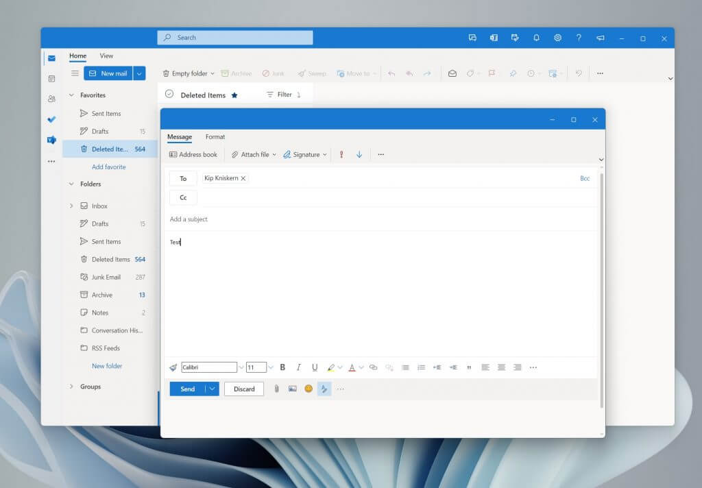
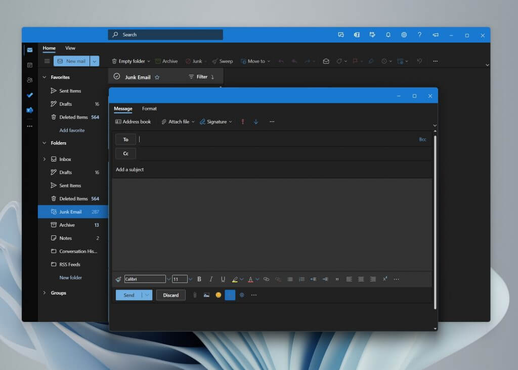
One big difference between One Outlook and the regular Outlook.com experience is the way the app handles opening windows. Creating a new message in One Outlook opens it in a new window that you can float around. This is exactly like what would happen in the old and existing desktop app.
Overall, the One Outlook app does seem to boot a lot faster than the desktop app, too. This is because it is based on Edge. Deleting messages, and switching between various parts of the new app is snappy. Even creating messages is a quick task, with the window popping up right away. Otherwise, this does feel exactly like Outlook.com would. Some things are missing though, as we weren’t able to add a connected calendar.
A glorified PWA
Overall, this One Outlook experience is quite nice but is also very similar to the Outlook.com experience. That’s not a problem, either, as most people are familiar with Outlook.com as it is.
The ongoing rumor is that this app might eventually replace Mail & Calendar in Windows, and also ship on MacOS as well as Linux. Yet, it looks like that might still be well off in the future. There’s still some work to do, and Microsoft could announce this One Outlook experience at Build 2022, then give Office Insiders a chance to send in feedback on the app. Let us know what you think of this app in the comments below.