Calibri is dead. Choose Microsoft's next default font
2 min. read
Published on
Read our disclosure page to find out how can you help Windows Report sustain the editorial team Read more
Key notes
- The time has come to replace Calibri as the Microsoft default font.
- Five new Microsoft fonts are now available; users are invited to choose the new default one.
- The new Microsoft fonts will remain in the general menu across all Office apps after the default one is selected.
- Sans-serif typefaces were the starting point for the new fonts Microsoft introduced in the menu.
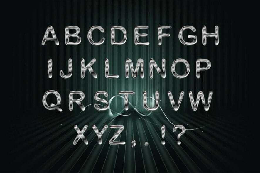
Microsoft introduced five new fonts and one of them should replace Calibri as the system’s default font. For that, users are invited to submit their votes.
Only one will be the chosen one, but the four other will be kept in the fonts menu across all Office 365 and other Microsoft apps.
While default fonts might not be very different in terms of aspect, they still bring some uniqueness when they’re used, Microsoft says.
They communicate a distinct personality in their own quiet way—a personality that by extension becomes our personality as well.
And one reason why default fonts are not too fancy or bold is that their role is rather functional and not visual. To that extent, they serve their purpose and keep users focused on their tasks.
Tenorite, Bierstadt, Skeena, Seaford, and Grandview
These are the names of the five newcomers commissioned by Microsoft and they’ve all been created by graphic designers. They embody various sans-serif styles—humanist, geometric, swiss-style, and industrial.
According to the designers, Tenorite brings crisp-looking shapes and wide characters with large spacing which makes it easy to read.
On the other hand, Bierstadt is described as more mechanical and rationalized than the current Arial font. This makes it minimalistic.
The third, font, Skeena, is softer, with curvier endings to the letters and visible differences between thick and thin variants.
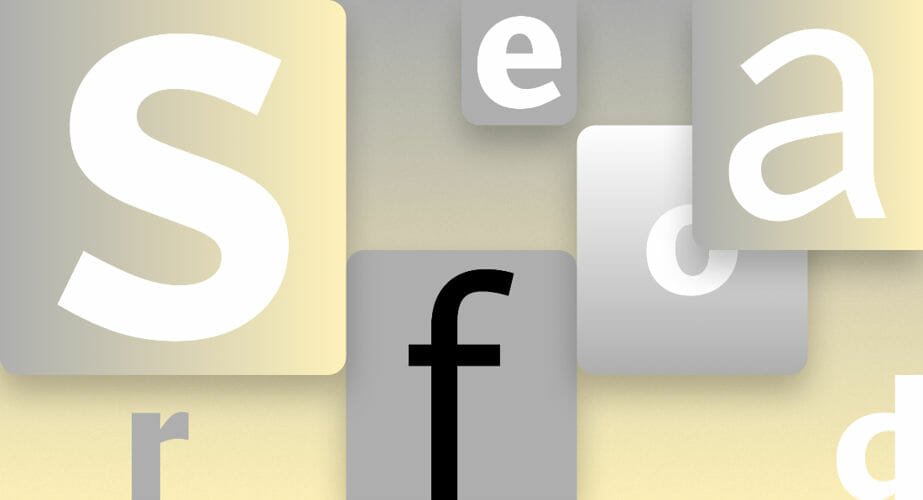
What the designers intended with the fourth font, Seaford, was to evoke familiarity. This is how one of the designers describes it:
At the start there was just a broad description of a personality—comfortable, warm, inviting, animated—so we began by studying the overall movement of old-style serifed faces. We hoped to create the same, familiar kind of warmth, but without the serifs.
Last but not least, Grandview takes a more industrial approach starting from Bahnschrift font.
Read more about the fonts as their designers describe them in the release notes. You can use them freely in the cloud across Microsoft 365 apps and then vote for the next default font on Microsoft’s Twitter account.
We’d also like to know which one you prefer, so leave a comment in the section below.

