Microsoft details how typography affects user interface design
![]() 4 min. read
4 min. read
![]() Published on
Published on
Share this article

Read our disclosure page to find out how can you help Windows Report sustain the editorial team Read more
Earlier today, Microsoft posted on their blog about the importance of fonts for developers and their apps and their apps’ interfaces. The importance Microsoft puts on font is great to see, especially because while fonts are an important aspect of written or typed work, the digital space is where most new text resides, like within an app.
The first aspect of typography in any space, according to Microsoft, is to consider the kerning of a desired font. If you’re not a designer-by-trade and haven’t studied textual design, kerning is the spacing between letters in a word. Specifically, the kerning of a letter refers to the fact that there is spacing in between letters as well as a designated space around letters with open spaces under overhanging bits like a capital “T” or odd-capped letters like “i” and “j”. Kerning is also essential to utilize when using an “r” next to an “n” so the two don’t clutter together to be mistaken as an “m”.
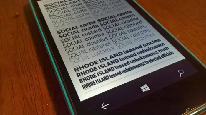
Similar to kerning is the character width of text. Fonts that are referred to as “monospace” have each letter taking up the same amount of width-space, while fonts that are known as “proportional” have varying character widths because each character doesn’t look like they take up the same space, and reasonably don’t in the text itself. Microsoft’s example showing the difference between the two types of fonts are Caslon and Courier New. Microsoft’s infographic of the two is included below for a clearer idea.
Microsoft also highlights the likely more-often-considered aspect of font: leading. Not leading as in leading an army, but leading but like pencil lead and the element. Leading is easiest understood as line spacing, since they often are the same thing when laying out text on a page. Leading is important because, as any user that’s read very tightly-spaced lines of text, it’s not very pleasant compared to something that’s got good leading. Estimating based on Microsoft’s example, it might appear that Microsoft Word uses their example of “good leading” as the default line spacing as of 1.15 points.
Serif versus Sans-Serif fonts are also important to consider as a developer, especially given Microsoft’s own app guidelines. And for those who don’t recognize the term “Serif” or “Sans-serif”, a serif font is one with little edges hanging off each character, like Times New Roman. A sans-serif font would be something like Arial or Verdana. Microsoft, for example, utilizes a sans-serif font throughout their products and services such as their company blogs, Office, and even Windows 10. The choice of which to use is often based on what impact a developer wishes their text to have on readers, so there’s no clear answer for which to use.
When creating an app, developers inevitably have to choose a font to use, and picking can be tough. But Microsoft advises against it, saying to only choose up to two, and even one is typically perfectly fine. Too much variation in font style can be jarring and interrupt the user’s experience within the app. Each font family contains different variations on a bas font, like a bold, italic, capital, or other form of the font to keep the roots of the font flowing throughout the app’s text.
Microsoft continues to offer tips to developers of any skill level in its continued attempt to aid and simplify the experience of building for Windows as a platform. The unification of Microsoft’s design language is what makes Universal Windows Apps and the Universal Windows Platform huge offerings for developers looking to reach millions of devices and customers.