Microsoft Store has a new Homepage and Category section which make browsing games and apps much easier
The new Homepage should be rolling out for users now.
2 min. read
Updated on
Read our disclosure page to find out how can you help Windows Report sustain the editorial team. Read more
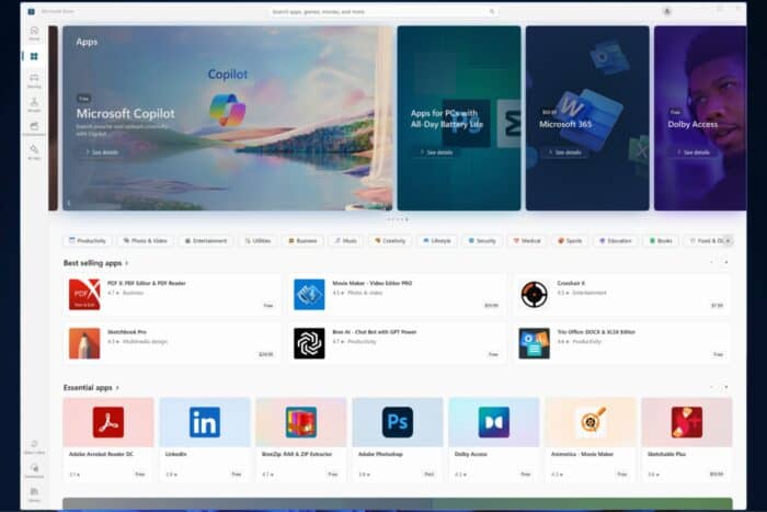
Microsoft finally updated the Canary Insider Channel with a new build, and the Redmond-based tech giant also made some huge changes to the Microsoft Store.
In a blog post, Microsoft says these changes bring new categories to the home page and are part of the Microsoft Store app version 22409 and higher, rolling out to Windows Insiders in the Canary and Dev Channels.
The new homepage in the Microsoft Store features app categories below the featured applications and games. Clicking on any of the categories will take you to a page where you can browse a variety of apps for that category. The same line of categories is also available in sections like apps and games.
In addition to the new categories, the Microsoft Store app is also getting a slightly updated look for the pages of individual applications and games. The updated design has a larger header and more rounded corners.
The Microsoft Store app will update itself automatically, so you should see these changes in a few days, but you can also update it manually to speed up the process.
App Categories: The apps page on the Microsoft Store will now show a new categories experience just under the featured section. Clicking on any of the options will lead you to a page where you can browse a variety of apps for that category. We hope you find this new experience helpful as you browse the store to find your next favorite app.
What do you think of the homepage and categories of the Microsoft Store app? Is the new design more accessible to navigate? Let us know in the comments section below.




User forum
0 messages