Stay healthy at work: Hands on with MyAnalytics in Office 365
6 min. read
Published on
Read our disclosure page to find out how can you help Windows Report sustain the editorial team. Read more
Other than productivity software included with Office 365, one of the key parts of having a successful business is keeping workers healthy and positive. Sure, you can accomplish this with team bonding, and other activities, but, workers already spend 8+ hours a day at their desks. How can you show them hard data on work patterns, wellbeing, collaboration, and their network?
MyAnalytics, a new part of Office 365, is one solution. This online service is included at no extra cost with most Office 365 Business subscriptions. It collects Office 365 data every day to give workers insights about their meeting habits, their most-used apps, and more. We recently went hands-on with it, and here are our thoughts on the experience.
The main dashboard
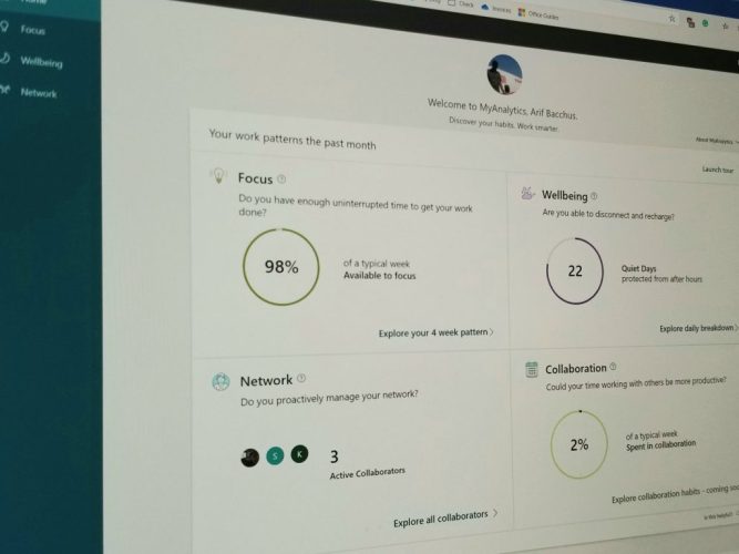
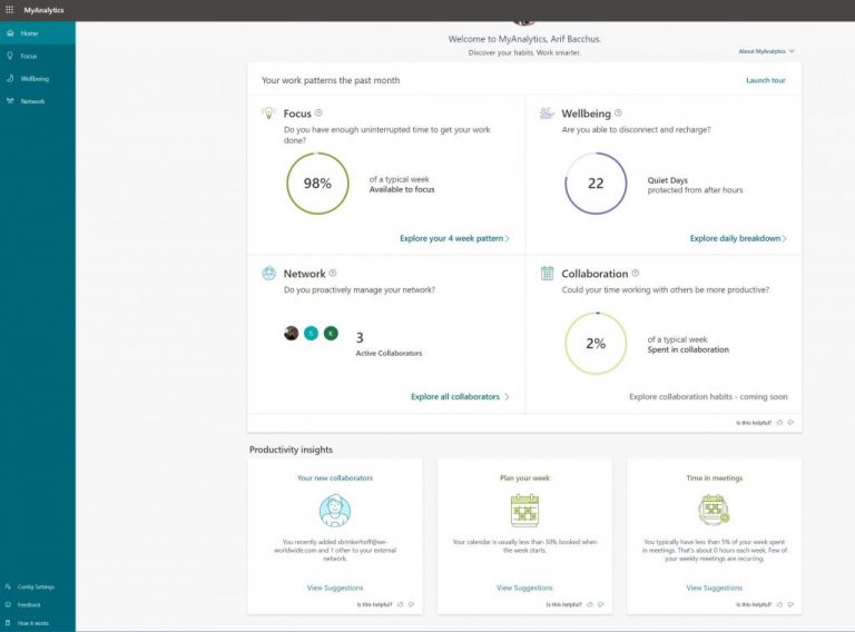
The core of the MyAnalytics experience is the dashboard. From this simplistic and clean-looking main page, there are several tiles. Focus, Wellbeing, Network, and Collaboration are the main tiles running along the top. On the bottom, are some insights on productivity. These include people recently added to an external network, and suggestions on how to plan a week or spend time in meetings. You can always click the view suggestions button to get more ideas on your productivity flows.
It should be noted, though, that each of the main tiles on the dashboard will show you a quick look at some active data, represented in the form of a circle. It’s really simplistic and helps make sense of data you otherwise wouldn’t be thinking about.
Finally, along the side, there’s a tab for navigating to the more in-depth areas of the dashboard. We have more on those later on.
Focus — a look at your uninterrupted work time
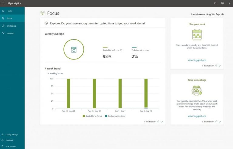
The first area of the MyAnalytics dashboard is Focus. Here, you’ll have a 4-week look at your work habits, and if you have enough uninterrupted time to get work done. This is calculated based on collaboration time, in meetings, emails, chats, and calls. Any of your time on your Outlook calendar with none of these activities is counted towards focus.
There are two main insights here, an ability to focus, and collaboration time — both calculated on a percentage scale. You’ll also see both of these represented in a weekly average represented in form of a circle.
On the right-hand side, you can also see some suggestions on how to plan out a week, and how you’re spending time in meetings. These simple but efficient reminders can help you stay focused on work, and plan out specific tasks. Again, it’s a clean and visually efficient way to represent productivity data that otherwise would go uncollected from Outlook, and other Office apps.
Wellbeing — a look at how long you’re away from your work
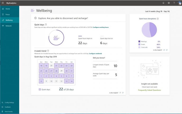
Next, there’s the Wellbeing section. From this section, you can see how long you’ve been working outside of your normal working hours — what Microsoft calls “Quiet Hours.” Similar to the Focus area, the data is collected over the last four weeks and will show you how long you’ve kept your quiet hours streak. You can configure the quiet hours and working days as needed in settings.
There’s also a pie chart on the right side to show what has interrupted quiet hours, be it meetings, emails, chats or calls. In this case, the more quiet hours the better, as it is essentially your ability to disconnect from work, and stay stress-free.
Once again, it’s rather interesting to see this data represented in the form of a chart, as not everyone will think that answering an email or Teams message can impact their wellbeing at work.
Network — who are you interacting with?
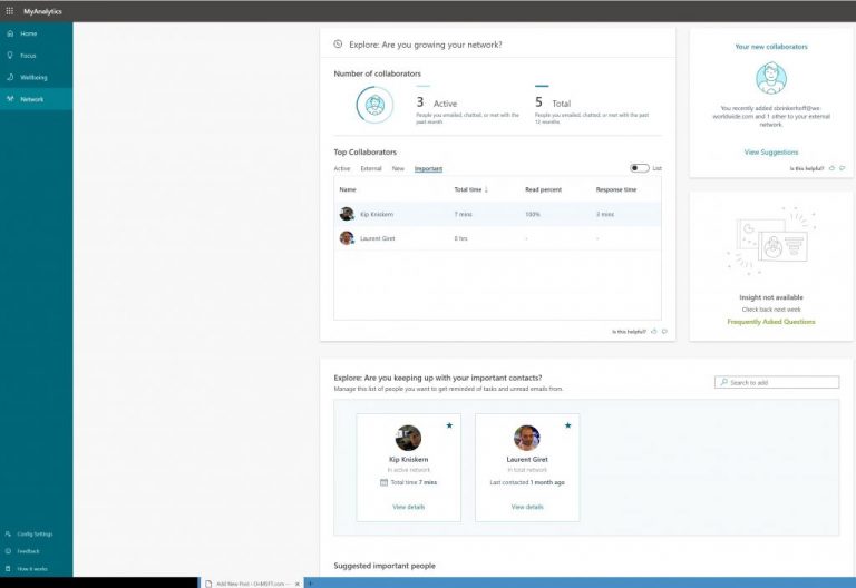
Third up, there’s the Network section. This section pulls data from Outlook and Teams and will give you a look at some of the people you’ve most often contacted. There’s a look at the total number of people you’ve collaborated with via emails or Teams. You also can see a look at the top people you’ve contacted. It’ll be divided into External contacts, Active contacts, New contacts, and your important contacts. There’s even an option to “map” our your contacts to visually see how often you’ve reached out to them.
Beneath this main collaborators section will be the Explore area. Here’s where you can see how often you’ve contacted your important contacts. You also can search for contacts and add them to the list, if needed. Finally, beneath the Explore area will be the suggested important people area. These smart important people suggestions are pulled from your email.
Collaboration —- measuring how much you work
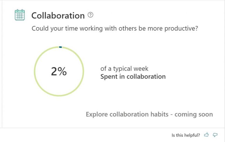
Finally, there is the collaboration section. While this area does not have a dedicated page with in-depth stats as yet for us, it will provide you a quick look at your workflow. The collaboration area looks at the estimated amount of time you’ve spent in meetings, emails, chats, and calls. Like wellbeing and focus, it is measured in a percentage.
On our end, this will just show this information in the form of a percentage. However, the more you use MyAnalytics, the more data it will collect. You might be able to see tips on how to batch email, reduce meetings, respond to meetings, meetings agenda, and how to start and end meetings on time.
Do you find MyAnalytics useful?
Be it the network, collaboration, focus, or wellbeing, all data collected as part of MyAnalytics is private and is only visible to you. It’s meant to keep you healthy at work and also improve your workflows. You can always opt-out of the experience by opening MyAnalytics and selecting the settings gear and turning the control to off. Do you think MyAnalytics is useful? Let us know in the comments below.




User forum
0 messages