Users don't like Bitwarden's new UI, but its developers confirms it's not definitive
Bitwarden encourages users to leave their feedback.
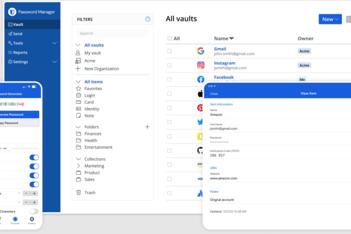
Bitwarden is a freemium open-source password management service, and also one of the best products of its kind, according to our review of it. The app encrypts credentials and stores sensitive information in encrypted vaults, and it can be used on a variety of platforms: from Windows to macOS, Android, WatchOS, and so on.
The app recently debuted a new design and many of the users are not really happy about it, with some of them questioning the updates made to the app’s navigation interface, claiming that Bitwarden now has a lot of unused space, and inconsistent styling, as well its filtering capabilities, and the lack of more info when accessing the Details page.
On Reddit, for instance, users even posted screenshots circling all the areas in design that would benefit from several changes.
Users agree that the Bitwarden is a great product, nonetheless, but its design should be worked on:
I saw the initial image and got really excited thinking Bitwarden had already updated the UI. I dislike the new UI and want the old one back. This mock up is amazing and makes much more sense than the current Bitwarden web UI.
I understand redesigning a UI takes time, but I would have preferred they hold off on releasing the new one until it was more complete.
Ah well, still a great product.
Reddit user
Others feel that they don’t understand why Bitwarden updates the UI this way:
So we all know Bitwarden recently updated their web app interface. I sincerely could not understand the point of this update. They’ve done their researches but the result is so underwhelming. The only change is that the top bar is now on the side…?
Not to discredit their design team, they did a great job on keeping Bitwarden as funtional as it ever is, but so much more could be done. Especially that none of Bitwarden’s clients follow the design system that the home page uses, they really should move to that direction.
Anyway, here’s my take on how the layout could be improved, using elements on bitwarden.com and a bit of my own thoughts. Would love to know your feedback!
Reddit
However, in the same Reddit post, a Bitwarden developer unveiled that the current UI updates are not final, nor definitive, and the app will suffer some changes based on users’ feedback.
I think it’s important to note that the update we did is just an iterative navigation design update, not an app redesign by any means, so effectively the original design is still there. We have greater plans for more of a redesign like your concept in the future and u/kevinBitwarden and his team are working on those things in the bigger picture of design changes to the Bitwarden product line.
Bitwarden developer
Even more, Bitwarden encourages users to leave their feedback, so that the developers can use it to improve the platform.
Thank you for sharing your thoughts on our recent navigation update. Your feedback is invaluable as we work to enhance the Bitwarden experience for all users. This update is just the beginning of our efforts to improve our products.
We’re excited about the broader design changes we’re working on, starting with our extension. We’d love to hear more of your insights and perspectives. Would you be interested in meeting with our design team to discuss these upcoming changes in more detail? Your input would be greatly appreciated as we continue to evolve Bitwarden.
Bitwarden employee
Do you use Bitwarden? What do you think of the latest updates to the platform?
Read our disclosure page to find out how can you help Windows Report sustain the editorial team. Read more


Improve this guide
User forum
0 messages