Here’s how visual cues impact the effectiveness of Universal Windows Apps
2 min. read
Published on
Read our disclosure page to find out how can you help Windows Report sustain the editorial team. Read more
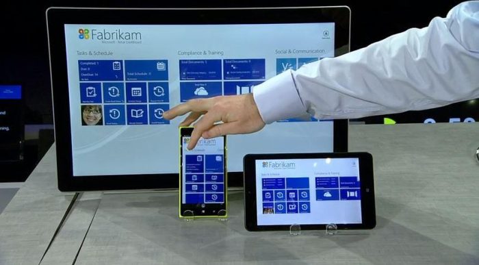
The Windows team has just published the next post in a series of best practices in designing Universal Windows Apps (UWA), and this time, it’s about designing visual cues.
Specifically, the Windows team looks at the generals of visual cues before diving deeper into how they can inform users of possible interactions, as well as guiding them to do transactions. One of the rules being emphasized is that visual cue should never distract users from the main content. They also need to be easy to understand, visible, and eye-catching.
Visual cues help your user to quickly understand what is happening in your app and to see what is important and what is not.
Similar to real-world objects, visual cues should also communicate well what they do and how they can be interacted with. The specific kind of visual cues that instruct people on these interactions are called “affordances”. These mostly come in the form of contextual changes to visual cues. According to famed designer Don Norman, two things matter in affordance design: whether they can be readily perceived and interpreted, and whether the desired action can be discovered.
Call-to-actions (CTA), on the other hand, are used to guide users towards transactions, by inviting them to give information, urging them to act, and offering an opportunity. These are often seen in free-to-play games and apps that rely heavily on ads and in-app-purchases. Some oft-used elements in CTAs are contrasting colors, noticeable difference in scale, larger fonts, and noticeable margins. Nevertheless, they should not be jarring and frustrating to look at.
All in all, the post presents fascinating and useful guidelines on making your apps not just attractive, but also usable and effective. While the Windows team’s intention is obviously geared towards UWA builders, these guidelines should work for any developer who wants their apps to be as effortless to users as possible.
Image credits: The Windows Blog


User forum
0 messages