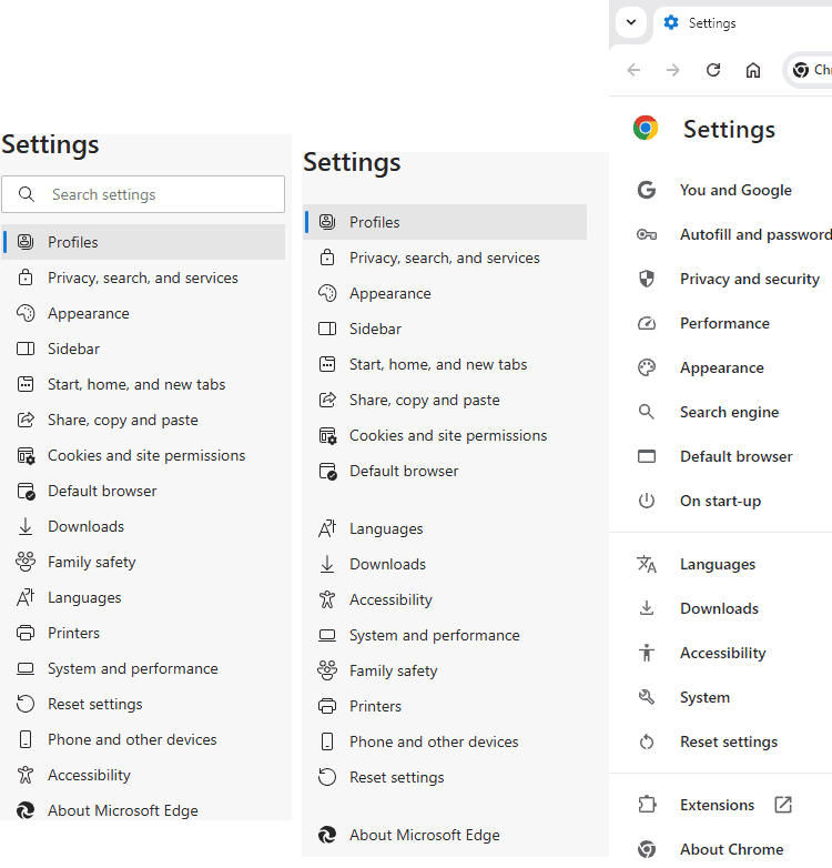
Microsoft Edge could get a Chrome-inspired Settings interface
The right-aligned search bar would be easier to navigate.
2 min. read
Published on
Read our disclosure page to find out how can you help Windows Report sustain the editorial team. Read more

Microsoft appears to be gearing up to redesign the Edge settings page in the Canary version. The search bar is being moved to the right, making it easier to find Edge browser settings. This aligns with the Chrome Settings layout.
Based on Chromium/Blink, Microsoft Edge is not a Chrome clone. Microsoft aims to differentiate Edge from Chrome by constantly testing and adding new features. All testing takes place in the Canary version, and the changes or new features are A/B tested, and these may never make it into the release channel.
Recently, we reported that Microsoft is trying to use Windows 11 Energy Saver for the Edge browser and is testing balanced and aggressive efficiency modes with advanced Prendering technology. Microsoft is currently redesigning Edge Settings.

Prominent Search Bar: The right-aligned search bar will likely become a more prominent feature within the settings page, allowing users to find specific options quickly.
Revised Navigation: The spacing and organization of the left-hand navigation menu could be changed, possibly improving the user interface for easier navigation.

Like any other feature in development, there is no certainty these changes will get into the Edge release.

However, Microsoft can improve user satisfaction and loyalty by providing easier access to settings, reducing navigation time, and adopting a more straightforward layout.

Microsoft can also consider implementing History Search powered by AI like Chrome and Copilot-powered search suggestions or personalized settings recommendations that could further improve the Edge Settings experience.
We noticed Microsoft is also making a minor UI change to the Resource controls feature, which lets you adjust how much RAM Edge can use. The change involves moving the slider to exactly below the Resource Controls settings.
Do you think Microsoft is copying design cues from Chrome for its Edge Settings? Let us know in the comments below.


User forum
0 messages