Microsoft updates its Planner web app with refreshed UI, new Planner Hub and more
3 min. read
Published on
Read our disclosure page to find out how can you help Windows Report sustain the editorial team. Read more
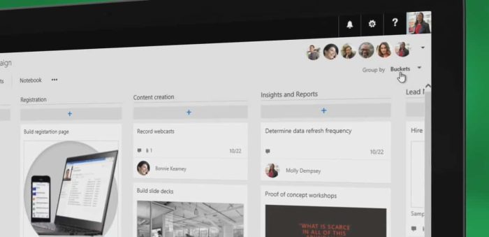
Microsoft quietly updated Planner, its project management tool for Office 365 customers, last week. Planner doesn’t get as much love as Microsoft Teams, the team collaboration app that Microsoft launched earlier this year, though both products are already integrated in some ways.
Indeed, it’s already possible create plans right from Microsoft Teams, though as of today those plans you create on the Slack competitor won’t be visible in the Planner web app. To be clear, you can still open these plans in the web app if you want to, but these plans created on Microsoft Teams won’t appear in the Planner web app or the iOS and Android apps by default, which can be a bit confusing.
As a result, it seems that it’s always better to create plans from the Planner web app, and you should really use the web client in the first place if you want to see your plans at all times in a separate browser window. The Planner web app also seems to be more reliable (it refreshes faster), and it has just been updated with a new UI that should improve performance for plans with a high number of tasks. Microsoft detailed some of the changes on its online Planner community last week.
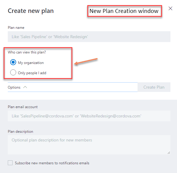
First of all, the new plan creation window now has a new option to let you choose who can view new plans: you can either make them available to all your organization, or restrict them to a few members you’ll add manually.
The card view has also been updated to make attachments more visible. When you add a link to a card, the link name will now show up on the card if you check the “Show on card” toggle.
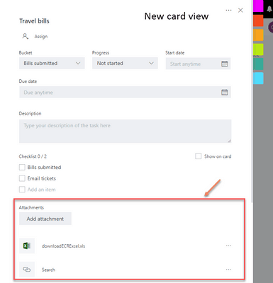
Previously, with links, Planner would show the full url on the card by default. Now it shows the “text to display,” making visible links on cards more readable. “Attachments” used to be only links, but now include Files, Links and SharePoint.
From the Plans card view, you will also see that it’s now easier to know if a plan is public or private, and you can also click on any card to add a new label or delete it.
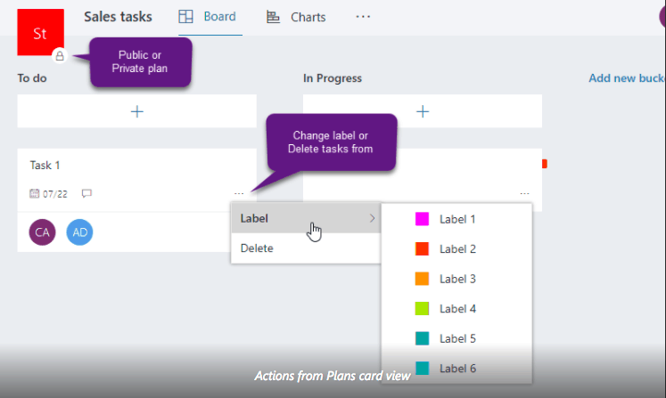
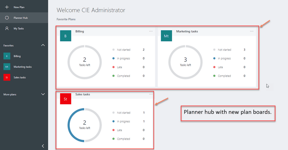
Lastly, the Planner hub has been slightly redesigned with new plan boards, which help you better track how many tasks are in progress, completed, etc.
This is a pretty nice update overall, though the project management app still remains a work in progress. In the future, we’d very much like to see more seamless integrations with Microsoft Teams, as it really make sense for companies to use both tools in synergy. If you also use Planner, let us know what are the other improvements you would like to see in the near future.



User forum
0 messages