Opera One vs Opera: Which One Should You Use & Why?
Opera One offers many improvements over the regular version
6 min. read
Updated on
Read our disclosure page to find out how can you help Windows Report sustain the editorial team. Read more
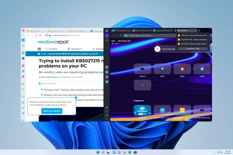
Opera One is the latest version of the Opera browser, coming with a whole set of fresh features. If you’re not sure making the switch to it is for you, keep reading.
We’ll compare Opera One vs Opera in terms of features and performance. By the end, you’ll know which is the best choice for you.
What are the differences between Opera One and Opera?
Here’s a quick overview of how they compare:
| Features | Opera One | Opera Classic |
|---|---|---|
| User Interface | Dark theme, decluttered sidebar | Light theme, traditional sidebar |
| Multithreaded Compositor | Smooth animations | Static interface |
| Tab Islands | Context-aware tab management | Limited tab organization |
| Customization Options | Limited customization | Extensive customization options |
| AI Integrations | Aria AI chatbot with live web results | Limited chatbot options |
| Performance Differences | Slightly higher CPU and memory usage | Lower CPU and memory usage |
| Base Engine | Chromium-based | Chromium-based |
| Extra features | Pinboards, media player, VPN, crypto wallet | Pinboards, media player, VPN, crypto wallet |
Now, let’s take each feature one by one.
User interface
The first thing you’ll notice when you start Opera One is its user interface. The browser comes with a dark theme, unlike the regular version. Of course, a light theme is available as well.
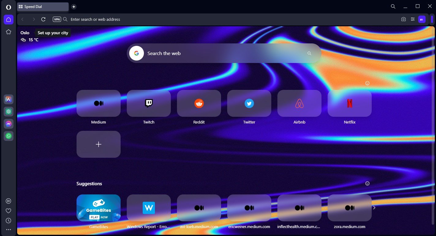
You’ll also notice that Opera One has fewer items in the sidebar by default. Of course, you can customize the sidebar any way you want, but it’s refreshing to see that developers decided to declutter the interface.
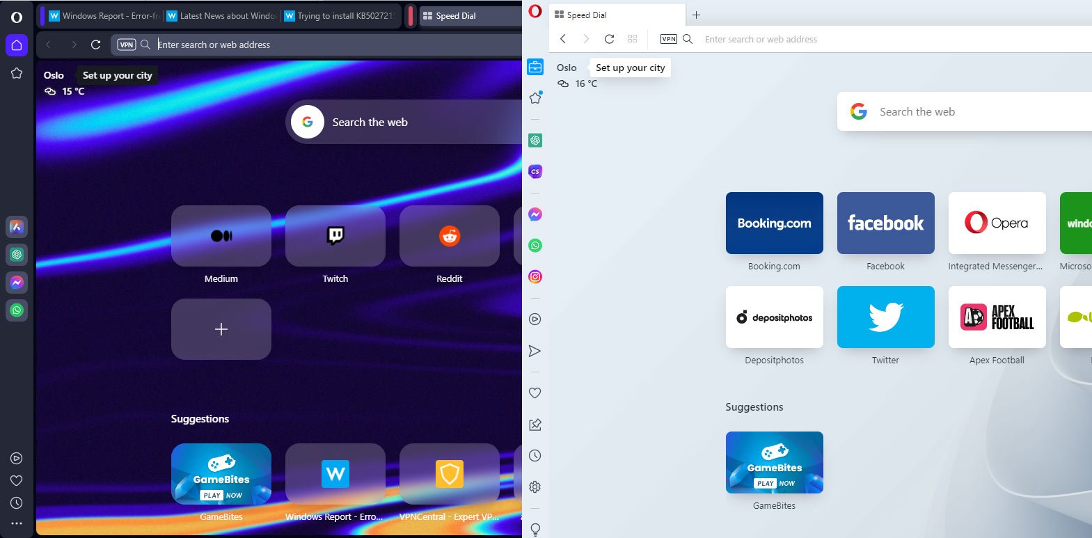
These are some minor interface changes, but now let’s focus on larger ones.
Multithreaded Compositor
Opera One is one of the first browsers that use Multithreaded Compositor, and it allows your user interface to have smooth animations without stuttering.
We didn’t see too many new animations besides the one when switching to different workspaces, and we have to admit that it looks impressive and innovative.
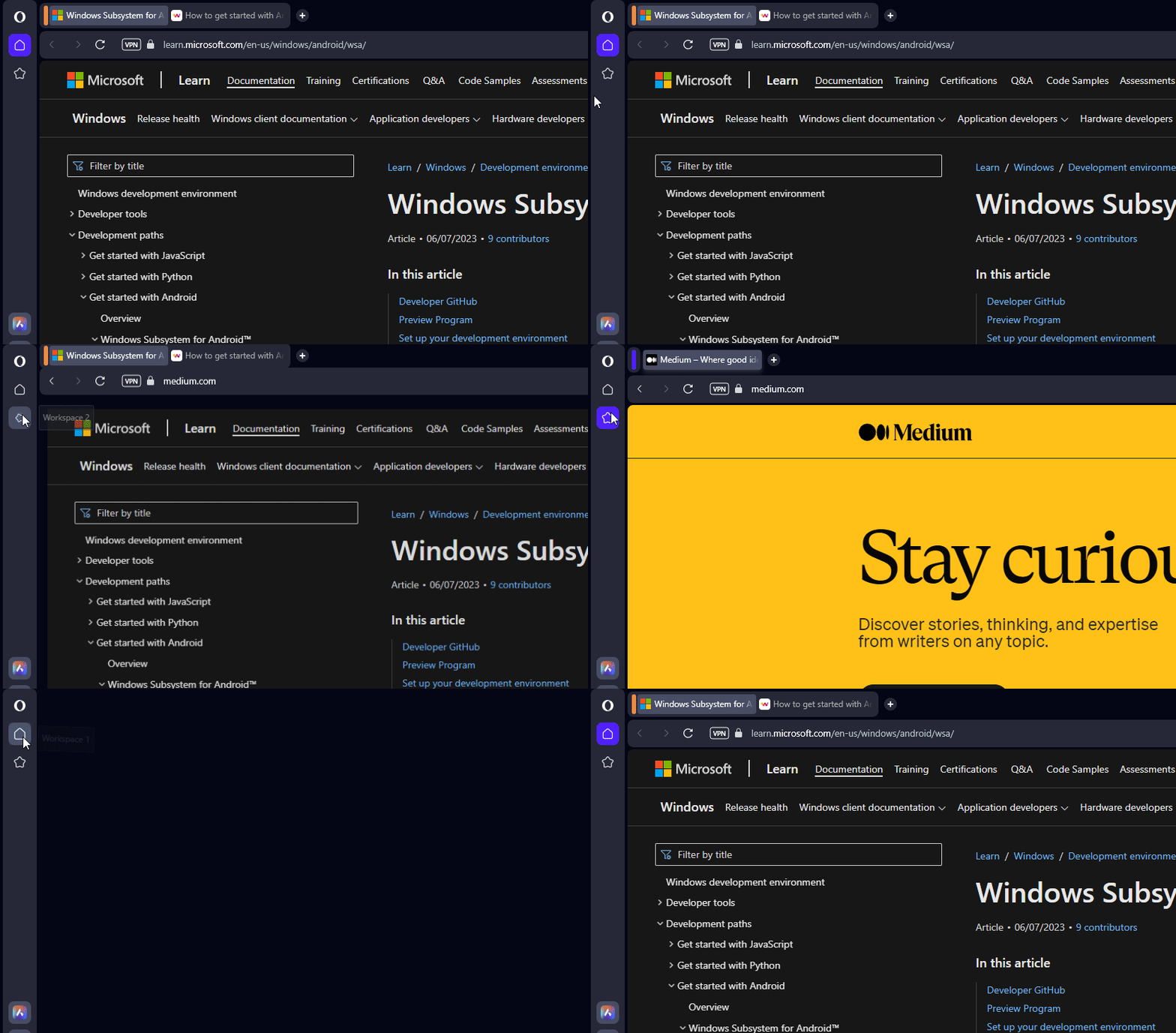
Keep in mind that this is an early release of Opera One, and we’re likely to see more animations like this in the future.
In comparison, the current version of Opera has static change when switching workspaces and it doesn’t look too appealing.
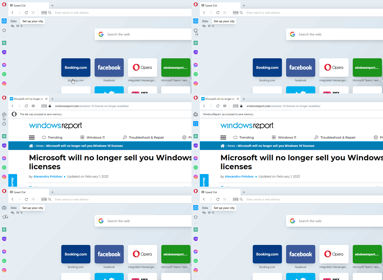
Some users might prefer workspace switching without animations, but currently, we’re not sure whether it is possible to disable them.
We’re pleased with this change, and we can’t wait to see more animations in the future.
Tab Islands – Context-aware tab management
One of the biggest flaws of Opera is the lack of any tab grouping, and Opera One plans to fix that. As you know, in Opera, there’s no tab grouping like in Chrome.
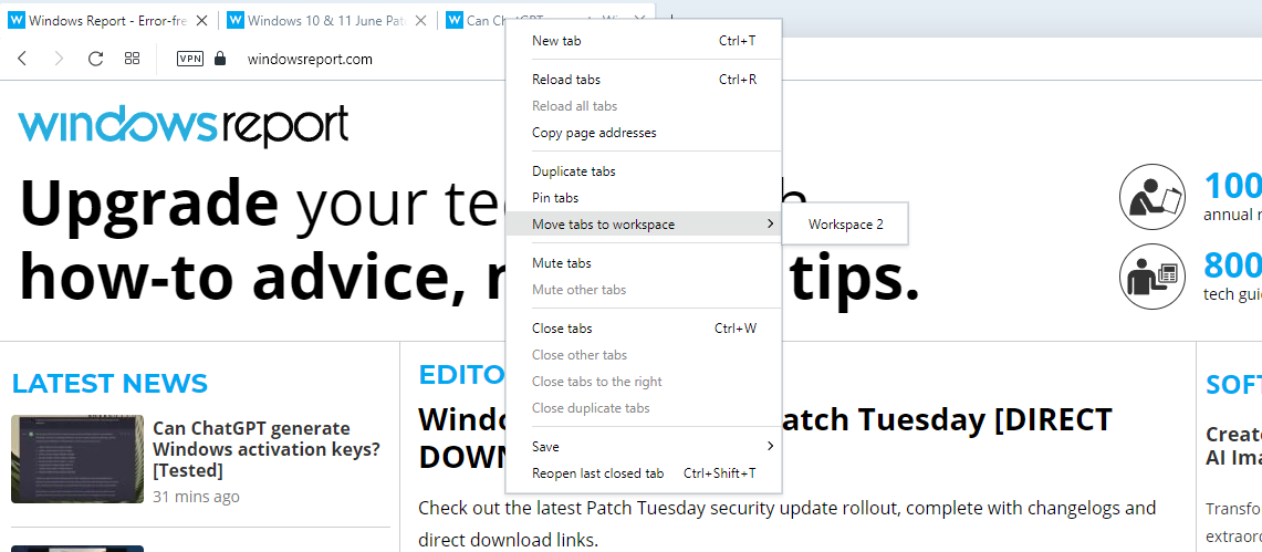
Instead, you can only move tabs into different workspaces to organize them. It’s safe to say that Opera offers pretty limited tab management and Opera One plans to change that.
How do the tab Islands work?
Tab Islands will group open tabs automatically based on the browsing context. For example, if you open multiple tabs from a single page, all the newly open tabs will be added to the same group.
The same applies to web searches. By doing so, you’ll have different groups for different websites and searches, allowing you to organize your tabs better.
It’s important to mention that you can minimize the groups and move them on the tab bar any way you want, so your tab bar won’t ever be cluttered.
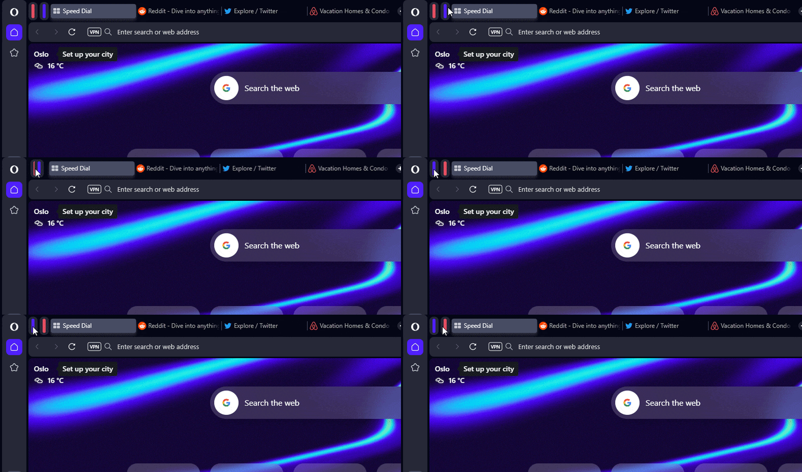
Of course, you can select multiple tabs and create a custom group. You can even create a new group using the add tab icon inside the Tab Island.
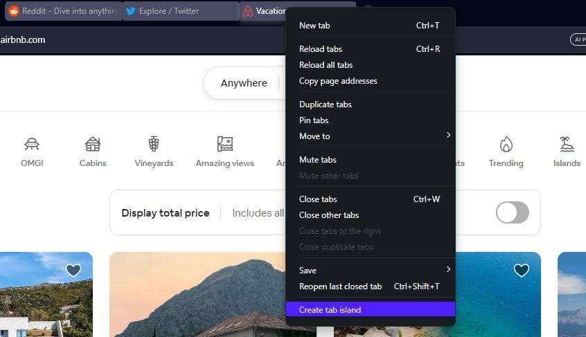
It’s important to mention that you don’t have to expand the tab group to access a specific tab. Instead, you can hover over the group and select the desired tab from the dropdown menu for quick access.
Customization options
Although the new tab grouping feature looks impressive, it still lacks certain features that other browsers, such as Chrome have.
In Opera One, all tab groups automatically have assigned colors, so there’s no way to customize them. In addition, you can’t label your groups, so your only indicator is the automatically assigned group color.
Aria AI
Opera has had AI chatbots in the sidebar for some time, but users were limited to ChatGPT and ChatSonic. With Opera One, users can take advantage of Opera’s AI chatbot, Aria.
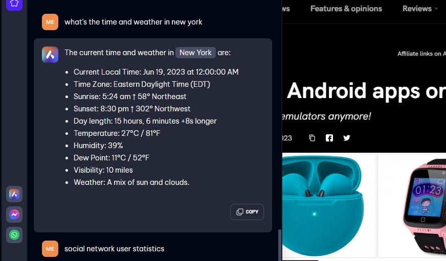
The chatbot is available in the sidebar, and to use it, you need to sign in with your Opera account.
Here’s what you should know about Aria AI:
- It uses OpenAI’s GPT technology
- Has support for live web results
- Offers information after 2021
Overall, Aria AI sounds like an improvement over ChatGPT, especially with support for live web results, therefore, it will be quite useful.
Of course, if you prefer ChatGPT or ChatSonic, you can use them instead since they are still available. Speaking of which, be sure to check our guide on the differences between ChatGPT 3.5 and ChatGPT 4.
Similarities between Opera One and Opera
All features previously available in Opera are available in Opera One, including Pinboards, a media player, access to various messaging and social networks, VPN, a built-in crypto wallet, an adblocker, and more.
Here’s a quick comparison of available features:
| Opera One | Opera | |
|---|---|---|
| Workspaces | ✔ | ✔ |
| VPN | ✔ | ✔ |
| Adblocker | ✔ | ✔ |
| Social media integration | ✔ | ✔ |
| Media player | ✔ | ✔ |
| AI Integration | ✔ | ✔ |
| Aria AI | ✔ | ❌ |
| Tab Islands | ✔ | ❌ |
As you can see, Opera One has all the features of Opera, but it also expands them with additional functionality such as tab management and Aria AI support.
Performance differences
We compared the performance on both browsers by opening 7 tabs on both browsers. As for the results, they were pretty similar.
Opera One had up to 1.5% CPU usage at times, while regular Opera didn’t pass more than 1%. Regarding memory usage, Opera One used about 150-200MB more than the regular version.
This isn’t a drastic difference, especially on newer PCs, but it’s something that some users might find important.
Overall, Opera One ran smoothly without any slowdowns, despite slightly higher CPU and memory usage. These differences are almost negligible, and you won’t notice them while browsing the web.
Is Opera One Chromium?
Yes, just like all other modern versions of Opera, Opera One is based on the Chromium engine, which makes it quite similar to Chrome.
This also means that with Opera One, you’ll be able to run Chrome extensions without any issues.
Final thoughts
Opera One is an improvement over Opera in every way. If you haven’t tried it already, we suggest you go ahead and download Opera One and try it yourself.
Have you tried Opera One, and what are your thoughts on it? Let us know in the comments below.
User forum
0 messages