What do you think about Microsoft's new Aptos font?
Aptos will replace Calibri in the following months.
3 min. read
Published on
Read our disclosure page to find out how can you help Windows Report sustain the editorial team. Read more
Key notes
- After 15 years, Calibri is coming to an end.
- Aptos, the new Microsoft default font, will take its place.
- The new font should be avaiable as the default font in the following months.
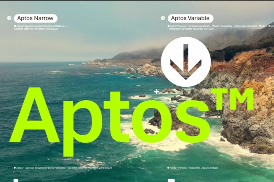
Big week for Microsoft Office users everywhere, there is a new Microsoft default font: Aptos. Aptos is set to take Calibri’s place, after 15 years of usage within Microsoft Office apps, such as Microsoft Word, PowerPoint, Excel and so on.
For 15 years, our beloved Calibri was Microsoft’s default font and crown keeper of office communications, but as you know, our relationship has come to a natural end. We changed. The technology we use every day has changed. And so, our search of the perfect font for higher resolution screens began.
Microsoft
And so the Redmond-based giant tech found the next Microsoft default font. Aptos, which was previously known as Bierstadt (the german for Beer Town, pretty suiting), was the right choice. Microsoft was looking for something sharp, uniform, and good looking on screen. Of course, there are a lot of fonts who would fit this description. But Microsoft chose to go with Aptos.
Aptos is set to become the default font on all Microsoft 365 apps in the following weeks and months to come. For now, you should get ready for the changes, and properly say goodbye to Calibri while it still is the default font.
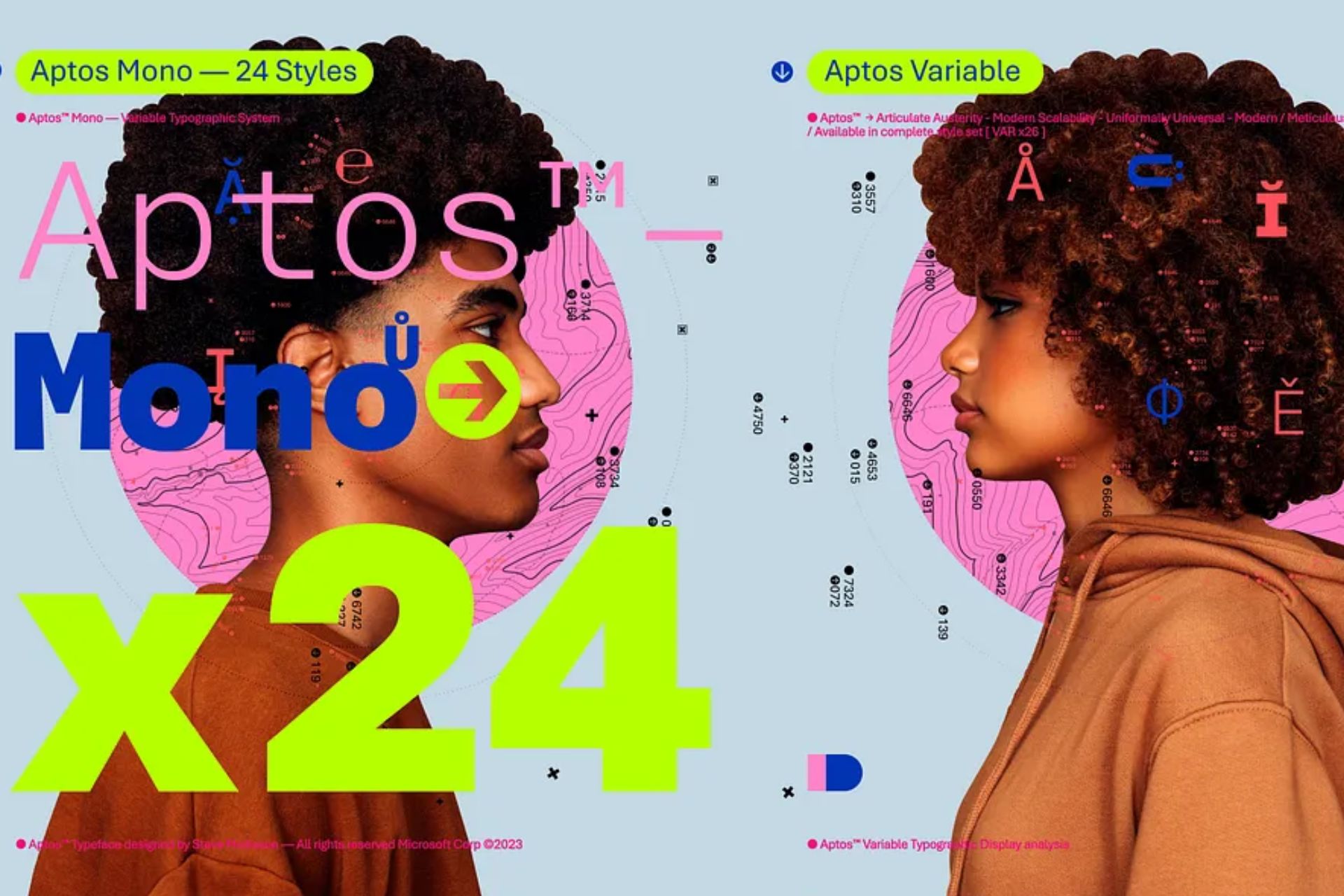
Here’s how the Microsoft Aptos font looks like
Aptos was created and designed by Steve Matteson, which one of the world’s leading type designers. According to Microsoft, he previously created the original Windows TrueType core font and the font of Segoe. He chose to name font Aptos, after the California little town, and he says the Aptos font has a humanist touch.
There’s always that little voice inside of me saying, ‘You know, you gotta try to sneak in a little bit of humanity. You can’t just use rulers and straight edges and French curves (a template used to help draw uniformed curves) to make all these shapes mechanical.’ I did that by adding a little swing to the R and the double stacked g.
Steve Matteson for Microsoft Design Blog
Even if the Aptos is now the default Microsoft font, you can still change the default font to the one you like in the Microsoft 365 apps. So if you’re not ready for the change just yet, you can still keep Calibri or the font that you love as the default one for your devices.
However, Aptos should be incorporated in every single Microsoft product from now on, and by end of thid year, it should totally replace Calibri.
What do you think about this new Microsoft font? Do you like it? Let us know in the comments section below.



User forum
0 messages