Best Font for Windows 11 [6 Most Popular Ranked]
Take a closer look at our top choices
Key notes
- The best Windows 11 fonts support the operating system and ensure users enjoy the customization of visuals.
- Microsoft developed some fonts that are freely accessible from the Microsoft Store.
- We have font families and types used by professionals for different tasks.
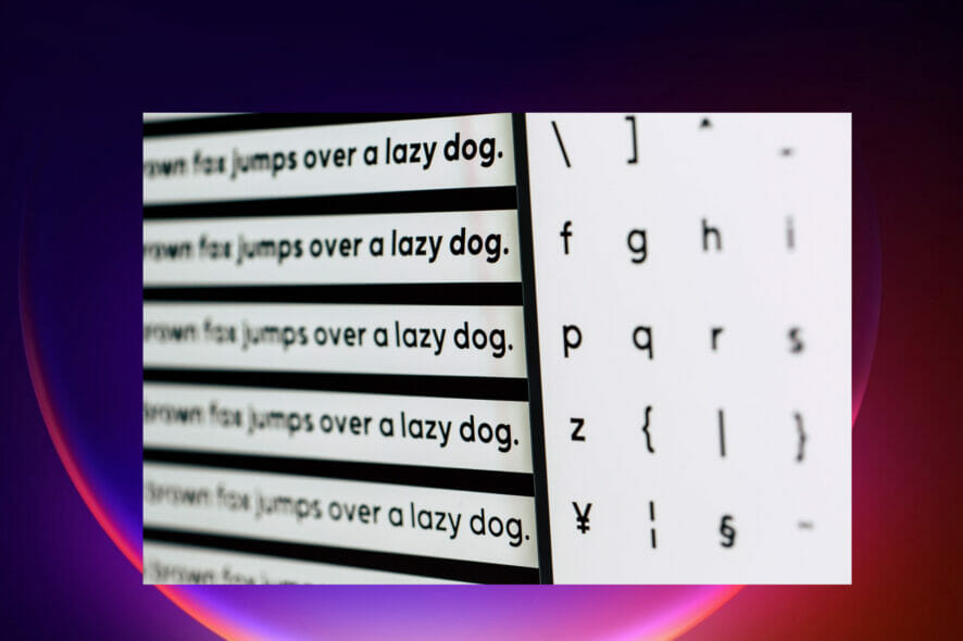
Fonts play a significant role in changing the appearance of text which changes the appearance of the entire content.
Each font has different styles; hence many types of fonts on the market. Some of these styles include weight, size, slope, color, or family.
Most apps and software come with default fonts that you can later customize to meet your needs. This article will look at the best Windows 11 fonts for your PC.
How can I download fonts on my Windows 11 computer?
There are several ways of downloading fonts to your PC. These are:
- You will find many font managers online that offer both free and paid versions from font managers. The software gives unlimited fonts and is customizable to meet your needs. Some of these fonts managers include Adobe Fonts, FontBase, and Nexus Font.
- Download directly from the Windows 11 Microsoft Store. You can avoid the struggles of downloading fonts from the website by visiting the Microsoft store and choosing the suitable font for your project or document
- From websites since many sites on the Internet offer fonts, either free or paid
What are the best Windows 11 fonts to enjoy?
Georgia
It was first released in 1993 by Matthew Carter. It’s a serif font with thick and thin strokes on a vertical axis. First, it was for small computers, but things changed, and the letters now match large computer screens.
Microsoft embraced the font when it was included in Internet Explorer 4.0 web fonts. This made it come with Windows as default and made professionals like designers use it as the first choice.
The default Georgis font uses non-lining numerals compared to the other versions. It is used in a lot of e-book applications.
There are several versions of the Georgia font:
- Georgia Pro – Has additional weight and small caps, supporting the extension of character sets and kerning. It has scalable computer fonts like lining, figures, and ligatures. You can access them by visiting the Microsoft App Store.
- Ms. Reference Serif – It has a bold weight and is in italic form.
- Georgia Ref – Has a single weight with extra characters with Microsoft Bookshelf 2000, Encarta Encyclopedia Deluxe 99, and Encarta Virtual Globe 99.
Verdana

It’s a serif type invented by the Microsoft team. This font has small sizes which are readable on computer screens with low resolution. It has tall lowercase letters with loose letter spacing.
Have wide counters and proportions that make strokes separate from each other.
The letters have closely the same shape so that they appear different from each other and increase the legibility of the text.
From 1996, Microsoft accompanied Windows, Internet Explorer, and Office with the font. Later, users were able to download it from the Microsoft website.
There are several versions of the Verdana font:
- Verdana Pro – has semi-bold black styles with italics that can get condensed across all weights. You can access it freely from the Microsoft Store.
- Verdana Ref – It works well with Microsoft references and gets used in-office programs, publishers, Deluxe, etc.
Segoe
Also owned by Microsoft and is commonly used in designing materials for online and marketing purposes.
It was first used as the default font for Windows Vista and Outlook before Microsoft designed its logo using the font.
Light and semibold font versions were turned off to improve screen reading. The font supports additional scripts, i.e., Arabian.
It uses rendering technology to ensure the font produces better layouts and readability. Segoe User Interface has variables that display text as small faces explicitly designed for specific font sizes.
It has several key variations:
- Segoe UI Mono has monospace characters mainly used in Latin, Greek, Hebrew, and Thai to draw symbols and shapes.
- Segoe UI Historic – supports old scripts like Gothic, Coptic, Runic, etc.
- Segoe Boot – it’s vertically shaped and mostly stretched to fill the screen, i.e., the BIOS fonts.
- Segoe UI Variable was introduced in Windows 11 to scale monitors with dots per inch.
Roboto

Roboto belongs to the San serif family font developed by Google. It has thin, regular, medium, bold, and black weights that match with slanting styles, not the italic ones.
They have light, regular, and bold condensed styles. It also has matching slanting designs.
There are several variations of Roboto fonts:
- Roboto slab consists of five heights(Extra-Light, Medium, Semi-Bold, Extra-Bold, and Black) with font axis ranging from 100 to 900.
- Roboto Mono – has a fixed width with seven heights (thin, extra-light, light, regular, medium, semi-bold, and bold).
- Heebo – has the Hebrew alphabet.
- Roboto Serif – it’s Roboto combined with serifs.
Rockwell
It has an Egyptian origin, and it belongs to the Serif class. Rockwell works well with displays; most designers use it to make banners or posters when conveying a message.
It’s large and bold, making it good to produce large prints. Note that well-known brands mostly use it due to its versatility.
Calibri
Calibri follows the modern style, and it belongs to the San-seif family. Microsoft replaced Times New Roman with Calibri in Microsoft Office and Windows Vista.
They start with the letter C to show that they belong to the ClearType system that allows text to be very clear on flat display devices.
The font has round stems and corners that make the font more visible on large screens. It supports computer scalable fonts that ensure the linings, text figures, and numbers 1-20 are accessible and easy to form glyphs.
It creates fractions by using small caps, caps spacing, superscripts, and subscripts. It is used in design programs like Adobe.
Calibri has similar characters due to confused characters, e.g., lowercase L and capital I.
Why are fonts so important?
It changes the visual presentation of texts by changing the look through the font’s features, i.e., size, color, height, or page arrangement.
They help on how people will receive the messages conveyed. For example, if you issue a warning using a font that looks dangerous with red color, most people will be very keen.
Most big brands and companies are very keen when choosing fonts for their designs, logos, and campaigns.
Fonts have a lot of styles that you need to use in the right way and project. There are a lot of websites and font managers; you can get any font you want.
If you lack some fonts on your PC, there are several ways to download and install fonts. Also, do not hesitate to check out the best Windows 10/11 free fonts software.
Now that you know what fonts you should use, why not look at our guide on changing Notepad font in Windows 11?
In the comments section, let us know which font you use on your Windows 11 computer.
Read our disclosure page to find out how can you help Windows Report sustain the editorial team. Read more


Improve this guide


User forum
1 messages