The new Xbox Home screen isn’t going over well with the first subset of users
2 min. read
Published on
Read our disclosure page to find out how can you help Windows Report sustain the editorial team. Read more
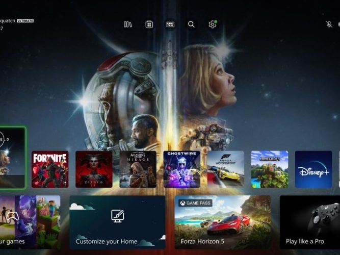
The new and “improved” Xbox Home screen hasn’t exactly been a hit with gamers since rolling out yesterday.
The new home UI has been in the works for months; we first reported on it in September last year when it was first released to the Xbox Insider Program’s Alpha Skip Ahead Ring. Yesterday’s launch was limited to a select subset of users.
The new Home experience was meant to be a more personalized and user-friendly one. However, some gamers have taken to the r/XboxSeriesX subreddit to voice their frustration with the new Xbox Home UI.
The original post by user Spiderwolfer complains, “Generally I don’t mind the new Xbox Home Screen layout but I don’t feel like it’s much better either.”
PLEASE tell me I can get rid of this…
by u/Spiderwolfer in XboxSeriesX
The post continues,
What I really wanted was for our custom groups to be at the top of the screen and this has put them down even further. This is a pretty annoying inconvenience and wish they had thought this through a little more. PLEASE consider changing this.
Spiderwolfer isn’t alone in this sentiment, either. Hundreds have commented on the post, mostly sharing the same criticism of the new Xbox Home screen. A common point of frustration seems to be Microsoft’s perceived indifference to feedback, even in the Xbox Insider Program.



User forum
0 messages