Windows 11 changes the color of the Lock and Switch User menus' bar
The update was spotted in the latest Canary build.
1 min. read
Published on
Read our disclosure page to find out how can you help Windows Report sustain the editorial team. Read more
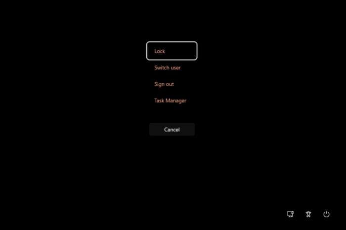
With the latest build to the Canary, Microsoft has updated Windows 11 with new icons for Windows Hello and removed the notification bell from the operating system’s taskbar.
However, the build also significantly changed the design of several areas of Windows 11. For example, the color of the Lock Screen, User screen menu bar, and so on could be changed to fit the overall theme of Windows 11.
Spotted by popular tech enthusiast @phantomofearth, the text of these screens will follow the accent color of the general theme, as you can see above in the featured image.
Microsoft might update every part of the context and additional menu, such as the Print Queue bar buttons (in the tweet below) in Windows 11 to follow the personalized theme color.
If so, this new capability would allow users to personalize their Windows experience, which is not bad, but it might diminish the operating system’s overall professional look, which is the iconic blue and white stripes.
Either way, these new options will most likely be optional, so users could choose to have a personalized Windows 11 experience or not.
What do you think about it?


User forum
0 messages