How to add a trend line in Power BI [STEP-BY-STEP GUIDE]
2 min. read
Updated on
Read our disclosure page to find out how can you help Windows Report sustain the editorial team. Read more

Adding a trend line is one of the most useful features in Power BI. But sometimes users are encountering problems with this operation.
The official Power BI forum has plenty of threads related to trend line issues:
I have a fact table with sales data which includes a SalesPeriod value. A related SalesPeriod table contains the SalesPeriodID that ties back to the Sales table and includes a “DateOfSales” column which is a datetime. When I add a column visualization, I would like to be able to add a trend line, but do not see that option under the Formatting tab. Note, there is one row in the SalesPeriod table per month where the DateOfSales values are the 1st of each month (all sales occur in a given month.year, aggregated in the data I am provided). I have select Continuous for the X-Axis type (which is the date field) and get expected results, but do not see a Trend Line option using the latest PowerBI desktop update.
So, the OP didn’t know how to add a trend line to the chart. Fortunately, this can be solved easily in a few steps and today we will show you how.
Steps to add a trend line in Power BI
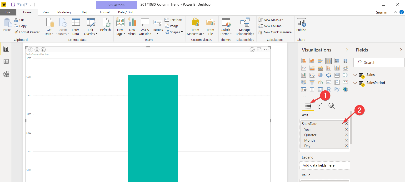
- Go to Visualizations and select Fields tab.
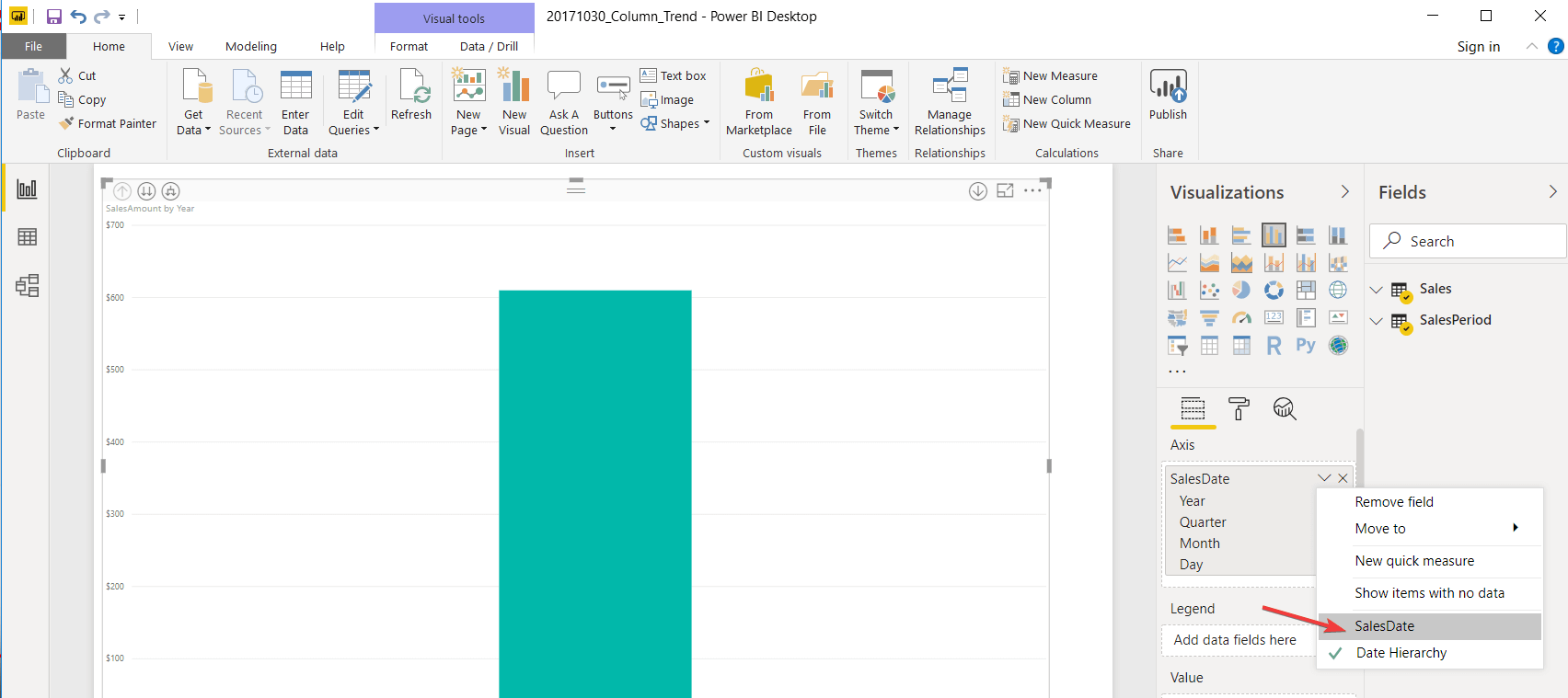
- Check Sales Date and select SalesDate. It will automatically deselect Date Hierarchy.
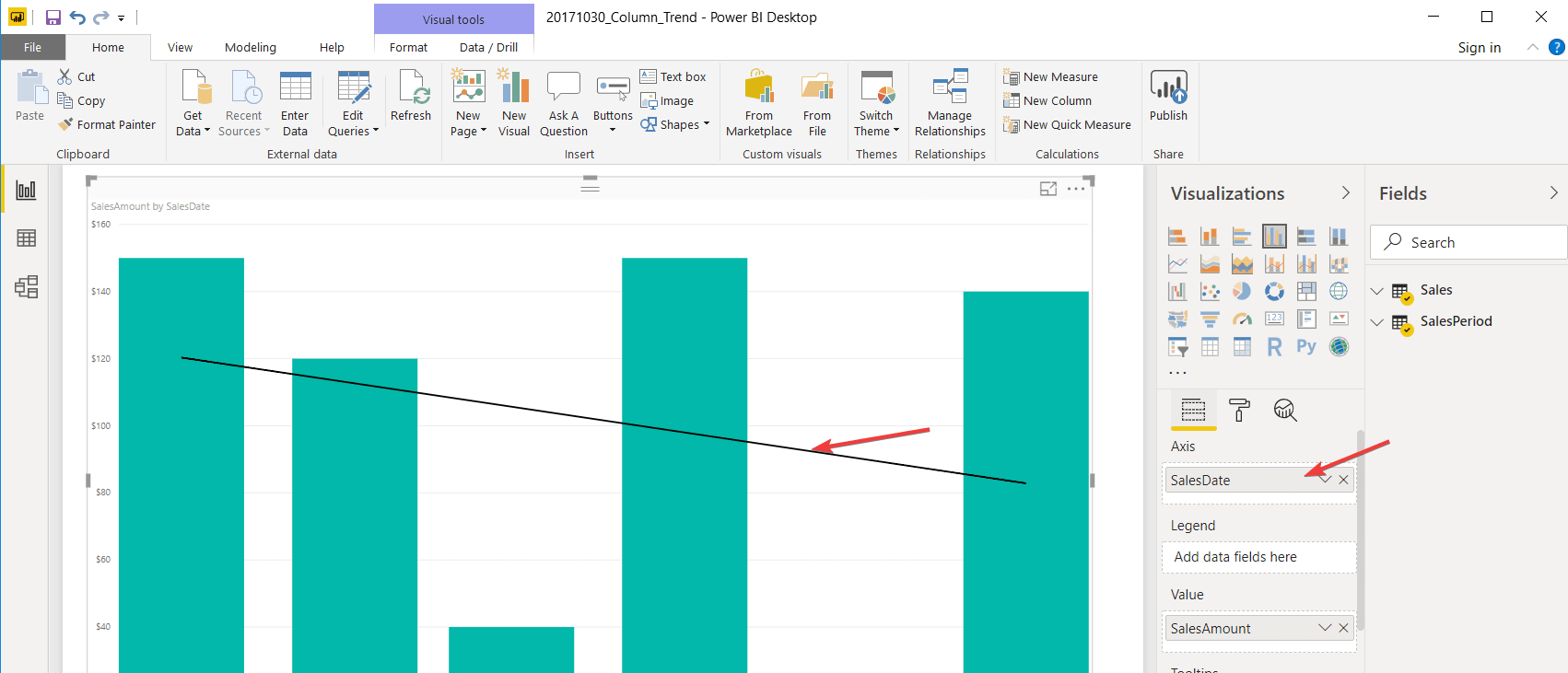
- Now you can see in the image below that the trend line appears when you select SalesDate.
We’ve written a nice piece about Power BI, do check it out.
Conclusion
So, there you have it: a really simple solution for a very important issue. The trend line appears with just a little twitch in the options.
How do you add a trend line in Power BI? Share with us your method in the comments section below.
RELATED ARTICLES YOU NEED TO CHECK OUT:




User forum
0 messages