Get the new Windows 11 Paint app experience [Insiders only]
3 min. read
Updated on
Read our disclosure page to find out how can you help Windows Report sustain the editorial team. Read more
Key notes
- Everyone is excited about the new Paint experience for Windows 11 but the future app version only has a few changed features.
- The most significant change about Paint is its user interface, which is modern.
- Microsoft also removed the Edit in Paint 3D button and added a changed text tool.
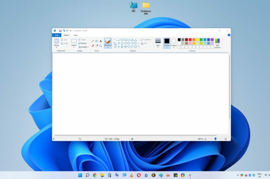
Do you remember that we were actually talking about this system built-in tool a couple of weeks ago? Well, what we said back then has come to pass and this app has now completed its evolutionary process.
We were all announced that Microsoft is about to start tweaking Paint and that the results would be satisfactory for all of us.
Panos Panay has now hinted at the redesigned Paint app and users are more than curious and eager to try it out.
What’s new on the Windows 11 Paint app look and features?
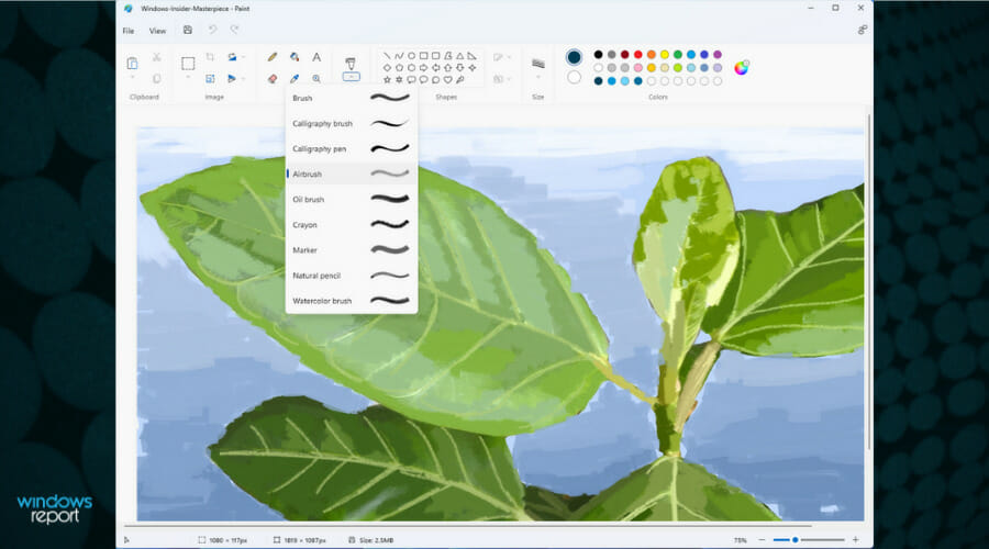
Update: Microsoft announced in a Windows Blog post that they are beginning to roll out the redesigned Paint app for Windows 11 to all Windows Insiders in the Dev Channel.
In the new announcement, we also have a new screenshot with the new Windows 11 Paint app and Microsoft touts a simplified toolbar menu, the round color palette, and drop-box menus.
We also learned that there is a new text tool that can be accessed by clicking on the A icon in the toolbar.
Microsoft’s Chief Product Officer Panos Panay tweeted about the new Paint experience and followers were ecstatic to find out more.
At first glance, the UI looks quite different from the version of Paint in Windows 10, but a much closer look shows very that very little has in fact changed.
For the trained eye, the only new features are a dark mode and the ability to change text alignment. Other than that, this all seems to just be simply a fresh coat of paint with some items moved around.
If you really make an effort, by looking carefully, you’ll see that the Edit in Paint 3D button has been removed.
Overall, this seems to be simply bringing the app up to the more modern design language of Windows 11.
All of the same features from the classic Paint are still here, and the UI tweaks aren’t beyond the limits of craftsmanship, so nothing out of the ordinary.
On Windows 10, Microsoft tried to promote a new app called Paint 3D for a couple of years, but the interface was radically different and not as intuitive.
All it did is it added a ton of 3D design tools that made it more complicated, too. With Windows 11, the company seems to have acknowledged that was a bad idea and is instead refining the Paint app everyone actually uses.
When will we see this new app make its way to Insiders? This is a question that we wish we’ve had the answer to, but unfortunately, we don’t.
We have yet to see the Focus Sessions feature teased a couple of weeks ago, so these early looks don’t necessarily mean it’s coming that soon.
But since we are talking about upgrades, last week, Microsoft also rolled out a couple of smaller UI updates for the Calculator app and announced a similar update for Mail and Calendar.
Are you excited about using the new Paint? Let us know in the comments section below.

User forum
0 messages