How To Add Data Labels In Power BI: Step-By-Step Guide
2 min. read
Updated on
Read our disclosure page to find out how can you help Windows Report sustain the editorial team Read more
Key notes
- Adding data labels helps users better visualize their documents.
- The Detail labels function is responsible for adding labels in Power BI.
- In the article today, we will teach you how to use this function to add labels.

Adding data labels is one of the most basic functions in Power BI. As you well know, the visualizing of data is one of the most important features of this tool.
However, using this option is not as easy as one might believe.
Users want to know how to show all data labels on their charts. One user reported the following:
I want to have a visual with all the data labels displaying count and percentage both. I guess only pie-chart and donut chart shows both % and count but the problem is that somehow some data labels (for smaller values) are still missing and I am unable to see all the data labels for pie chart. I have already selected “All detail labels” in Label style i.e. the full details option of data labels in pie-chart.
So, the OP wants to add a visual with all the data labels because some labels are still missing. Fortunately, there is a simple solution to this problem.
Today we will show you how to add data labels in Power BI in a few easy steps.
How can I add data labels in Power BI?
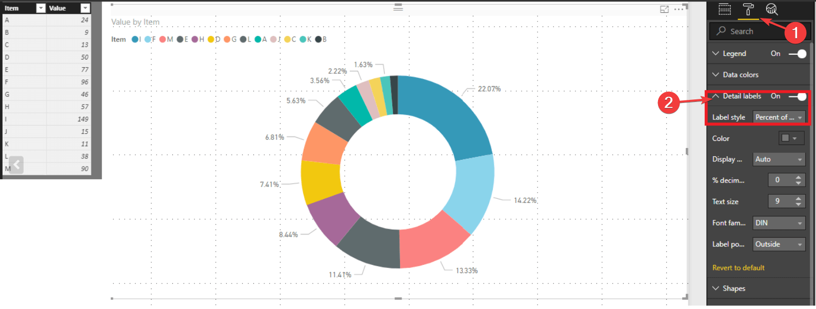
- Go to the Format pane.
- Select Detail labels function.
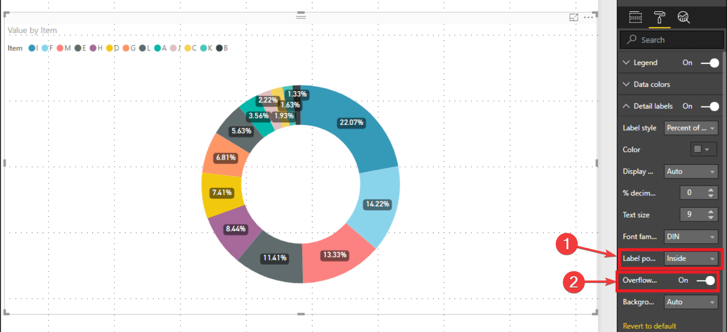
- Go to Label position.
- Change from Outside to Inside.
- Switch on the Overflow Text function.
Keep in mind that selecting Inside in Label Position could make the chart very cluttered in some cases.
So, adding data labels in your charts is pretty easy, but the steps to do that are not always as obvious as they seem.
Also, it is worth mentioning that the solution above is available for pie charts and donut charts. For other types of charts, the steps may vary.
Still, the method described above is the heart of the matter when it comes to adding data labels in Power BI.
Just adapt the solution to your project and there you go: your data visuals are now top-notch!
Did you find our method useful? How do you use data labels in Power BI? Do let us know in the comments section below!





User forum
1 messages