Microsoft is experimenting with a darker mode for Edge
A new Darker Mode feature is allegedly on the way
2 min. read
Published on
Read our disclosure page to find out how can you help Windows Report sustain the editorial team. Read more
Key notes
- If you weren't already happy with Dark Mode, you might be in luck.
- Microsoft is trying to improve the feature of the Edge browser.
- Everything is still in the testing phase, for now, so we have to wait.
We all know what the Dark Mode feature is for most of the browsers or other apps we use, so there’s no need of going further into that.
And, if your favorite browser is Microsoft’s Edge, then you will be pleased to know that Dark Mode will be greatly improved.
By the way, if you need any help activating Dark Mode on Edge, we got you covered. Now, let’s see what all the fuss is about today.
Are we getting an improved Dark Mode for Edge?
The Redmond tech giant began working on dark mode or dark theme for Edge somewhere around 2018, maybe even 2019.
In fact, Microsoft started testing some of the elements in June 2019 in the Canary Preview Channel, and about four months later, it rolled out a feature that would allow users to enable dark mode on websites they would visit.
Now, fast forward a few years to 2022, an Edge Dev channel update made the transition from darker themes to lighter themes and vice versa much smoother when toggled between the two.
Not to mention that, later on in that same year, Microsoft added a dark theme to window mode context menus.
It’s time to move on, however, and the company will soon be adding more darker Dark theme option to the Edge browser.
As a matter of fact, a recent Twitter post has revealed that the Redmond giant is now testing a new Dark theme on the Canary channel.
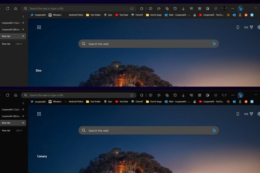
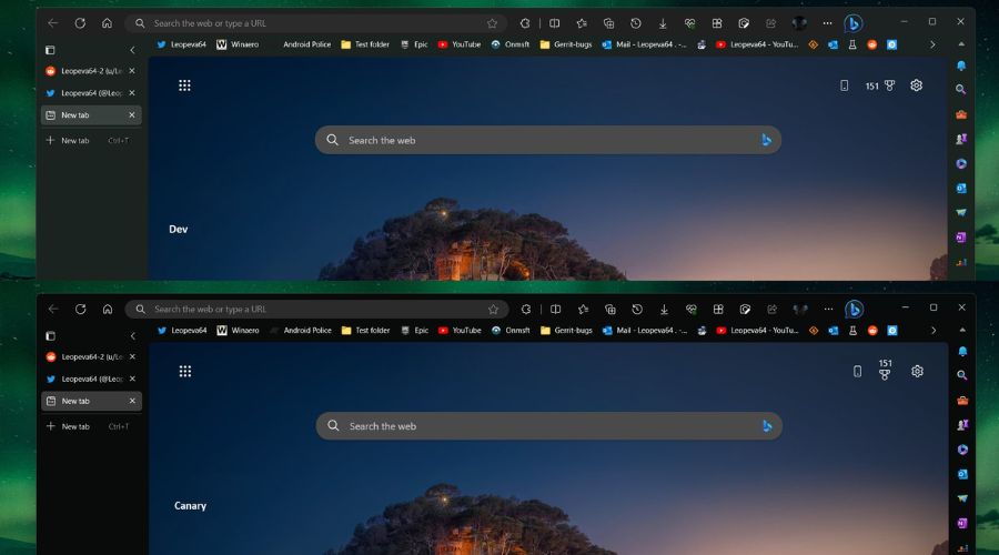
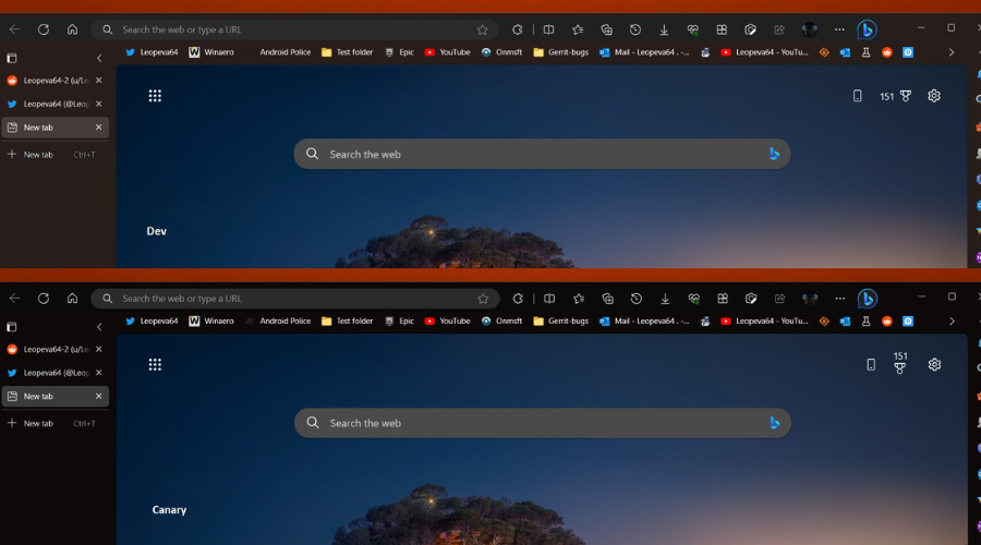
Apparently, in Edge Canary Microsoft is testing a full black background for the tab strip, toolbar, favorites bar, vertical tabs, and sidebar.
This leak also comes with screenshots of the new theme. The Dev and the Beta channels still possess the current Dark theme. The Canary screenshots are below while the Dev and Beta are on top.
One might think that Microsoft will offer both options simultaneously so users who prefer the darker tone can choose it, though this is entirely speculation for now.
Most likely, the Edge development team could completely replace the current Dark theme with the upcoming darker one.
What are your thoughts on this new Microsoft initiative involving Edge? Share your opinions with us in the comments section below.





User forum
0 messages