Microsoft Edge gets a new sleek and streamlined Tab Actions Menu, currently testing in Canary
The new redesign offers integrated tab search and recently closed tabs
3 min. read
Published on
Read our disclosure page to find out how can you help Windows Report sustain the editorial team. Read more
Microsoft Edge has gone through various changes over the years, and Microsoft is constantly working on new features trying to improve it.
It seems that the redesigned Tab Actions Menu is being tested in Edge, so let’s dive in and see what’s new.
The new Tab Actions Menu is currently being tested in Edge Canary
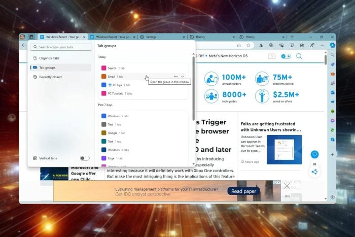
Tab Actions Menu allows you to organize and manage tabs in Edge, and this feature has been redesigned.
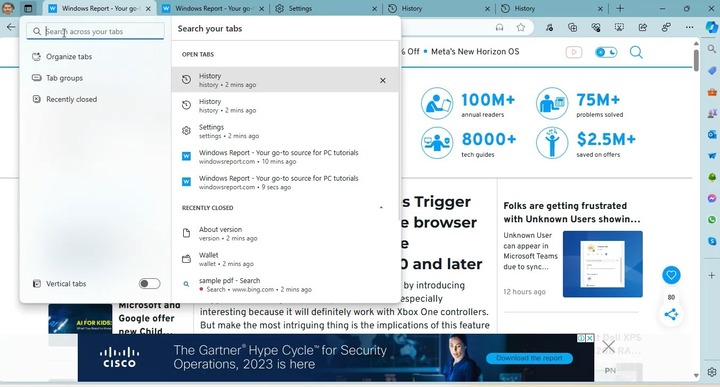
The menu now has a built-in search allowing you to easily find any open tab, as well as the option to access recently closed tabs.
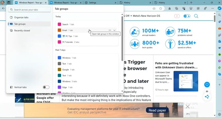
That’s not all, as you can also access tab groups that were created last week or last month. This is a new feature since Edge didn’t have access to tab groups based on a timeframe.
Last but not least, the option to toggle vertical tabs is still here, allowing you to quickly switch between two different tab layouts.
This isn’t the first time Microsoft decided to redesign the Tab Actions Menu, but the current iteration looks sleeker and more streamlined than its predecessors.
We have noticed that certain options are missing compared to the previous versions, such as Tabs from other devices and the ability to move tabs to a new workspace.
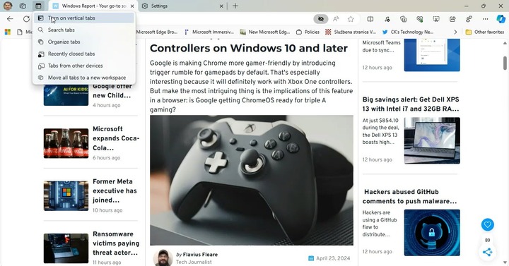
We assume they were removed because they weren’t used as much as other options. Do keep in mind that this isn’t the final design, so these options might be back.
Compared to the previous version, this one is more streamlined, and it doesn’t open various features across the browser thus cluttering the interface.
For example, tab search is now integrated into the Tab Actions Menu, and it doesn’t open a new menu in Edge like before.
The recently closed section also works differently, and it doesn’t open in the History flyout, since it’s fully integrated into the Tab Actions Menu.
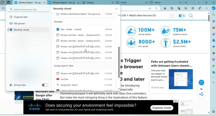
This is a welcome improvement, and it’s enabled by default in Edge Canary. If it’s not available for you, this might be due to A/B testing, and in that case, you just need to wait for a bit longer.
As for other incoming features, Edge will feature buttons on websites to directly install web apps. In case you looking for some recently released features Edge just got rewriting with Copilot and better pen support among other features.




User forum
0 messages