Take a look at the rejected versions of Microsoft Office apps' icons
The team played around multiple designs
Microsoft’s new Office icons may look sleek and modern, but they weren’t always destined to be this way. Before settling on the glossy, minimalist set we now see across Windows and iOS, the design team went through a series of bold, sometimes downright experimental ideas. Now, Microsoft has shared what the rejected Office icons could have looked like via an Instagram post.
In a rare behind-the-scenes reveal, Microsoft showcased several concept icons for Word, Excel, and PowerPoint that pushed the limits of the familiar Office look. Some were inspired by notepads and paper stacks, others reimagined the apps with almost no letters at all. A few of these early prototypes could’ve easily passed for creative app logos rather than productivity tools.
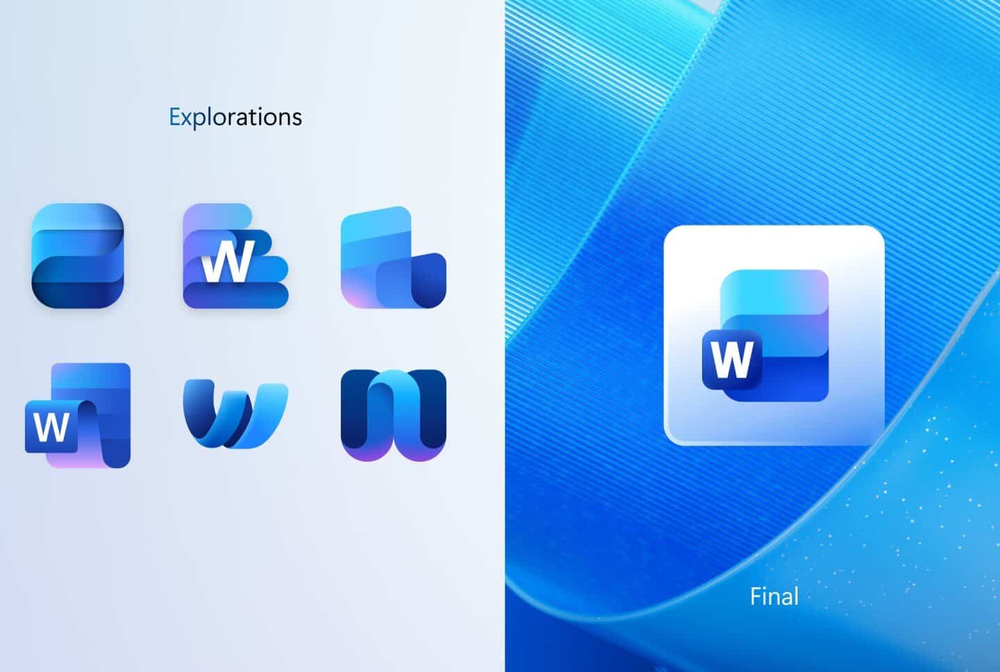
Excel’s concepts explored “cell” geometry to an extreme, with some designs resembling 3D grids or fragmented patterns. Word’s icons played with negative space and typography, while PowerPoint’s drafts toyed with ribbons and pie charts to visualize its storytelling nature.


What’s fascinating is how much personality these designs had. The final icons are meant to blend into Windows’ Fluent Design ecosystem, prioritizing harmony over boldness.
Would users have embraced more expressive, artful versions of Office? That’s a design “what if” we’ll never truly know.
via: The Verge
Read our disclosure page to find out how can you help Windows Report sustain the editorial team. Read more


Improve this guide


User forum
0 messages