Check out this Windows 10 Fluent Design concept with rounded edges
![]() 2 min. read
2 min. read
![]() Published on
Published on
Share this article

Read our disclosure page to find out how can you help Windows Report sustain the editorial team Read more
Microsoft is planning to redesign Windows 10 icons in Windows 10 20H1. The company says that the upcoming version of Windows will bring rounded corners for icons. This piece of news surprised many Windows 10 users in a nice way.
This news reminded us of a Reddit post that where UX designer Maël Navarro Salcedo shared his concept of rounded UI edges for Windows.
This was the first design he made right after a leaked version of Microsoft’s Fluent Design surfaced online. The tech giant modified the existing design of Windows applications with a blurred transparent window, rounded corners and added shadow effects.
Initially, the OP redesigned a mail app back in 2017 and later worked on File Explorer in a second attempt.
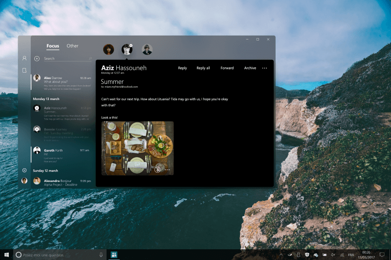
Mail App (Fluent Design concept)
Later on, the added some significant changes to the design of File Explorer. He removed the box from the address bar and used rounded rectangles to group different folders on the left-hand pane. Furthermore, he also moved the search bar to the navigation area on the top left.
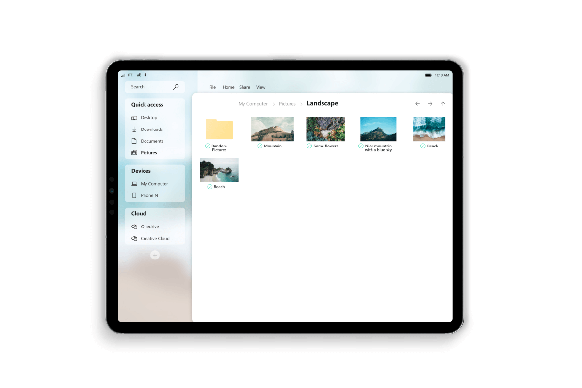 File Explorer (Fluent Design concept)
Maël Navarro Salcedo also made some minor design changes to Microsoft Store.
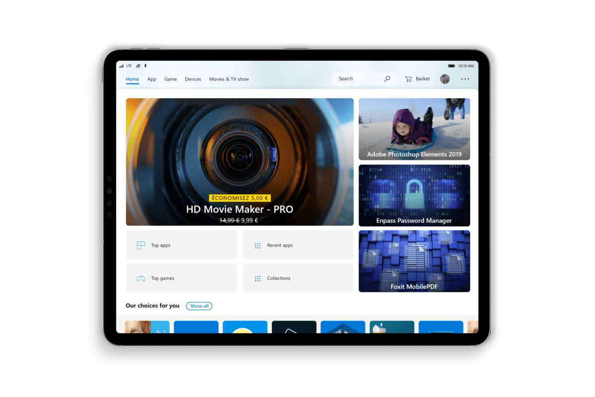
Microsoft Store (Fluent Design concept)
The designer stated that he used the Affinity Designer to work on these designs. Affinity Designer is a cheaper and lighter tool. He encouraged Reddit users to share their opinions and thoughts about this rounded design.
Many users didn’t like the idea and pointed out this was nothing but a copy of Mac’s design.
Please no. It was refreshing to leave rounded corners behind when I switched over from macOS. Why would I want round corners with 90 degree display corners? It makes no sense. It feels too much like it’s doing Apple, let Apple be Apple, and let MS be different to them in terms of UI
However, the designer is of the opinion that all the devices will eventually adopt the rounded corners.
I think tablet and then laptop (after smartphone now) will update to rounded corners in few years. The software will have to adapt to it.
What do you think about this rounded UI concept? Let us know in the comments section below.
RELATED ARTICLES YOU NEED TO CHECK OUT: