Google Workspace Apps' New Redesigned Gradient Icons Leaks
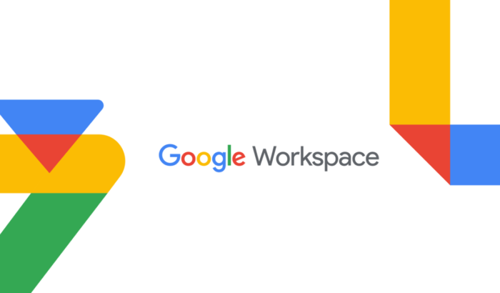
Google is reportedly redesigning icons for its Workspace apps, with new gradient-based icons rolling out across core services like Gmail, Drive, and Calendar. The latest redesign marks one of the biggest changes in Google’s iconography in recent years.
Google pushes gradient icons across Workspace apps
At a time when Google is doubling down on AI-powered features across its apps, the new icons appear to reflect that direction. The gradient style, already seen in products like Gemini and Maps, is now expanding across Workspace app icons, according to 9to5Google.
Notably, Google is moving toward clearer shapes and more distinct color identities, while also removing the page-like background container for a cleaner look. This comes after users have criticized the company for icon similarity. For those unaware, the previous design language forced all four Google colors into most icons, making them harder to distinguish. Now, that’s changing.
Speaking of specific changes, here is what you can expect out of the new icons:
- Google Docs: Retains the paper-like icon, but now uses a cleaner, more focused blue look
- Google Sheets: Switches to a landscape layout, reflecting spreadsheet orientation more naturally
- Google Slides: Also adopts a landscape format, making it in line with presentation use
- Google Drive: Drops red, keeping green, yellow, and blue with a more rounded triangular shape
- Gmail: Keeps its “M” envelope but is now heavy on red, improving recognition
- Google Calendar: Returns to a more classic, skeuomorphic style with a dominant blue tone
- Google Meet: Completely moves to a bold, yellow-focused camera icon
- Google Chat: Introduces a pill-shaped message bubble with a friendlier design
- Google Keep: Removes the background container to highlight the light bulb more clearly
- Google Voice: Keeps its core shape but adopts softer, more rounded edges
- Google Forms: Drops the paper motif for multiple-choice bubbles, while purple remains the main color
- Google Sites: Switches from dark blue to a lighter shade, with a horizontal layout reflecting desktop web
As of now, there’s no word on when the redesigned icons will reach the masses.
Read our disclosure page to find out how can you help Windows Report sustain the editorial team. Read more


Improve this guide


User forum
0 messages