Hands-on with the newly redesigned Microsoft Teams public preview: A cleaner dark mode, and more
7 min. read
Published on
Read our disclosure page to find out how can you help Windows Report sustain the editorial team. Read more
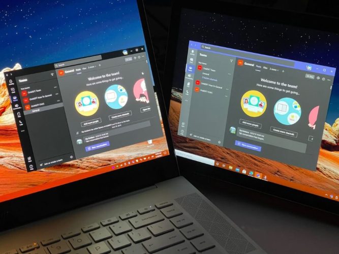
Since its introduction in 2017, Microsoft Teams hasn’t really seen a lot of visual or design changes. The app has largely kept the same look, with gray and purple-colored sidebars, and a purple title bar.
Towards the end of 2020, though, Microsoft announced some changes for Teams, including new Fluent icons and subtle color changes. It recently became possible to try out some of these changes in public preview, which is exactly what we did. Here’s a hands-on look at the experience, and some of the changes you’ll notice when it rolls out to you.
How to try the new Teams design
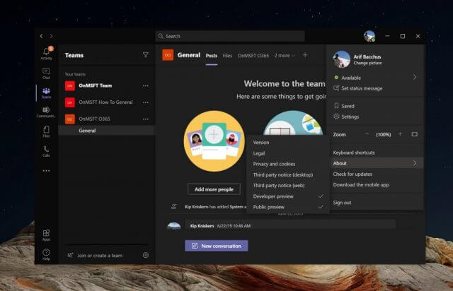
Before jumping into anything, we’ll explain how you can try out this new design for yourself. You’ll need to enroll your Teams app in the public preview program to proceed. To do so, select your profile picture at the top, then choose about, and then Public preview. You’ll then see a notice which will alert you to switching to a public preview. You might be signed out, and will be required to sign back in. If at any time you want to switch back to the old teams, you can follow these steps in reverse.
The biggest change is dark mode
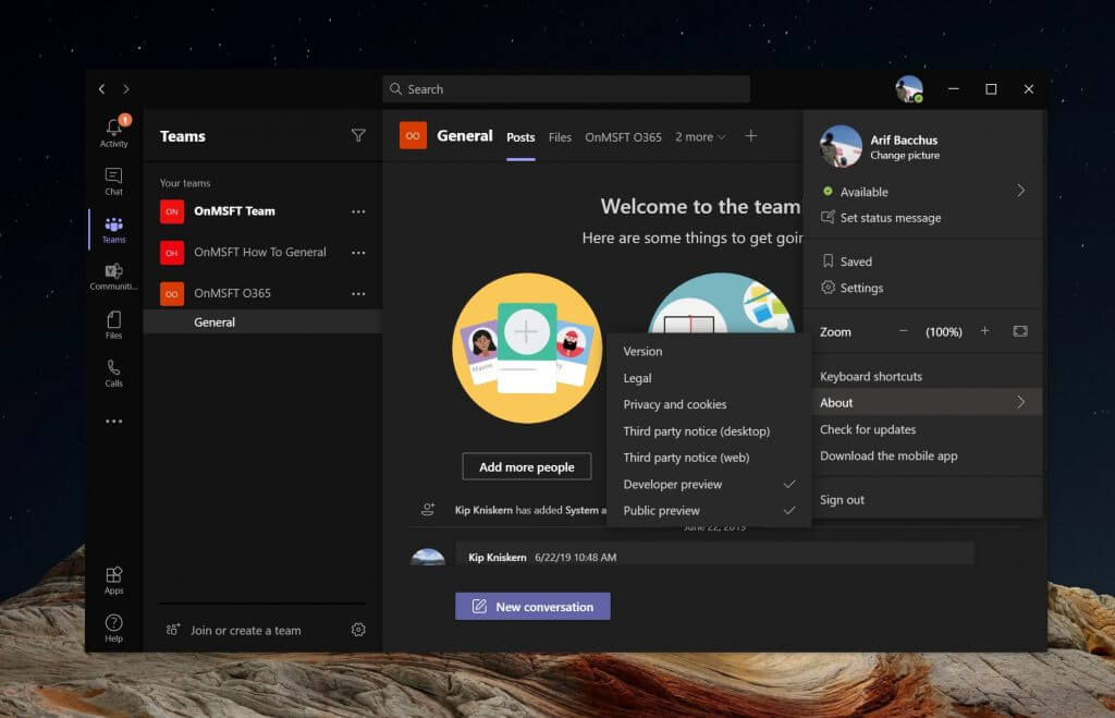
One of the biggest changes in this public-preview version of Microsoft Teams is the dark mode. Unlike before, the dark mode in this Teams version is now more representative of the experience of Windows 10 apps. It’s a lot cleaner than what we’ve seen before.
Overall, this new Teams look drops out a lot of the purple shades that have been present in the current non-preview version of the app. The title bar is now all black, as is the search bar. Microsoft also dropped out the gray shadows in the sidebar, too, changing it over to a pure black color. The white text from messages, as well as icons now stand out more in the improved dark mode.
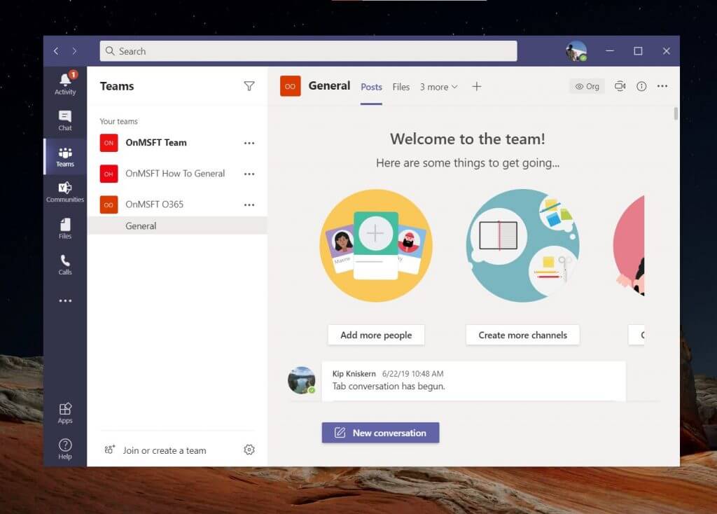
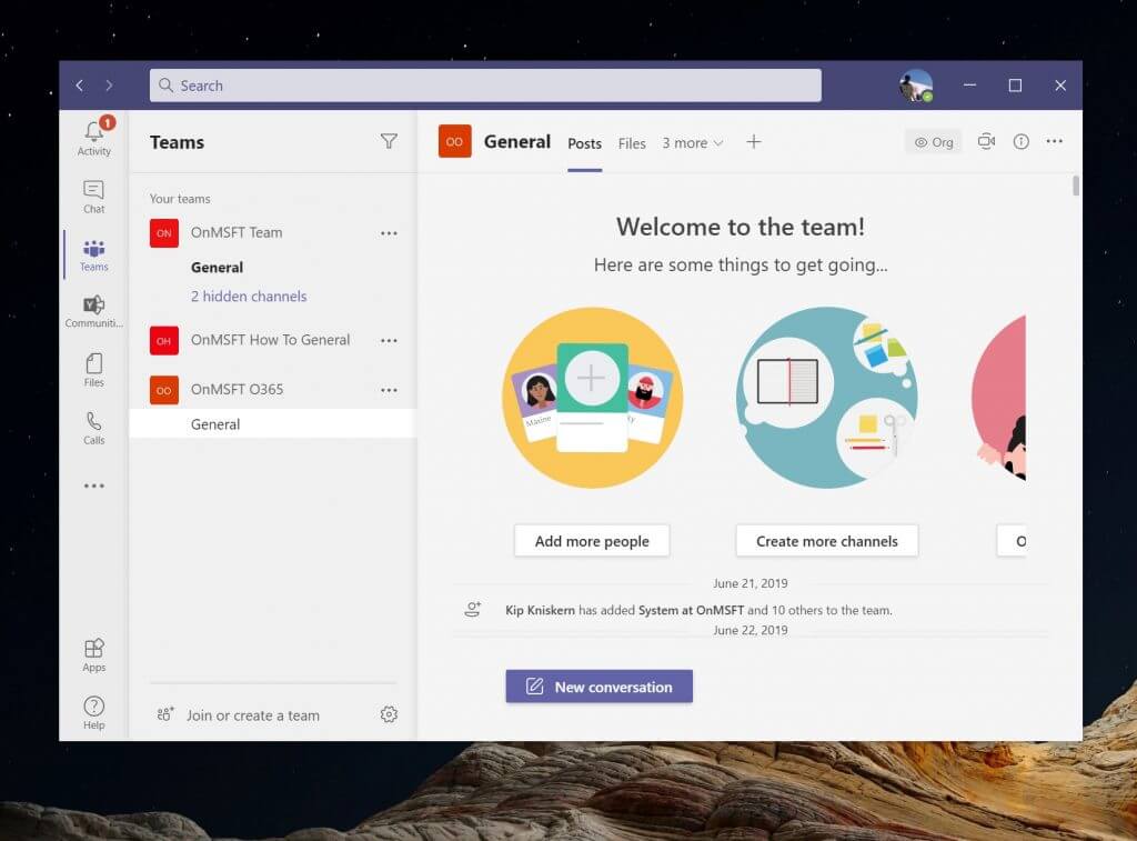
See the changes for yourself in the slider above! The first slider is the original version of Teams. The second is the current public preview version of Teams. Let us know what you think in the comments.
The regular light theme looks different, too
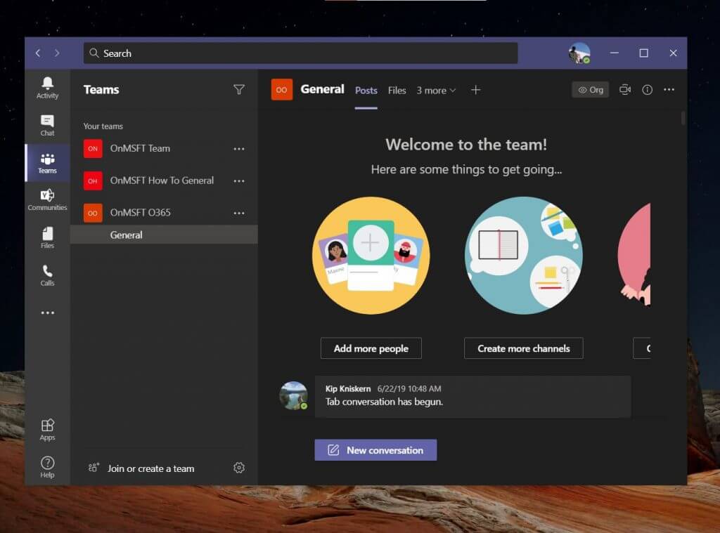
If you’re not a fan of dark mode, then you should be happy to know that the standard light theme in the public preview version of Teams looks a bit different, too. Just like the dark mode, Microsoft has made changes to the title bar as well as the sidebar in Teams, all designed to be easier on your eyes.
Generally speaking, there’s a couple of visual tweaks. You’ll see a lot more of Fluent Design aspects. Teams now has more of an acylic look to it, though not as much as other stock Windows 10 apps. What that means is that instead of being all white, UI elements in Teams is rather a lighter gray color.
While the public preview version of the standard light mode theme in Teams still preserves the purple title bar, you should now notice that the sidebar has lost its purple in favor of that lighter gray. The icons in the sidebar also have a more subtle gray-black look, complete with drop-shadows, helping them stand out more.
Overall, it’s a great look for readability in the sidebar. Chats, calls, and channels are now much easier on the eyes.
Other changes on the way
As we noted when we reported on the news, this is just the start of what is to come in Teams. It’s just a new coat of paint for now, but Microsoft is also planning to roll out new icons, too. The new icons in Teams will be rounded, to match Microsoft’s new Microsoft 365 icons, and what we’ve seen in the leaked Windows 10X build. So, what do you think? Do you like this new look? Let us know in the comments below.



User forum
0 messages