Microsoft is cluttering back the Windows 11 File Explorer's context menu with Edit with Paint and Notepad
File Explorer's context menu is turning into a mess
2 min. read
Published on
Read our disclosure page to find out how can you help Windows Report sustain the editorial team. Read more
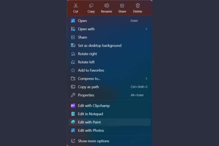
Back when Microsoft changed File Explorer in Windows 11, everyone was reluctant but we welcomed the change as it made the context menu more clear and somehow less cluttered. Although, to be honest, I still use the keyboard for basic commands because it simply doesn’t make sense to access the top menu’s cut, copy and delete options.
Well, since then, Microsoft kept adding more and more options, and that menu has become a lot cluttered than the old Windows 10 one. Now, a user spotted another nonsensical change in the File Manager’s context menu that adds to the already growing list.
The user pointed out that in Windows 11 version 11.2410.28.0, Microsoft added the Edit with Paint and Edit in Notepad options when you right-click an image.
The change doesn’t make sense for a number of reasons. First, you already have those options in the Open with submenu. Then, there’s the problem of adding one more default option that you might not need or want.
Finally, how do you edit the image in Notepad? And this is happening for a JPG file, not some obscure format that Windows doesn’t recognize. By now, File Explorer should recognize file types and recommend the right options for opening and editing.
Then, there are 2 Share buttons, one at the top and one inside the context menu and they do exactly the same thing.
To conclude, the File Explorer’s context menu is a highly used functionality that is supposed to work fast and be intuitive for everyone. Constant changes, obviously, influence that ease of usage. Finally, users would embrace the changes too, but only if they add improvements and make sense in simplifying, not complicating things. We can only hope that Microsoft will look into these issues and fix them.
What do you think about File Explorer’s context menu? Let us know in the comments below.




User forum
0 messages