Power BI Mobile's revamped UI helps you access things easier
3 min. read
Updated on

Power BI got a lot of updates recently, including URL parameters for paginated reports, a new set of capacity settings, and features like grouping and Analytics.
Power BI Mobile gets a revamped interface
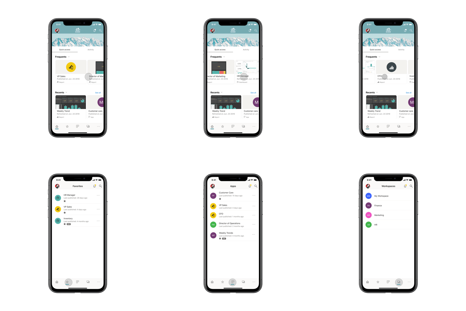 Now, Microsoft has released the public preview of a new look for Power Bi Mobile:
Today, we’re excited to announce the public preview of the “new look” now available on Power BI Mobile. We’ve refreshed our app and introduced new experiences, adding a home page that provides quick access to your commonly used content and includes your organization brand theme, and new navigation bars that give you an easy way of navigating through the app. With the new and refreshed experiences, it’s now quicker and easier to find what you need, when you need it.
All these new features aim to improve how users interact with their content on the go.
With the new look, the first thing that you’ll see at the top of the page will be your organization’s branding, so it will feel more like Power Bi.
New Power BI Mobile features for quick and easy access
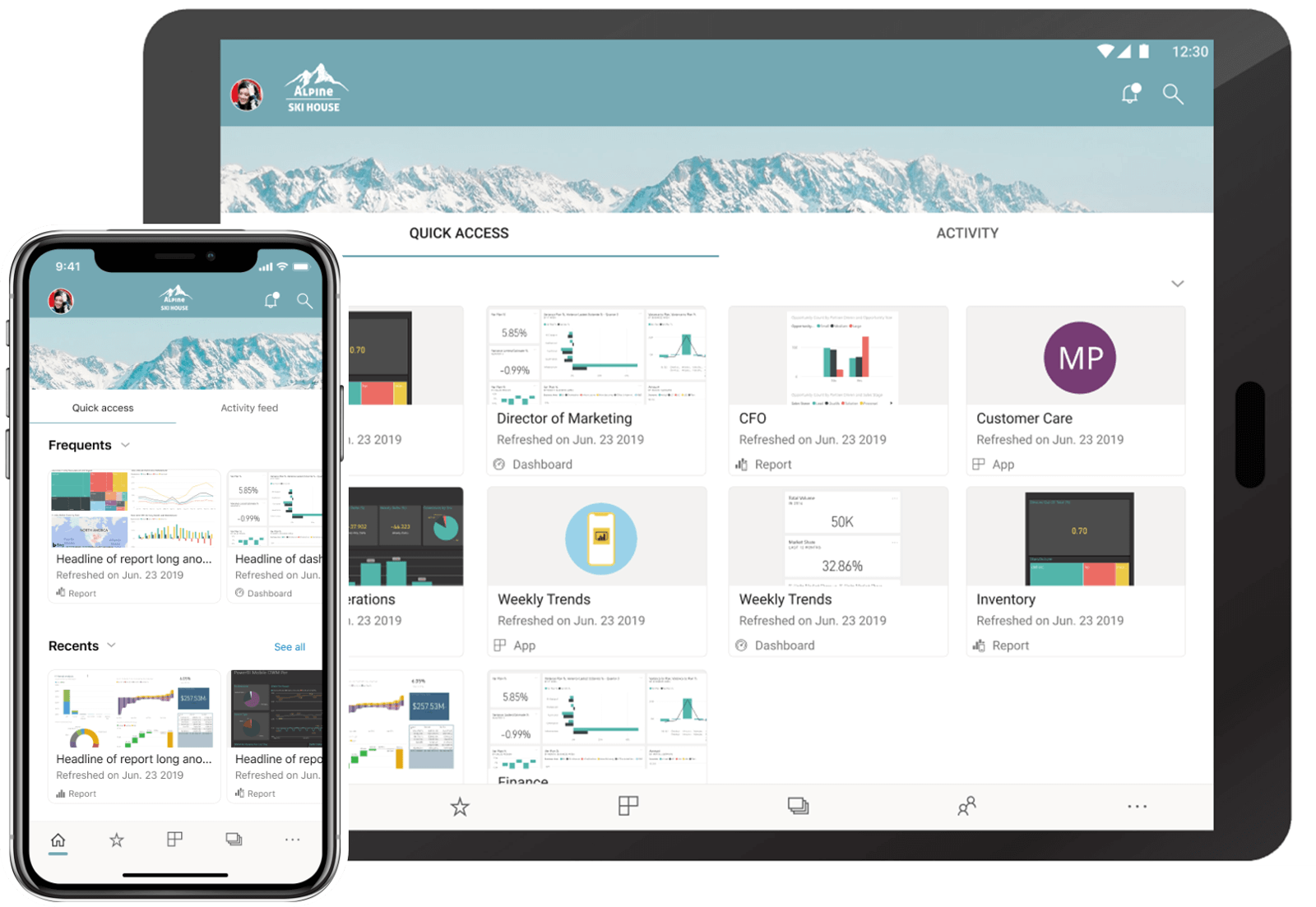 In addition to that, the home page will now have two new tabs: Quick access and Activity.
In the Quick access tab you’ll find you’re most frequent accessed items in Power BI, so you’ll never have to look for them again.
You’ll see content cards and metadata for the content itself, like the last refresh time. In the Frequents section you’ll be able to look for your items and keep them organized by the number of times you viewed them.
Activity will keep you connected with events that are relevant to you from your Power BI account, through a feed. This way, you’ll stay up to date with the latest comments and activities.
This feature is not yet available, but Microsoft said that it will come soon and more info will be revealed with its release.
Finally, the re-built app navigation makes it easier to go through pages and items on mobile. There’s a new bottom navigation bar for that.
And also a new top bar that allows you to access the notification center and search for Power BI content.
If you’re interested in trying the new look of Power BI Mobile, you’ll have to manually opt-in by turning it on through the introduction banner, side panel, or app settings.
During the preview period, new capabilities will be added based on user feedback, and you can vote on new feature ideas.
READ ALSO:




User forum
0 messages