Samsung Galaxy Flip5: The First 48 hours hands on
5 min. read
Published on
Read our disclosure page to find out how can you help Windows Report sustain the editorial team. Read more

Back with another installment of the First 48, and this time we’re handling the Samsung Galaxy Flip5 thanks once again to AT&T.
Unboxing
Continuing its trend of minimalistic packaging, Samsung ships the Flip5 in discrete matte black box with an embossed silhouette of an unfolded Flip phone that resembles a two-tone black domino dead center.
When opened, the packaging reveals a single unfolded Flip5 wrapped in fine black construction paper and little else visible. Under the phone, tucked away is the necessary paperwork, single black USB-C to USB-C 2-foot cable, and metal sim card ejector.
Aside from using eco-friendly practices as an excuse for packaging, Samsung’s approach to wrapping their devices does in a little more than thin sheets of construction paper and equally thin boxes helps to center the object and jump starts the experience.
In a roundabout way, the less that there is in the box, the sooner a user is up and playing with their new device.
Clever girl.
Look and Feel
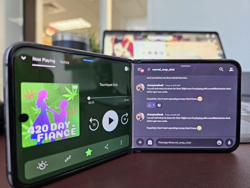
Holding the Flip5 unfolded feels almost like any other smartphone aside from its slightly elongated design. For a common comparison, I’d imagine holding a Sony Xperia 1, 10 Plus, and PRO-I net a similar in-hand experience, right down to the narrow width to aid in reachability.
At $1,119.99 the Flip5 offers a premium heft that accents its metal and glass frame without being overly bulky or cumbersome when unfolded.
The edges are wrapped in polished aluminum that can look black or dark grey depending on the lighting. With half the exposed body of the Flip5 being a screen the Graphite color only really shines on the half-sized back panel but looks nice in contrast to those darker graphite edges, and the completely black Wi-Fi bands
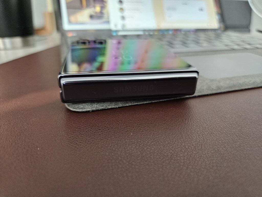
The infamous Samsung folding hinge in the Flip5 is initially hidden and tucked away between the two separate ends of the phone when unfolded while flush power and volume buts sit anchored on the left side of the phone.
Unlike the Fold5, the Flip5 doesn’t feel as slippery, thanks to its narrow design when opened or its squatter position when closed most users will be able to get a full grip around the smartphone when in use.
The weight of the phone feels comforting and in its folded position it feels intuitive for anyone whose first cellphone experience included an LG Tracfone, Sharp GX, Motorola RAZR or V300 or the myriad of other flip formed devices.
On the inside of the phone there is an initial notice of the crease in the screen, and its presence tends to linger longer than the Fold5 as its horizontal presence makes it a constant contact point when scrolling the long screen vertically.
We’ll see if the crease eventually becomes white noise when using the Flip5 as it did while using the Fold5.
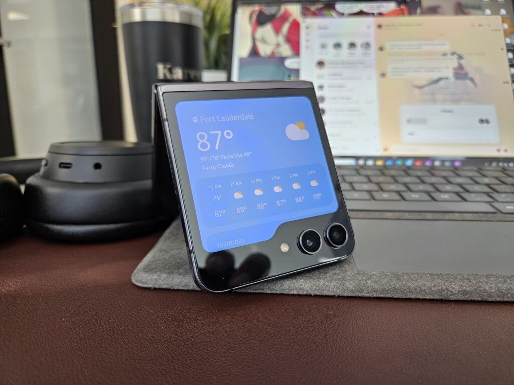
Lastly, the camera arrangement is another notable design observation as it protrudes out of the top screen enough to offer a physical marker to help users identify the top front of the phone when scavenging for it in a pocket.
Performance
I mean, there isn’t much to say here just yet. The Flip5 performs like a modern smartphone in most ways.
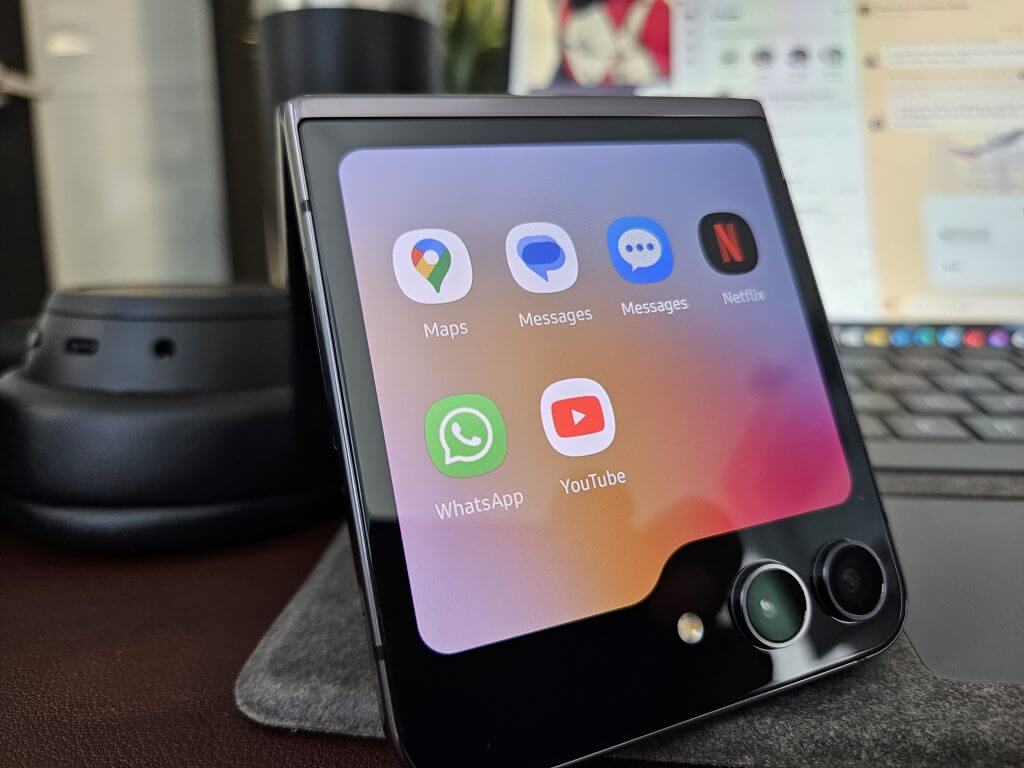
The biggest caveat is the widget accessibility on the cover screen. With full screen sized widget support on the Galaxy Flip5, opening the phone takes a backseat to skimming quick notifications that include weather, stocks, messages, step count, calendar events, calls, alarms, maps, Whatsapp.
For longer engagements, users can watch video content from Netflix and YouTube which is a nicety paired with its compact design allowing for much longer viewing sessions with the phone nestled in the palm of the hand rather than some finger contortions that include pinky balancing.
Equipped with the Snapdragon 8 Gen 2 mobile SoS, the Flip5 has speed through all tasks I’ve put it through that includes downloads (mostly thanks to AT&T’s network coverage in South Florida) loading web pages, gameplay, and video streaming.
Samsung’s OneUI has gotten optimized and feels just as fluid on the Flip5 as it did on my S22.
Initial Thoughts
Aside from the nostalgic appeal of condensing the physical footprint of your smartphone, Samsung’s work on the outer screen is by far the biggest reason to get into this style of phone.
I’m victim to getting lost in my phone when attempting to do quicker and more focused interactions like responding to text, checking notifications, or keeping up on news. While the widgets panel is limited in its app support, the ones that are available are currently more than enough for me to keep my phone closed at most times.
Using the phone for a couple of days with a focus on the outer screen has brought me to the realization that if phones replaced their notification shade with a handful of full-sized widgets with varying degrees of functionality, people may not be on their phones as much, at least not me.
But it’s also early days, we’ll see how widgets help with my phone detox weeks in.




User forum
0 messages