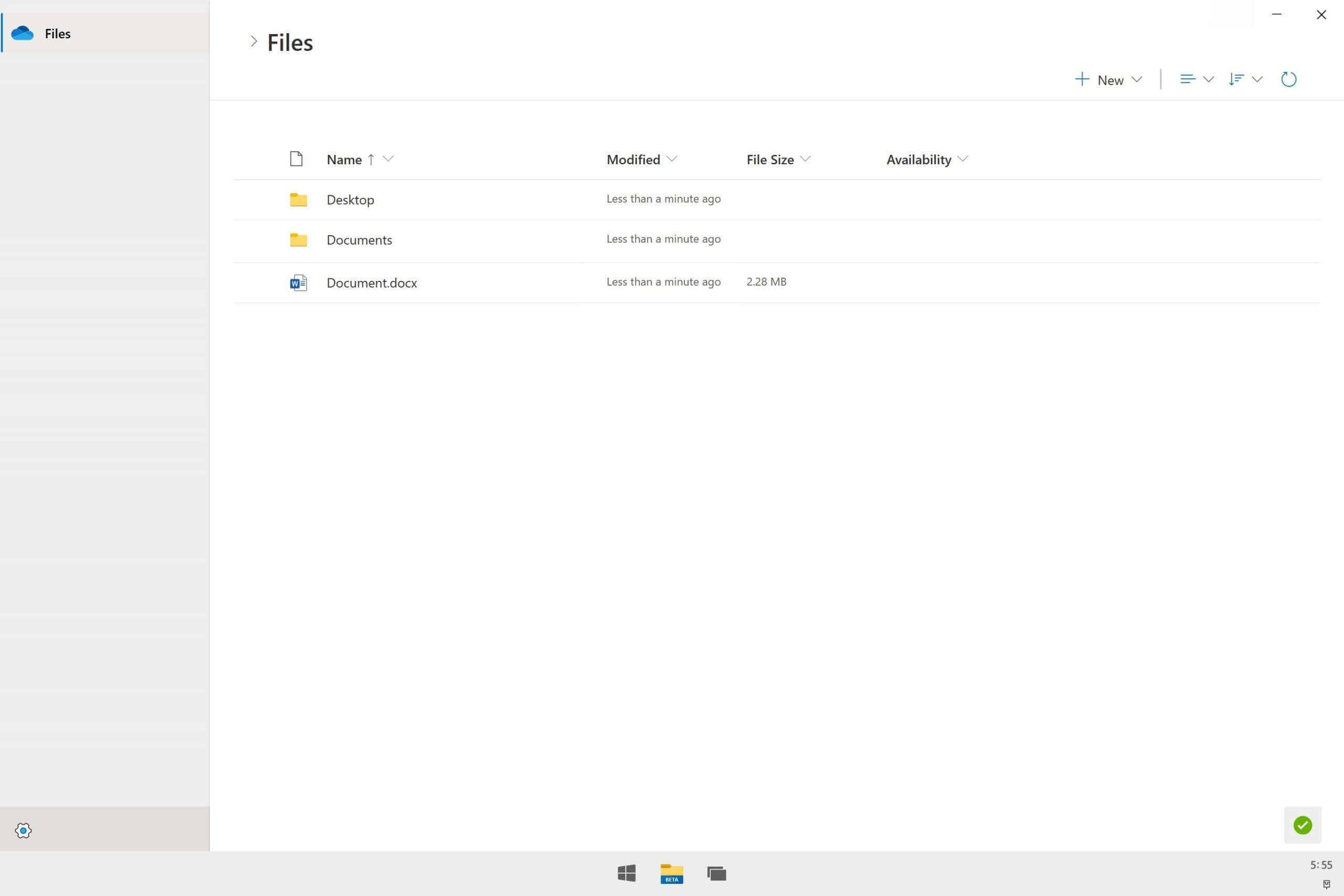
Windows 10/11 just got a brand new File Explorer design
2 min. read
Updated on
Read our disclosure page to find out how can you help Windows Report sustain the editorial team. Read more

Fluent design elements have been a part of the Windows 10 experience ever since it was first introduced back in 2017.
Groove Music, Mail & Calendar, Movies & TV, Calendar, and other Windows 10 features have since received tweaks and modifications, and it seems that now the File Explorer is getting a shot at it.
The new design focuses on OneDrive integration and simplicity
Microsoft is designing a new File Explorer that will be released with Windows 10X later in the year.
The design focuses on keeping OneDrive at its heart, with the new Windows 10X File Explorer becoming a lightweight solution that will enable users to browse through and move their files between the cloud and local PC.
The new design now makes it look more like a web app, but it has deep integration with the OS.
According to the folks from WindowsCentral:
….(The new File Explorer) web app, with a few OS integration hooks here and there…..
The new File Explorer doesn’t come with a sidebar or other tools that you may be used to seeing. It boasts a completely redesigned interface that favors foldable devices and even traditional laptops that might be launched by the end of 2021.
What do you think about the new File Explorer design and its OneDrive integration? give us your feedback by leaving us a message in the comments section below.
[wl_navigator]


User forum
0 messages