Users are loving the new Microsoft Office file icons
2 min. read
Published on
Read our disclosure page to find out how can you help Windows Report sustain the editorial team. Read more
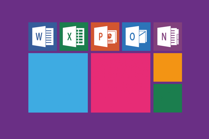
Microsoft recently released a series of brand-new filetype icons for the Office Suite applications including PowerPoint, Word, and Excel. Furthermore, this time, Microsoft also revamped the current icon design released back in 2013.
Erin Woo, who is currently working as Microsoft’s Product Designer announced the brand new icons on her Twitter account.
She unveiled some of those icons by sharing a brief video of them. The video shows that the tech giant also released new icons for video, audio, and image file types. T
he tweet says that these icons are gradually rolling out to mobile users of OneDrive and Outlook. However, it remains to be seen if the same icons will be available to Windows 10 users as well.
Excited to finally share the newly redesigned filetype icons for Office! They're simpler, a little ✨cuter✨, and now available in Outlook for iOS (Android – soon!), OneDrive, and more. pic.twitter.com/f0Z70OrIv8
— Erin Woo 胡穎恩 (@wooerin) May 9, 2019
Microsoft has always been experimenting with the design of its Office Suite varying from a small icon redesign to a complete visual overhaul.
However, the new change appears to be powerful, smart and appealing for users. You will now find a more simple background with a Fluent Design touch.
New Microsoft Office icons coming soon
The Redmond giant has not released new icons for Publisher and Access. According to Microsoft, the company aims to achieve harmony and simplicity with its light, bold and appealing colors.
Microsoft is reportedly currently working to release a new Fluent Design UI revamp for its entire range of products.
It seems like Microsoft is making significant efforts to revamp most of its applications including Office Suite.
Microsoft Office is very popular among both MacOS and Windows users.
Although there are many other third-party office management software, users still prefer to use Microsoft Office.
Most users loved these icons but some of them pointed out some visible inconsistencies.
Why would the music, video, and photo icon not match the document icon? Why would they choose just a rectangle for those three? That doesn’t make any sense to me.
Do you want Microsoft to add some other changes in Microsoft Office? Let us know in the comments section below.
RELATED ARTICLES YOU NEED TO CHECK OUT:




User forum
0 messages