Microsoft now hides the Sign out button in the Start menu of Windows 11
The Sign out button is now hidden behind a three-dot menu in the new Account Manager
3 min. read
Updated on
Read our disclosure page to find out how can you help Windows Report sustain the editorial team. Read more

As if showing app recommendations in the Start menu weren’t weird enough, Microsoft now hides the Sign out button in Windows 11 behind a three-dot menu of the new Account Manager. Not to forget, Microsoft’s decision to show app recommendations in the Start menu was criticized by a former employee and Windows 11 users.
The recent Windows 11 Insider Preview Build 22635.3500, under KB5036985, released for the Beta channel users brings this change. Microsoft mentions the new thing as Account Manager in its recent blog post.
The new design change gives you a glanceable view of your current subscriptions. You’ll also see a few account-related notifications and a prompt to add a recovery method. Microsoft says that the new design makes it easy to manage account settings.
Microsoft hides Sign out button in Windows 11 behind a three-dot menu
Well that all sounds like a change, but something is missing in there that will make you go mad over Microsoft. Now, the Sign out and Switch User buttons are missing with this update. You will have to access the Sign out button from the submenu hidden behind a three-dot menu.
What’s more ridiculous is Microsoft thinks that displaying OneDrive storage and an Xbox Game Pass subscription expiry date is okay.
Although Microsoft hasn’t mentioned the hidden Sign out button in Windows 11, it has outlined changes it made to the Start menu. Here’s what Microsoft mentioned in the blog post:
This update starts the roll out of the new account manager on Start menu. When you sign in with a Microsoft account, the new design gives you a quick glanceable view of your account benefits and makes it easy to manage account settings.
Besides hiding the Sign out button, Microsoft also gives the Lock button a new home. You can find the Lock button in the power menu with the Shut down, Restart, and Sleep options.
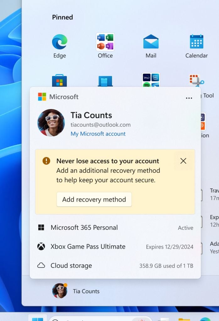
From the users’ point of view, the so-called Account Manager doesn’t seem to add any value since the Subscription data and account notifications are already there on the Settings app’s home page. If you thought that enough, well there’s more.
The Settings homepage has a new banner that asks you to subscribe to Xbox Game Pass. If you’re already subscribed, you’ll see game recommendations as if that’s what users look for in the Settings app.
Not sure what Microsoft has been doing recently, but it is another thing that might get criticized. What do you think about Microsoft’s move to hide the Sign out button in Windows 11? Please pour in your thoughts in the comments below.




User forum
0 messages