Take a look at the (almost) complete UI for Windows 10X
3 min. read
Updated on
Read our disclosure page to find out how can you help Windows Report sustain the editorial team. Read more
Key notes
- A few pictures and videos of the new Windows 10X interface were leaked on Twitter.
- Leaks show a clean UI, very similar to that of Chromebooks.
- It's possible that apps & programs will only show in a launcher, and not on the main screen.
- Fans have various opinions about the soon-to-be-launched OS.

Several videos related to the long-awaited Windows 10X interface have transpired recently on several Twitter accounts.
At least one of the videos shows a full setup, while other sources point toward areas of the home screen such as the settings and the start menu.
At a first look, the UI is the very much simplified single-screen version Microsoft has promised and that fans have had the chance of seeing in bits in several leaks over the past months.
The first single screen PCs with Windows 10X installed are expected to be shipped this spring.
Centered icons on the taskbar, clean home screen
A first picture showing the home screen was published by Zac Bowden, with the promise to come with further details.
A few hours later, the first videos also appeared. Starting with the booting screen, the design looks minimalist, as seen from the video posted by ALumia.
The initial screen is followed by a few set-up screens in which the user is invited to choose region, keyboard, agree to the terms of use and purpose of use. The process takes only a couple of minutes, depending on the loading time. According to the Tweet posted by Albacore, this setup comes with Windows 10X build 20279.
Fans are even invited to test the interface themselves in a virtual machine using a specific set-up file which the account-owner provides.
It’s important to know that, as Tom Warren points out, the set up can be completed only with a Microsoft account and an active Internet connection
Similarities with Chrome OS
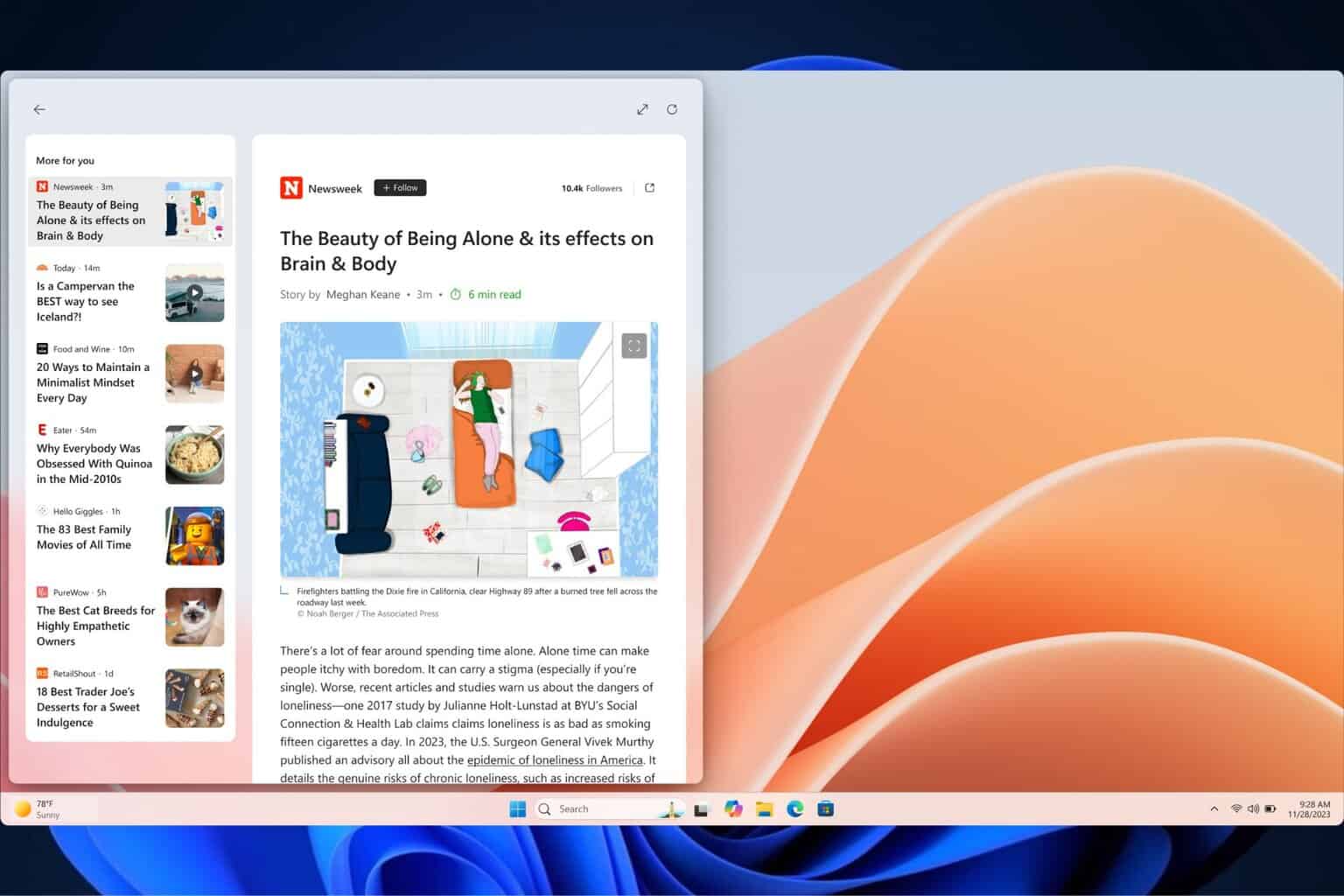
Getting to the home screen, we can see that the taskbar comes with centered icons, very much like on Chromebooks, rather than being populated from left-to-right as on Windows 10.
From the looks of various pictures, the icons for your most used apps can be placed on the taskbar, similarly to the current OS.
However, no files or apps are seen on the main screen, at least in the leaked images and videos. Everything is grouped in one place – the launcher.
Here, the user will be able to search the web or the device for a specific item, open installed apps and programs, and view recently opened documents.
In the bottom-right corner, when clicking on the clock, the Quick settings menu pops up. Here, users can adjust volume, activate the VPN, change the keyboard layout, and more.
The notifications will also be displayed in this area, with a button to clear them if considered unnecessary.
With all these details, similarities with Chrome OS are striking. While some can’t get over the fact that Microsoft has copied their rival way too much, others see the new OS as quick, clean and fluid.
Initially designed for dual-screen devices, Windows 10x will come on single-screen ones, given the shift in user consumption trends last year. As mentioned, the first models are expected soon, and that’s when we should also see the final version of the UI.






User forum
1 messages