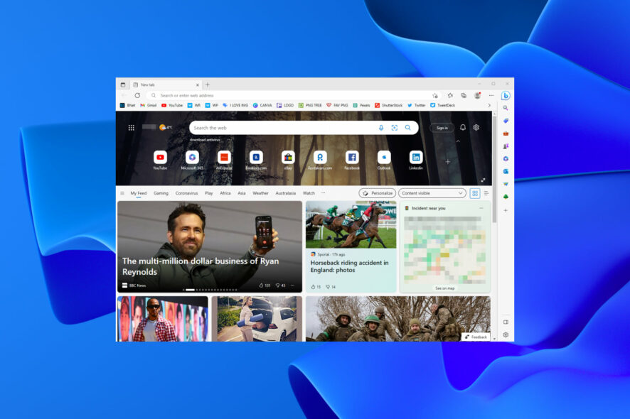
You can now disable rounded corners on web pages in the Edge browser
2 min. read
Published on
Read our disclosure page to find out how can you help Windows Report sustain the editorial team. Read more
Key notes
- Not a fan of the futuristic appearance that the Edge browser has been getting lately.
- Don't worry, Microsoft added ways to revert some of the recent cosmetic changes.
- Check out how you can also disable these functionalities with only a few clicks.

As we’re sure you know, a few weeks ago, the Redmond tech company revealed a significant redesign idea for its browser.
This idea features reworked tabs, a large Bing Chat button, rounded corners for web pages, and other changes.
However, the redesigned Edge browser turned out to be a bit controversial, as users quickly jumped on Microsoft for enforcing questionable design choices with no options to disable them.
Thus, after dealing with huge amounts of customer feedback, Microsoft has decided to do something and is now fixing the situation.
Remember you are in the right place to get help with problems like Edge cookies getting deleted after restarting, or if you need help with renaming web apps on Edge.
Not everyone enjoys this cosmetic change on Edge
Note that the tech giant has already addressed the problem around the Bing button, since one of the recent Edge Canary updates brought the option to disable it with a single click.
Now, Microsoft is making another move to show it listens to consumer feedback. Edge Canary 113.0.1743.0 lets you toggle off rounded corners for web pages.
Thus, you can toggle on or off rounded corners for browser windows in the Appearance settings section. Simply access the Settings app, then go to the Appearance section.
It is there that you’ll find the Use rounded corners for browser window option, and restart your browser to apply the changes.
Exactly like with other new features in Edge, you can help Microsoft better understand what users think about changes in the browser by giving the option a thumbs up or down.

You might even think that it’s safe to say that the rounded corners for websites, or browser windows, as Microsoft calls them, are the most hated part of the redesign.
Many think that this design robs you of screen space and creates visual confusion since most computer screens are still perfectly squared, not rounded.
That being said, some people have no problem with spicing things up a bit, so Microsoft has decided to do the only right thing and let users decide for themselves.
What is your opinion on this design choice for the Edge browser? Share your thoughts and opinions with us in the comments section below


User forum
0 messages