Windows 11's design is amazing, but can we get it on more apps?
5 min. read
Updated on
Key notes
- When people think of Windows 11, the first thing that comes to their minds is the new design.
- This highly-coveted fluent appearance is what users want for all the software on their devices.
- As you know, due to certain incompatibility reasons, some apps do not share this new aspect.
- Users are coming up with new design concepts for some of the more popular apps, daily.
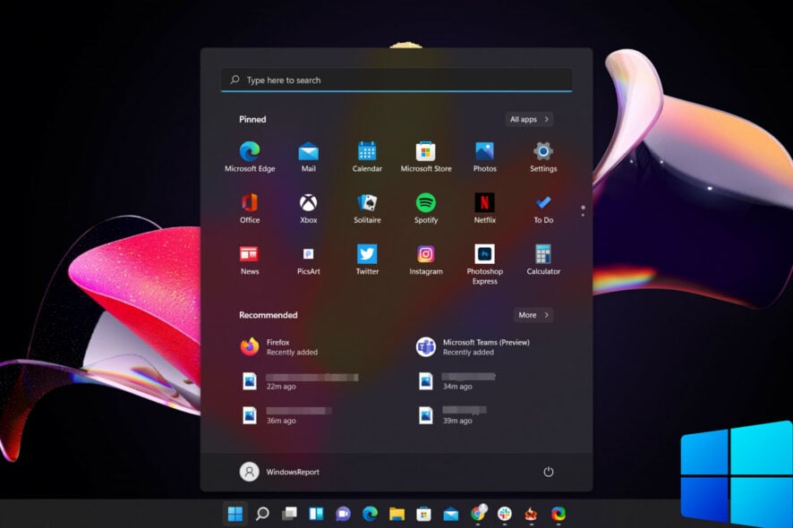
Even though there are so many aspects of the new operating system to be analyzed and discussed, ever since it became available for testing, everything seems to revolve around one main topic: aspect.
Windows 11 users state that their favorite element of the upcoming OS is by far the new fluent aspect.
There are, however, certain software choices that can’t adopt this new design style just yet, due to certain incompatibility issues.
This doesn’t stop people from wanting this design applied to all their favorite apps, and the ones that know their way around a PC to design concepts that deliver just that.
One thing is for sure, which is that this probably won’t stop until Microsoft takes heed of all these requests and delivers an OS that includes more of these popular demands.
The Windows 11 design language is requested on more apps
First, let’s all understand what design language means. This is a more technical term that refers to an overarching scheme or style that guides the design of a complement of products or architectural settings.
In this case, since we are talking about Windows 11, it applies to the OS itself. To be more exact, Insiders that already took the future operating system for a spin want its fluent design, with rounded corners, applied to absolutely everything.
Throughout these weeks in which Windows 11 was available for testing via the Windows Insider program, we’ve witnessed different concepts and software solutions for applying this much-coveted design to more and more apps.
As you can remember, we’ve discussed bringing the Windows 11 specific fluent design to Steam, and we’ve also explored how different coding software would present itself under the same aspect.
But that now that everyone has got a taste of this new style, it will be hard to stop. And with new concepts surfacing every day, soon enough Microsoft will have to find a way of making every app compatible design-wise.
Daily, specific forums and social media platforms are absolutely bombarded with new ideas on how to bring the fluent style to our most used applications.

In the screenshot above, you can see the design concept for Adobe XD, one of the more popular apps that users have requested to be redesigned according to Windows 11 standards.
The list is vast, as you can imagine because everyone wants to be able to use their favorite applications and be visually pleased, further enhancing the feeling of using new software.
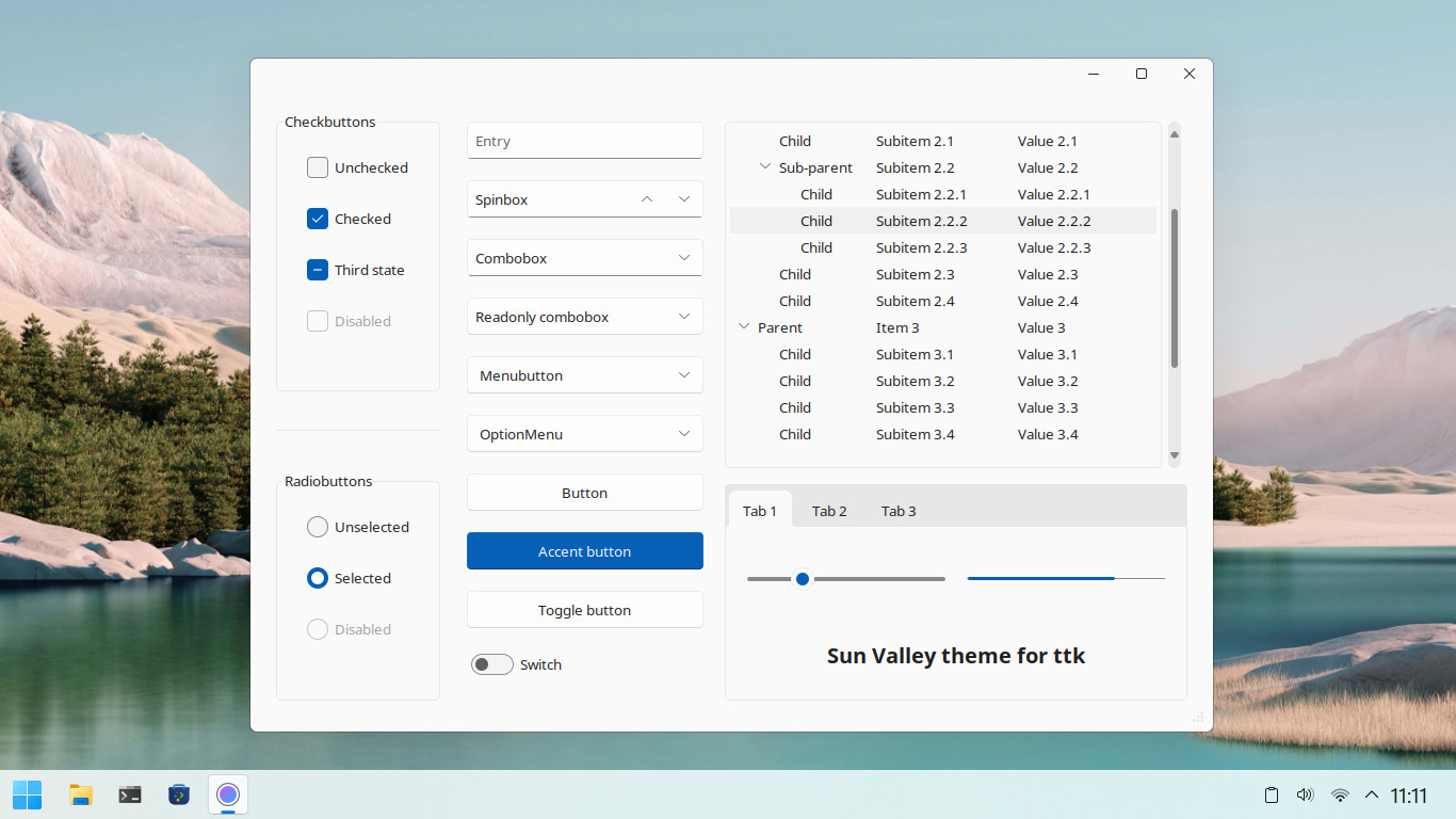
Another Reddit user brought the same design pattern to Tkinter, which you might know is a Python binding to the Tk GUI toolkit.
You’ve probably also asked yourself the following question: what’s with all the hype about this new Windows design?
Well, the answer is pretty simple and it has to do with the way we perceive change and react to it. Of course, after using a certain UI for so long, a newly re-designed, better-looking one will certainly be far more appealing.
Furthermore, there has been a lot of talk during these years in which we used Windows 10, about how other operating systems such as macOS, look far better than Windows ever did.
And Microsoft did have a plan to give the OS a complete makeover with the Sun Valley project, but it seems that they’ve just decided to offer us a completely new experience instead.
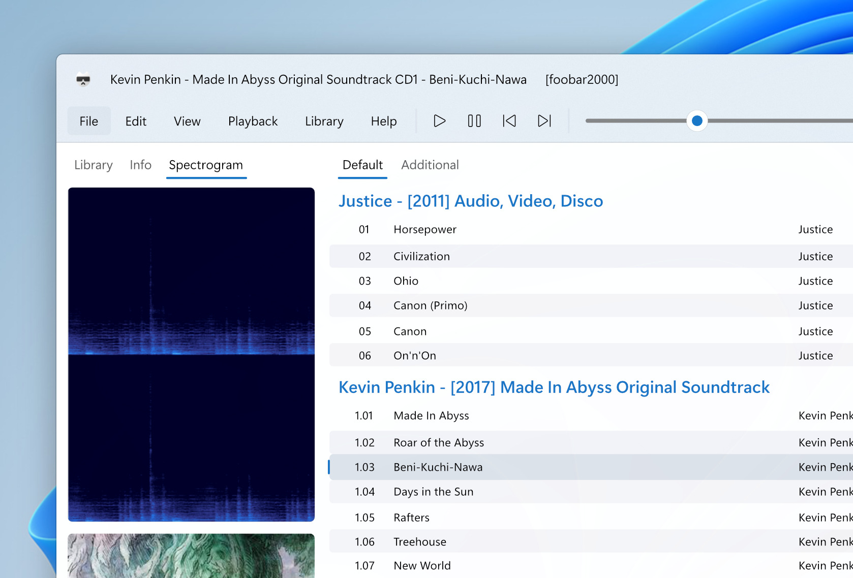
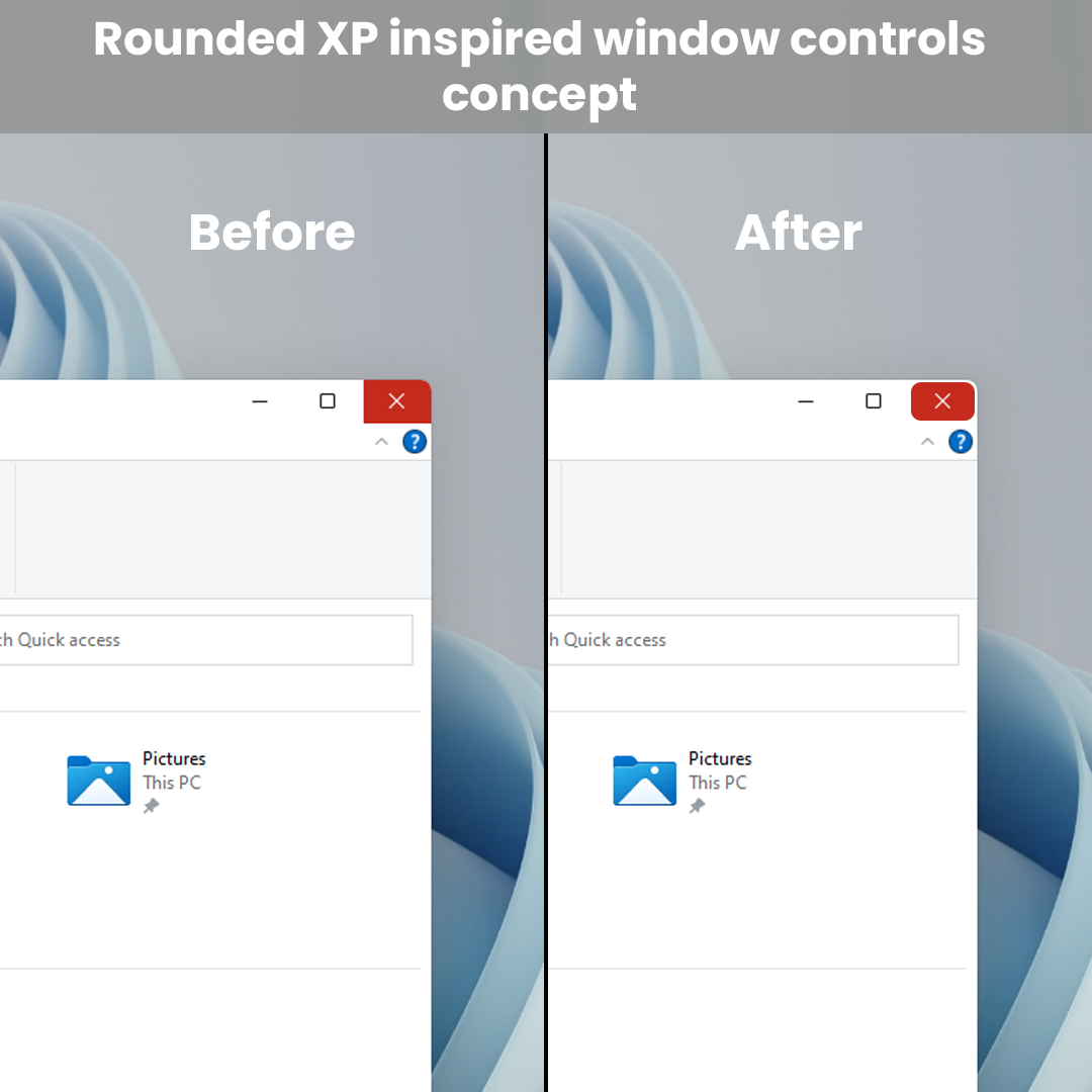
Here’s a design element that proves to be even better looking than the one that Microsoft chose. Another one of the more tech-savvy Windows 11 users has decided to reshape the minimize, maximize and close buttons on windows.
This makes the buttons look like on Windows XP and you can see what this looks like in the screenshot below. However, not everyone agreed with this new choice, calling the new button appearance childish and impractical.
There seems to be a fine line on how much one can actually tweak the new OS, using these fluent design elements, before it starts becoming tacky and forced.
However, this isn’t really about the built-in elements that Windows comes with as a package. What users really desire is for this design language to be applied to their favorite software.
And believe us when we tell you, that list is a long one. But these are not outrageous demands, as it would feel normal for downloaded and installed software to take the same aspect as the OS it runs on.
This will make the certain app feel like a system native and create an overall harmony of shapes that will surely delight users.
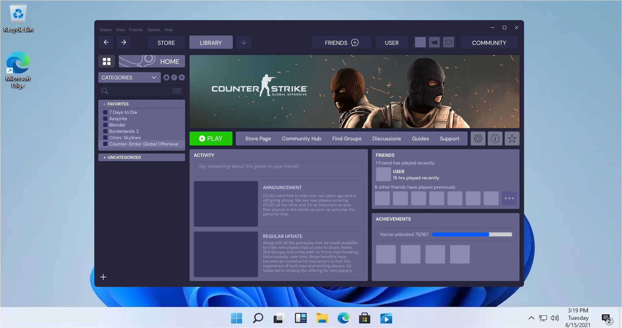
The important thing to remember is that Windows 11 is still in its beta testing phase and it can’t be labeled as a complete experience.
Most likely, when it will be declared a stable and full product, such features will be included in the very fabric of the OS.
What are some of your favorite apps that you wish would have this fluent aspect? Let us know in the comments section below.





User forum
0 messages