Microsoft will redesign Windows 11 Settings UI for Default Apps
You should be able to set up your Windows experience easier now.
2 min. read
Published on
Read our disclosure page to find out how can you help Windows Report sustain the editorial team. Read more

Microsoft is looking to overhaul the Settings page for default apps in the Windows 11 24H2 update and introduce a new default app picker for Windows apps. To put it mildly, the current UI is not particularly user-friendly, especially for less tech-savvy users. The company wants to change that with a more intuitive interface.
Microsoft is also investigating a more robust way to display default app choices. As part of the Windows 11 24H2 update, Microsoft has added a default app section to the Settings app.
The section allows users to set default apps on a per-extension basis rather than dig through the Settings app and the Control Panel to set or unset their chosen app.
The company now wants to make setting default apps in Windows 11 a bit easier to understand. As Albacore, a Windows enthusiast, discovered, the default apps section is being overhauled with the Windows 11 24H2 update.
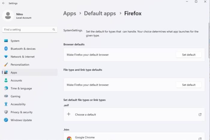
Currently, though, the page is filled with placeholders like half-baked ViewModels and misaligned text descriptions. The change was noticed on Windows 11 24H2 build 26120.2213, released recently under KB5045885.
As you can see in the image above, the text appears to have been updated. The Default Apps selection page now says, “Set a default for a file type or link type.” Hence, it is unclear what the final product will be like after the overhaul.
In other news, Windows 11’s Settings is also getting a special page for the upcoming Windows Intelligence, which seeks to bring all AI features together in a unified experience.


User forum
0 messages