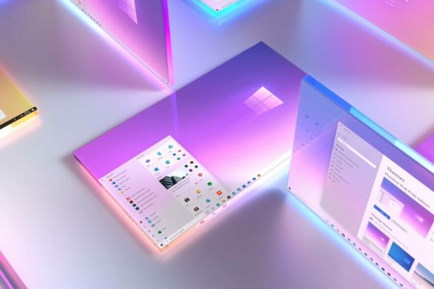
Windows 10's Fluent Design is a complete overhaul
3 min. read
Updated on
Read our disclosure page to find out how can you help Windows Report sustain the editorial team. Read more
Key notes
- A Microsoft Edge insider posted a comment on Reddit complaining about the design of Microsoft Edge and posted a mockup of what it would look like with an acrylic Title bar and round corners.
- An allegedly Microsoft employee answered the post with lots of new insights about the work behind Windows design.
- If you're interested in more information about Fluent Design you can visit our Fluent Design section.
- Want to read more about Windows 10? Check out our Windows 10 Hub for a lot of new and interesting articles.

Today, a Microsoft Edge insider posted a comment on Reddit that created more than a stir for Edge and Windows 10 users alike.
He complained about the design of Microsoft Edge and posted a mockup of what it would look like with an acrylic Title bar and round corners.
The discussion fired up as more users contributed with other arguments about the same issue.
What is the Microsoft Fluent Design hurdles?
We all hold our breath when we see new design additions or design promises that sometimes never come to fruition, but things are not that simple as they seem.
An allegedly Microsoft employee that describes himself as a person with insight at Microsoft replied with a very long post describing the inherited problems with Windows design:
Technically, Windows 8 and 10 are using WDDM that was used for Vista and 7. Xp didn’t have such a thing. In 8, they modified the aesthetic to fit the sharp corners of tiles and all, but ultimately it was just Aero lite underneath sans glassy effects.
Then came 10. And oh boy are we still dealing with this issue. 10 had some further changes done with WDDM under the hood and some more stuff removed and replaced.
But came the dev bridges for apps and figuring out how to hodge podge Win8 apps that were full screen intended to be multi-windowed but still accommodate the Charms calls in a new UI form.
The technical issues, unfortunately, don’t stop there but continued with Accommodating Island wood iOS app ports and Centennial legacy Win32 apps:
This is something we’re fixating the most on at the moment (really quite sad tbr but here we are). There are issues getting the display rendering of UI controls of those apps to be homogeneous with Win32 styled programs. Even the damn window UI is inconsistent.
What’s the situation with Fluent design right now?
CokeRobot user, who is potentially a Microsoft graphics team member, continues in his Reddit post to describe the Fluent Design which seems to be a complete overhaul:
Fluent design has been a challenge because of the restraints of the modern UI that was made in Windows 8 that restricted how far down apps could go down into the operating system.
WDDM is a very low level process and tapping into that to stay within bounds of modern UI programming is a challenge.
This is why seemingly trivial things like the Settings app take builds to see changes because it’s a weird mix between modern programming but also taps down into low level system calls. Henceforth, it requires an OS feature upgrade to change.
Fluent is also a fully different design language no one has done so it’s also challenging in of itself. We’re trying to design a UI across touch, mouse, and holograms, AND mobile devices from Google and Apple.
Getting things to look right and be understood by the average end user takes soooooooo much God damn time. Seeing some mock up concepts that get posted here, they’re nice to see but put that in front of an office worker and see how well it works. Sometimes it will sometimes it won’t.
The user ends his post by saying that they are working on this constantly on our glacial pace.
Of course, we are very eager to get all new and shiny things tomorrow, but all these are done by humans, office workers, people like us.
What are your thoughts about this? Let us know in the Comments section below.
The article Windows 10’s Fluent design is a complete overhaul appeared first on WindowsReport.com.
[wl_navigator]


User forum
0 messages