Settings app redesigned in the latest Windows 10 Preview build
Microsoft changed a few aspects of the Settings app in Windows 10 Preview with the latest build, aspects mostly focused on design improvements.
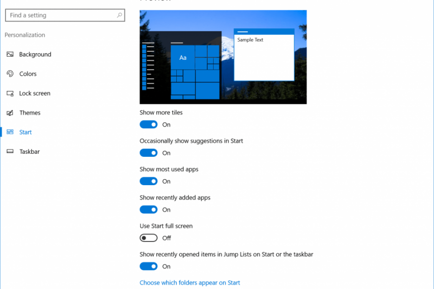
From now on, the navigation pane will be white or black depending on the selected theme. As a reminder, you can change the default theme in Windows 10 Preview by switching between the light or the dark mode. If you’re not sure how to change the default user interface theme, check out this article.
Additionally, Microsoft added a small block of color which highlights the settings page you’re currently on. Similar to the navigation pane, a highlighter picks up your accent color so it fits better with the environment.
And finally, the last change is the small Home icon, which, as its name says, takes you to the home page of the settings app when clicked. The home icon is located in the upper-left of the window, and it appears above the navigation pane on every page of the Settings app.
As Microsoft mentioned in the official Windows 10 Preview build 14361 announcement post, most of these changes are included because Insiders requested them through the Feedback Hub. Since we already had a few Settings app changes in previous builds, it is safe to say that the Settings app in the Anniversary Update will look considerably different than it looks in the Threshold 2 update.
What do you think about these changes? Do they make using the Settings app any different?
RELATED STORIES YOU NEED TO CHECK OUT:
Read our disclosure page to find out how can you help Windows Report sustain the editorial team. Read more


Improve this guide


User forum
0 messages