Viva Engage will be enhanced with a new design for its reactions card in conversations
The design will follow that of Teams.
2 min. read
Updated on
Read our disclosure page to find out how can you help Windows Report sustain the editorial team. Read more
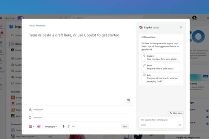
After announcing a Unified Create button for Viva Engage, Microsoft seems to be updating the platform with a new look and feel for reactions in conversations.
According to the latest entry to Microsoft 365 Roadmap, the new enhancements will add a more interactive style to the reaction section. Microsoft says these enhancements will turn others’ reactions as clickable pills across the conversation card.
While we don’t have any images of the new look, the Redmond-based tech giant says the new Viva Engage reactions will align more with other 365 apps, such as Teams. So think about that platform’s looks: the reactions should follow that design.
It’s worth mentioning that this new design will not change the number of icons available in Engage, but the design will be visible on other platforms that integrate Viva Engage, such as Teams and Outlook.
Here’s what the entry says:
Viva Engage will feature a new look and feel for reactions in conversations. Users will see a more interactive style, showing others’ reactions as clickable pills across the conversation card. This design brings Engage reactions more in line with other Microsoft 365 products, including Teams. There are no changes to the number of icons available in Engage with this new design. Users will see this change in Engage web and Teams and Outlook apps. Mobile apps and other integrated surfaces will follow.
All these changes will be made to Viva Engage in October.


User forum
0 messages