
Google Is Modernizing the Chrome Menu, Here Is How It Looks
The main menu redesign is part of Google’s 2026 GlowUp project, which has already brought visual changes to several parts of Chrome’s desktop interface.


 3 min. read
  Published on
Google is testing a redesigned main menu for Chrome in Canary. The new design replaces the browser’s current long list of commands with a more organized, section-based layout.
Google has already been refreshing several parts of Chrome’s desktop interface through its 2026 GlowUp project. The company has tested themed colors in Settings and changed other areas of the browser as it works toward a new visual style. The Omnibox has also received attention, with Chrome removing older entries such as the Windows Emoji shortcut from its address bar menu.
Now, Google is testing a larger redesign for Chrome’s main menu.
Chrome’s current menu places most of its options in a long list, with the profile card, Passwords and autofill, History, Downloads, Bookmarks and lists, Tab groups, Extensions, and other controls appearing one after another.
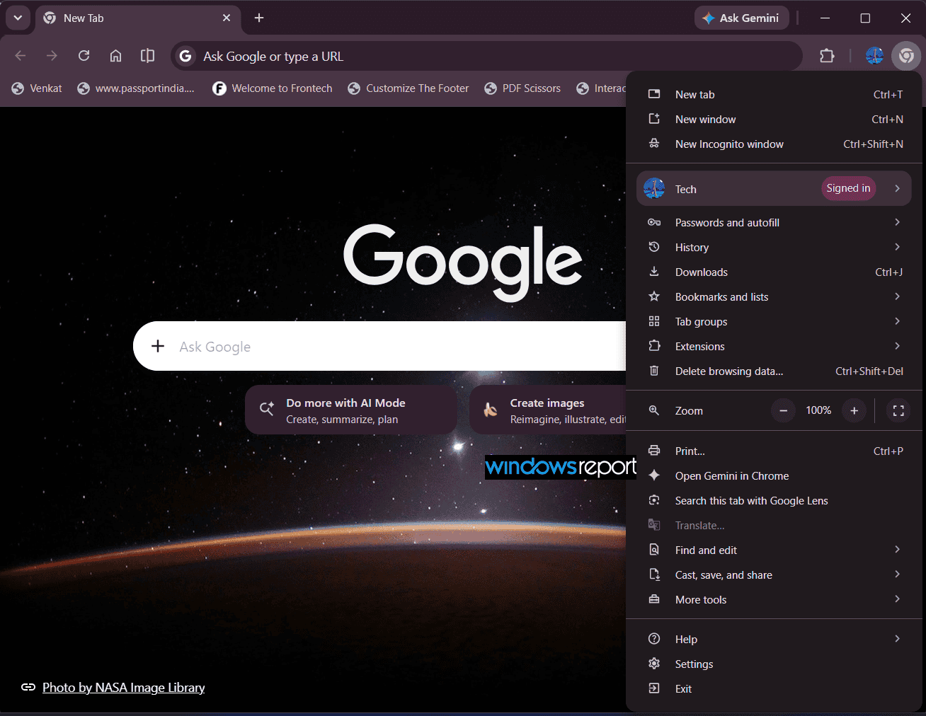
In the Chrome Canary version we tested, Google has reorganized that layout into separate sections with rounded containers and more spacing between related controls.
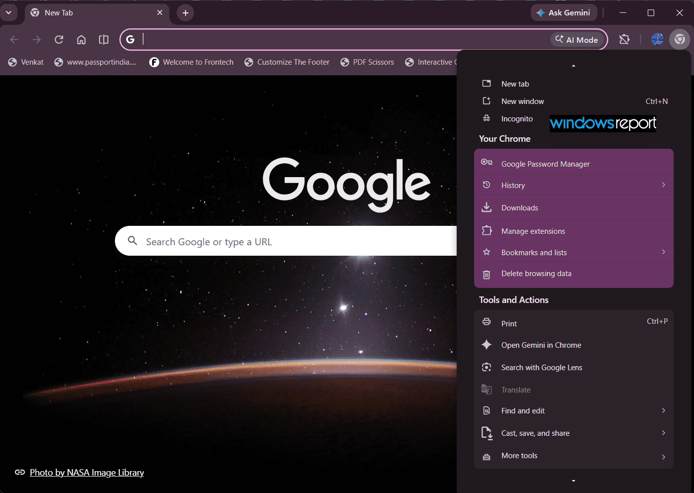
The menu begins with basic actions for opening a New tab, New window, or Incognito. It then includes a “Your Chrome” section with Google Password Manager, History, Downloads, Manage extensions, Bookmarks and lists, and Delete browsing data.
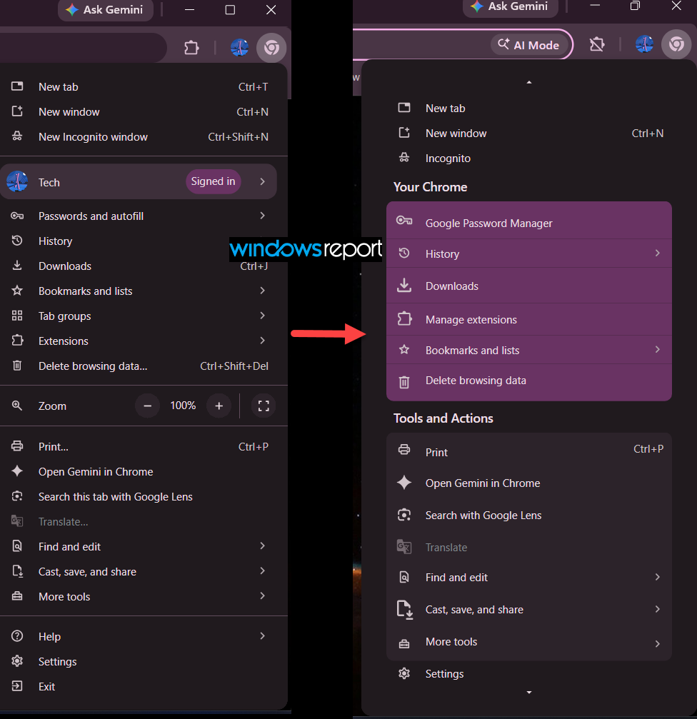
Extensions is now labeled Manage extensions in the redesigned menu, while the current menu uses Extensions. The other controls inside the Your Chrome section receive the same colored visual treatment, bringing related Chrome options together without changing their core functions.
A “Tools and Actions” section includes Print, Open Gemini in Chrome, Search with Google Lens, Translate, Find and edit, Cast, save, and share, and More tools. Settings remains at the bottom of the menu.
Some options have also changed position. Tab groups, for example, no longer appears as a standalone item in the new menu. Help and Exit are also below the initially visible menu area and can be accessed by expanding or scrolling the menu.
The rounded sections and increased spacing fit the broader GlowUp design. The new layout groups related controls into dedicated sections, separating Chrome-specific options from actions such as translation, Lens, printing, and sharing.
This is still an early Chrome Canary test. Nothing shown here is final. Google is still working on the menu and its organization, so the sections, item placement, labels, and which options appear in the initial view could change before the redesigned menu reaches Chrome users.
Google has not announced when the redesigned menu will reach Chrome users. For now, the Chrome Canary test offers an early look at how the company could reorganize one of the browser’s most frequently used interfaces as the GlowUp project continues.


Read our disclosure page to find out how can you help Windows Report sustain the editorial team. Read more



Improve this guide

User forum
0 messages