Here are some of Windows 11 22H2's upcoming features
13 min. read
Updated on
Read our disclosure page to find out how can you help Windows Report sustain the editorial team. Read more
Key notes
- Microsoft is not done customizing Windows 11, and we are going to receive more stuff in the future.
- We've prepared a short list of some of the most exciting upcoming utility features for Windows 11.
- There are no exact release dates for what you are about to see, so we'll just have to wait for them.

You’ve surely heard talk of the first major update for Windows 11, so you must have an idea about what this software package brings to the table, besides all the bugs.
The 2022 update for the latest Microsoft-designed operating system will also revamp certain areas of the OS, making it more practical and easy to access.
We are going to show you some of the features you can expect in the near future, most likely towards the end of this month, and even in early January 2023.
Some of these new features you’ve already seen in our cumulative update articles, which means that some of you are already familiar with the upcoming changes.
What improvements to look for in the near future
Let’s start by saying that the tech giant is now working on updating the weather widget on Windows 11’s taskbar.
On that note, the latest Windows 11 preview build brings a new set of theme-aware icons to make the widget easier on the eyes and improve its glanceability.
These above-mentioned icons’ overall design remains the same, but now they feature slightly different shades and colors with improved contrast on dark and light backgrounds.

Microsoft says the higher contrast ratio and new tones make the information clearer, especially for users with low sight.
Keep in mind that Microsoft updates Windows 11’s widgets using the so-called Windows Web Experience Pack from the Microsoft Store.
Therefore, you can expect the updated weather icon to show up on Windows 11 22H2 and 21H2 once the company is done with testing them in the Dev Channel.
Tech-savvy users have now found a dedicated Settings page for USB4 devices inside the new build 25314, which was recently released to the Canary Channel.
The screenshot of the Settings app shows a new USB4 Hubs and Devices page inside the USB section, so there’s something to look forward to.

We can understand that the USB4 devices that are connected, which, in this instance, are none as the user did not have any USB4 devices.
You should know that, on the previous Dev channel build, the USB page is pretty much like how it is on Windows 10 as well, ie, it shows notifications when USB devices have issues connecting to the system.
This new USB4 page is hidden which means it is disabled by default. However, it can be enabled using velocity ID 39305332, not recommended since these are work-in-progress features and are often quite unstable).
This means that there’s a lot to look forward to in terms of Windows 11, so if you haven’t upgraded yet, you should definitely get on it.
Microsoft is also testing a new and modern-looking Windows 11 volume mixer accessible via the taskbar Quick Settings panel that helps adjust the volume on a per-app basis and switch between audio devices.
Indeed, this new feature was announced earlier this week and is now rolling out to Insiders in the Dev Channel running the Windows 11 Insider Preview Build 25309.
Insiders now need to open the Quick Settings panel to access it after clicking the volume icon in the Windows tray or use the new global keyboard shortcut Win + Ctrl + V for even faster control.
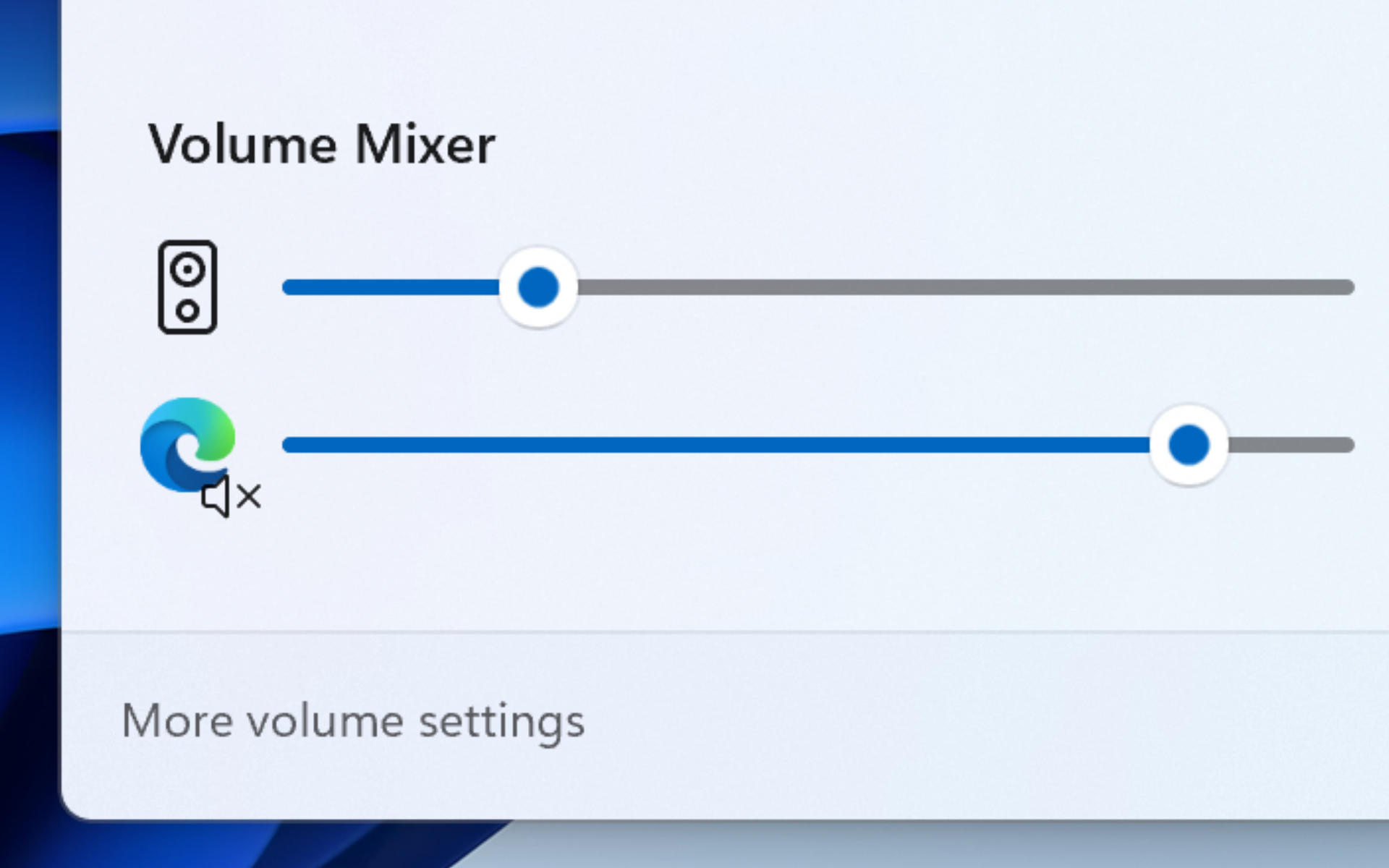
Please keep in mind that, while Redmond just announced it, the feature has been available since at least January, and it could be enabled using the ViVe tool.
This Windows 11 Dev build also adds a quick access list for additional available spatial sound options such as Dolby and DTS, and you can find out more in our dedicated article.
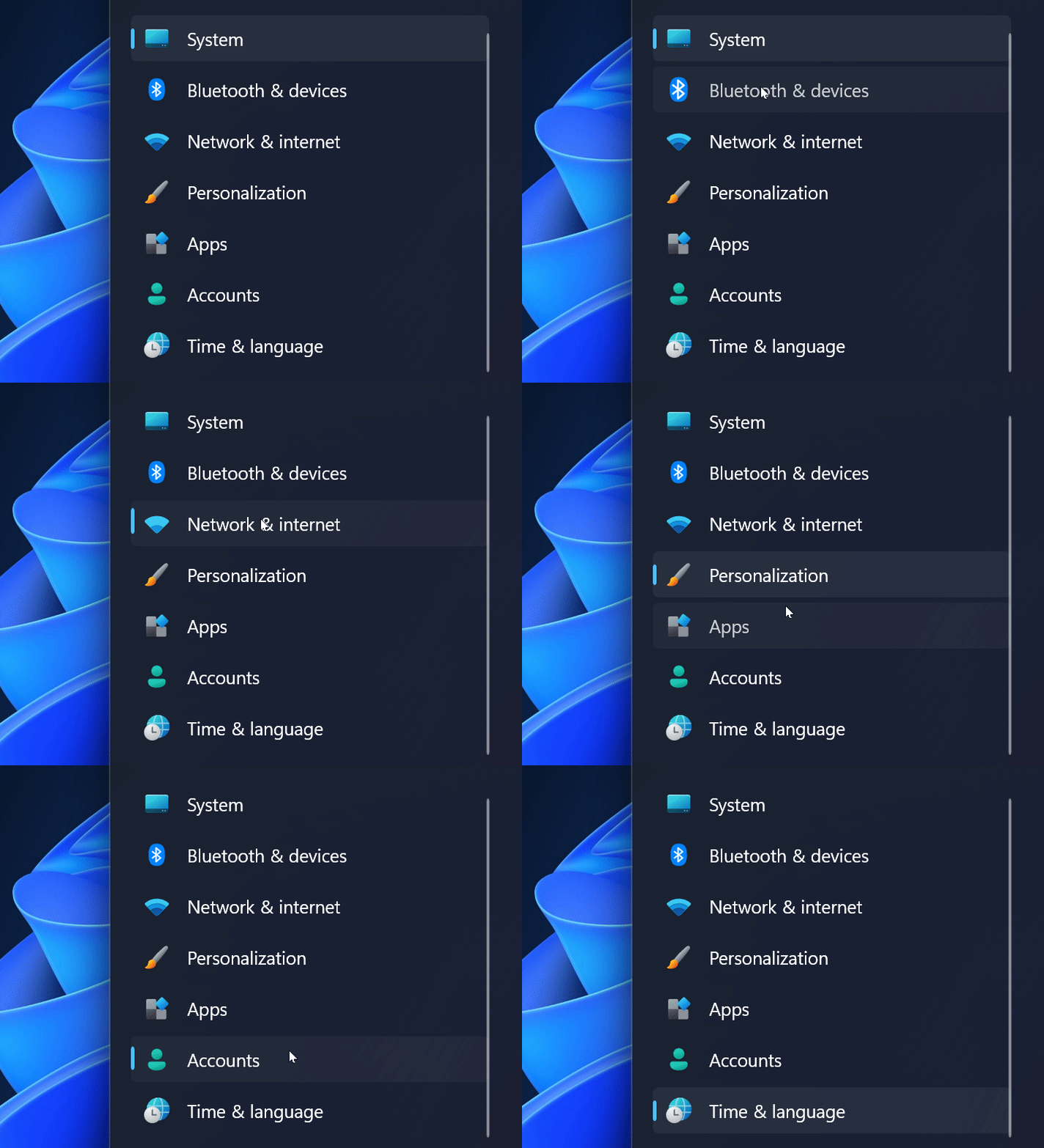
In case you didn’t already know this, Windows 11’s Settings app is about to get a host of new features and improvements.
Indeed, Microsoft is working on letting you add VHD/VHDX drives, improved keyboard options, a brand-new Home section, and more.
As the Twitter leaks suggest, Windows 11 users will soon be able to create virtual hard drives inside the Settings app.
You might have missed it because the feature is buried deep inside the operating system and has no ID for the Vivetool app yet.
However, unearthing it lets you generate a fixed or dynamic VHD (up to 2TB in size) or VHDX (up to 64TB plus resilience to power failures), specify the location, and select a partition style (GPT or MBR).

Another important change will please those with two or more keyboard languages, as the updated Keyboard section lets you rearrange the language order in the input language flyout and set a keyboard to use by default on the sign-in screen and boot.
Keep in mind that, unlike the option for creating virtual hard drives, you can already test the updated keyboard settings using the Vivetool app.
We’ll continue by saying that it appears that Microsoft is preparing to give users more taskbar customization features.
On this note, newly found strings in Windows 11 build 25300, the latest Dev release, point to the option responsible for toggling on and off the taskbar clock and date.
Tech-savvy users discovered that we will soon benefit from features such as:
- Hide taskbar clock
- Hide time and date in the System tray
- Turn this on to hide your time and date information in the corner of your taskbar
It is also worth noting that the existence of those strings does not mean Microsoft will implement the ability to disable the taskbar clock.
That being said, it is undoubtedly interesting to see Microsoft considering adding such an option while ignoring customers wanting to separate the Wi-Fi, volume, and battery indicators or refusing to allow Windows 11 users to place the taskbar on top of the screen.
Soon, Microsoft will add a new way to end unresponsive processes in Windows 11 in the form of a new option that will show up when right-clicking an app’s taskbar icon.
A tech-savvy Windows Insider that usually spots changes discovered and tweeted about the feature and shared a screenshot showcasing it earlier this week.

While this Microsoft’s efforts to add additional features will be welcomed, this could likely mean trouble for those accidentally clicking the new End Task option and closing their apps without saving.
Many think that a better idea would be to have this show up when pressing a modifying key like CTRL or ALT in a similar fashion as the one used by Apple’s macOS to hide some (context) menu options.
If you also want to enable this hidden feature, you can use the ViVe tool. However, we have to warn you that these experimental features can be unstable and cause crashes.
Know that once toggled on, the new End Task option will be displayed in the Jump List shown when right-clicking apps’ icons in the Windows 11 taskbar.
This new and interesting functionality is currently in development as a hidden feature of Windows 11 build 25300 in the Windows Insider Dev Channel.
The new icons play neat animations when you click them, a feature that will be accessible through the Settings app soon.
The visual change is pretty discreet, so if you were expecting full-blown animations, you might be waiting in vain, at least for the time being.
Still, this will be a nice addition, considering that even such a small change will make the operating system seem more alive and responsive.
Finding stuff on your PC will become even easier once Microsoft permanently adds the new search bar to the taskbar.
An apparent insignificant change that will make all the difference when you are multitasking and time is of the essence.
Even though clicking on the Start menu icon and then typing in your query wasn’t complicated at all, the tech giant sought to further simplify the process.
We’ve first shown you this new feature when we presented Dev Channel Insider Build 25252, so you were probably already familiar with it.
After already getting significant improvements, the Windows 11 Task Manager is also getting a search bar for itself.
Needless to say, this will make finding the processes you are looking for a lot easier, thus allowing you to quickly and efficiently optimize your device’s performance at any given time.
When talking about upcoming features for Windows 11, it would be impossible to mention the new Dark Mode button that will be added to the Action Center.
Users seeking a more eye-comfortable experience will soon have the ability to turn the Dark Mode feature on or off with only a couple of clicks.
We’re also going to get an improved version of Widgets in the upcoming Windows 11 22H2 updates, so let’s also keep that in mind.
With build 25201, we’ve explained that Microsoft is introducing an Expanded View in Widgets, which you can use to expand or collapse the size of your widgets board.
Also, since we’re on the topic of Widgets, since Dev Channel build 25227, both vertical and horizontal header position styles were being tested.
Now, the Redmond company has now begun rolling out the update to all Windows 11 users and the change was once again first spotted by Twitter users.
However, Microsoft says it will be a gradual rollout and if you don’t find it immediately, there is nothing to be anxious about.
Even though it is not exactly the same thing, it looks like a part of that change will now be available to the wide public.

Furthermore, there is a home button now, and a video button, though it looks different from the one that was in Build 25227 before.
Not to mention that it also replaces the section where previously time was displayed and clicking on the section loads up MSN weather news.
Another interesting and equally useful upcoming feature is the change the clock on the taskbar is about to undergo.
We are actually talking about the fact that we will also be able to see seconds displayed on the clock, something that was missing so far.
You might remember enjoying this feature while using the good old Windows 10, so Microsoft decided to do right by its users and add it to Windows 11 as well.
As many of you know, Microsoft keeps refusing to give up and allow users to disable the Recommended section on the Start menu.
Furthermore, the company is actually proceeding with the idea to the extent of displaying ad-like recommendations of various websites.

So, we will soon be able to access our most visited websites directly from the Start menu, with only one or two clicks.
Don’t worry, you will still be able to force-disable website recommendations in the Start menu if you really don’t want to see them there.
You should also know that, since there were so many users unhappy with Windows 11 showing more ads on the Start menu, developers removed recommended websites in the latest preview build.
Thus, Microsoft is removing the suggestion action for searching copied text in Microsoft Edge and showing recommended common websites on the Recommended section in Start, both of which began rolling out with Build 25247.
Based on feedback from Insiders, features, and experiences you see in the Dev Channel may get removed and never released beyond the Dev Channel.
It is really interesting, to say the least, to see Microsoft removing the ability to search highlighted text in Edge, especially considering that Windows 11 lets you modify it to work with other browsers.
The tech giant might bring the feature back in future updates or remove it for good due to negative feedback, low usage among insiders, or other factors.
That being said, whatever the motivation behind the decision, most users will be happy to see Microsoft making the Start menu arguably less annoying.
Let’s also talk about the new Windows Search box on the Start menu, which we’ve shown you above, and the Search Highlights we will start seeing on it.
What are those? They are small images representing holidays and other events, which Microsoft place in that box almost on a daily basis.

Many say that, apart from confusing the users with constantly changing graphics, those highlights create an illusion of extra misaligned apps on the taskbar.
Then again, we as people, have a tendency to be reluctant to new things, so maybe we will get used to it in the future.
Another interesting change to look for in this new version of the Windows 11 operating system is the helpful banners Microsoft has now implemented for the Search feature.
If you remember, kept Microsoft displaying banners above the taskbar to promote the new Edge, so you’re pretty much going to get deja vu with this one.
Yes, those are back to drive attention to Windows Search filled with ads, which has many wondering why they have to put up with this.
The Redmond-based tech company tries to excuse itself, claiming that the change is here to improve the value of Search shortcuts and reduce friction in the broader Windows Search experience.
On the more useful side of things, we are getting an easier way to find what we need on the Internet, with just a couple of clicks.
It all starts with the fact that Microsoft does not want to deal with the idea that some users prefer browsers other than Edge.

Therefore, the latest improvements to the Suggested Actions feature are yet another way to impose Edge on unsuspecting users.
Selecting text in Windows 11 now displays a small banner with a button allowing you to search the internet with Bing and Microsoft Edge only.
We are also going to get a lot more notifications and warnings where we expect them the least, so don’t be surprised when stumbling across them.
That being said, Microsoft will now place various Settings-related alerts in the menu that appears on the screen when you click your profile on the Start menu.

This new feature can display ad-like prompts to set up OneDrive, sign in with a Microsoft Account, back up files (in OneDrive), or complete your profile.
Most of these recommendations can live peacefully in the Settings app, where I will most likely change or enable something.
And, to make these recommendations look more critical, it uses the same orange dot that appears on the power button when Windows wants to complete the update procedure.
These are only some of the upcoming tweaks that the operating system is about to undergo, but we will probably be looking at more.
We’ll keep you posted on any important changes coming to Windows 11 in the future, so make sure to keep an eye on us.
What other utility features do you think Windows 11 should receive? Share your thoughts with us in the comments section below.




User forum
1 messages