Chrome’s Reading Mode is losing some toolbar buttons to cut clutter
Google is slimming down Reader Mode in Chrome as the work behind its immersive direction becomes clearer.

Google is slimming down the Reading Mode in Chrome. We earlier reported that a commit and its flag description pointed this feature in a more “immersive” direction. The latest changes in Chrome Canary now give a clearer picture of how this work shapes the Reading Mode interface.
Reading Mode loads articles into a side panel. It strips ads, menus, and other elements that pull attention away from long pages. It gives you a cleaner view of the text, and you can pick a font or background that suits your eyes. The Read Aloud feature can speak the page while you look at other tabs.
For many readers, this experience already offers a calmer way to follow news or long guides.
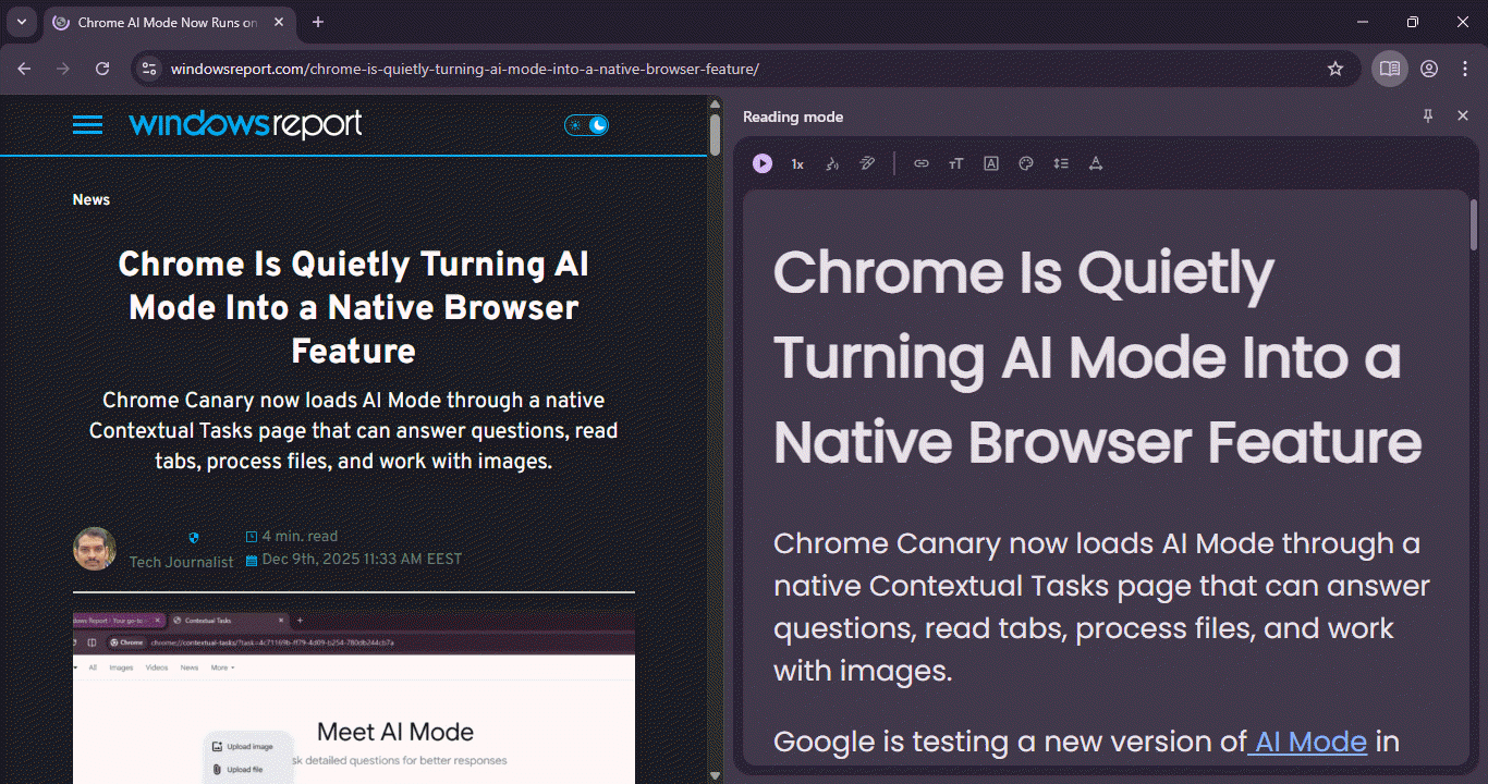
The toolbar inside this pane is now smaller. Before this change, the top row placed several buttons for font size, theme color, and line spacing. These controls worked as intended but made the header look crowded.
In the latest Canary version, Google appears to be preparing to move these options into the menu at the end of the toolbar. The main row now highlights the Read Aloud controls, which stay easy to reach.
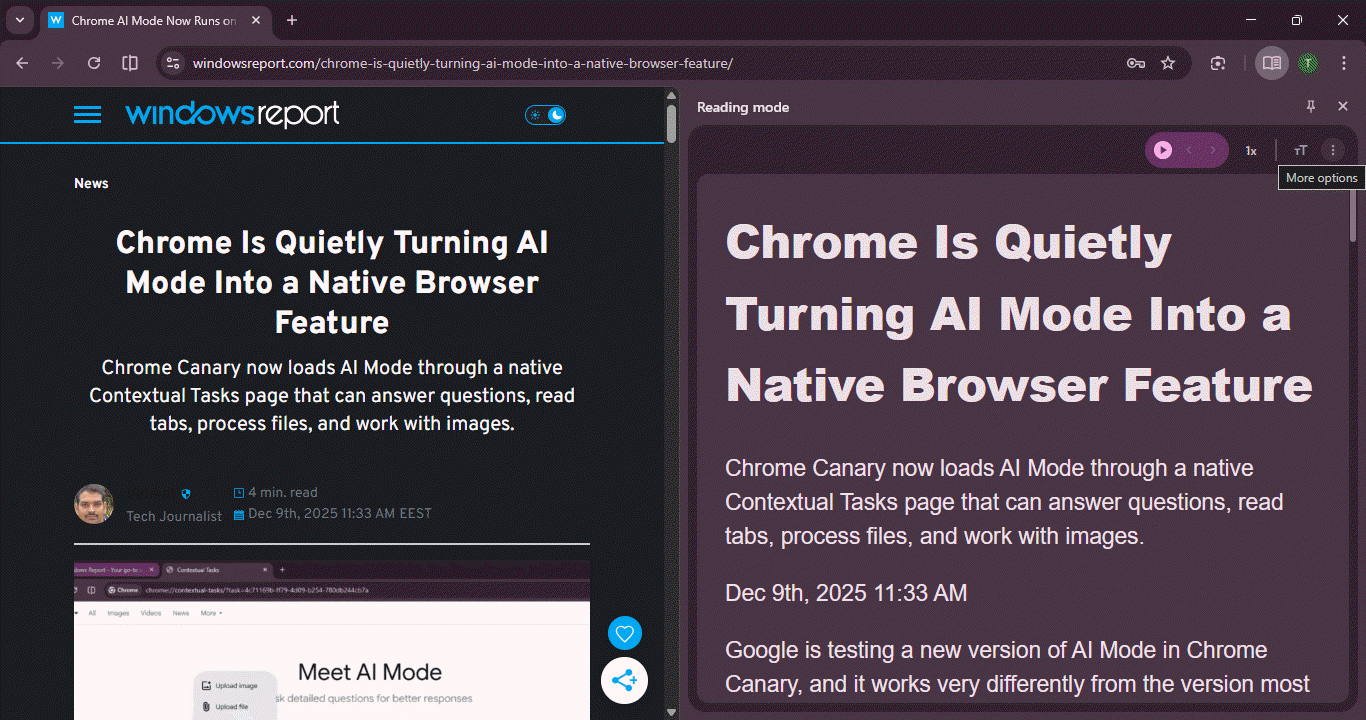
This change gives the reader pane a simpler layout. It also reduces the number of elements you see at first glance. That makes it easier to focus on the text instead of the extra options.
Chrome is also testing a Reading Mode button in the address bar for quick access. It may also show a thank-you message when you set it as your default browser.
Read our disclosure page to find out how can you help Windows Report sustain the editorial team. Read more
Improve this guide


User forum
0 messages