Microsoft Edge's experiment ditches News Feed for a Cleaner New Tab Page Experience
News Feed in Microsoft Edge NTP is a distraction
2 min. read
Published on
Read our disclosure page to find out how can you help Windows Report sustain the editorial team. Read more
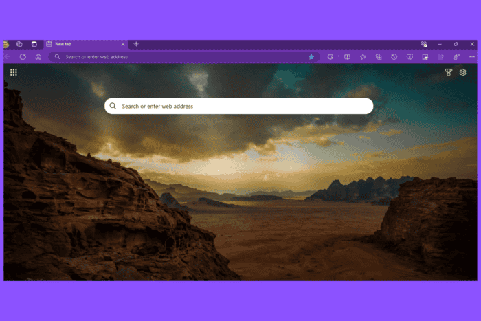
Microsoft is testing a clutter-free New Tab Page, especially without including a feed, in the Edge browser in Canary.
Microsoft Edge has made substantial progress in recent years after switching to Chromium/Blink regarding performance, new features, and stability. However, Edge has long been criticized for its default start page, which is cluttered with a feed and recommendations.
While the new tab settings allow customization, Edge shouldn’t provide a bad startup page to users by default.
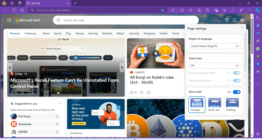
Microsoft tests a Clutter-Free New Tab Page design in Edge
Recently, we reported that Microsoft has quietly released a new tab extension for Edge, WoWTab, which provides regular and calm modes. To address distractions caused by the feed, as well as privacy concerns due to it, Microsoft seems to be experimenting with a minimalistic New Tab Page for the first time since Edge’s launch.
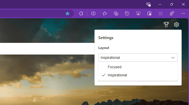
As spotted by us, the new design under testing comes with the removal of the news feed and allows users to choose between two customizable layouts: “Inspiration” and “Focused.”
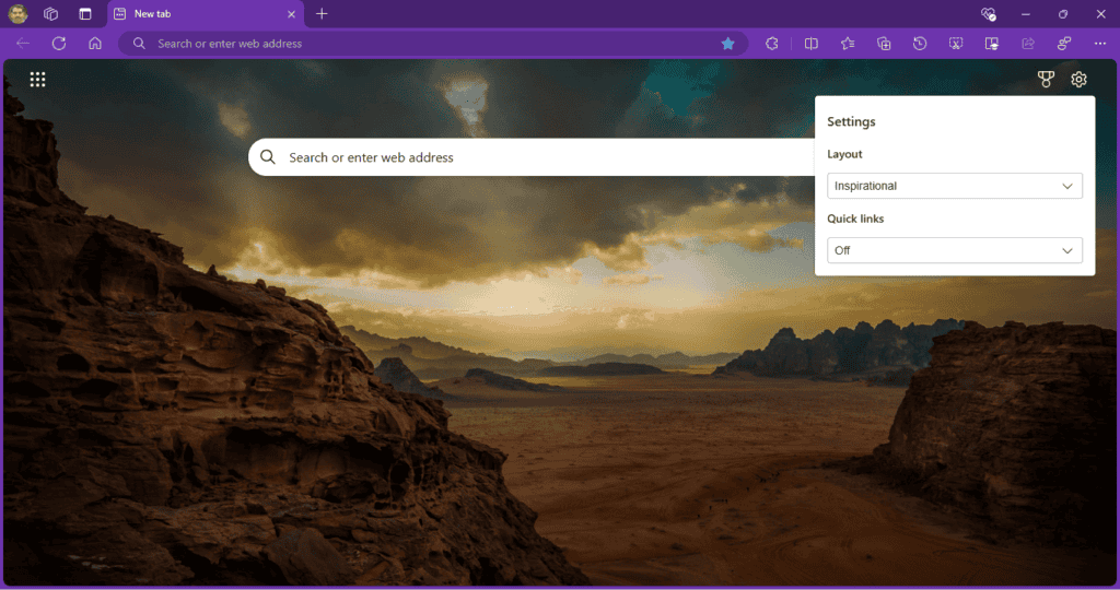
While the “Inspiration” layout displays a visually appealing background image, the “Focused” layout prioritizes a minimalist design.
Additionally, quick links are turned off by default, but users can enable them and choose between one or two rows.
The usual search box with the Copilot option included is available for searching the web whenever you want.
With the new design, the new tab page loads much faster and improves the user experience. This also makes Edge align with the new tab page layout offered by Chrome and Firefox, which doesn’t hinder performance.
Users can be able to show frequently visited sites by using the settings provided on the new tab page.
Apart from the minimalist new tab page change in Edge, the Microsoft browser may get an Extension performance detector that warns when extensions slow down pages. Additionally, users can switch to picture-in-picture mode for a video from the Edge taskbar icon.


User forum
0 messages