Customise your World of Warcraft user interface [TIPS & TRICKS]
5 min. read
Updated on
Read our disclosure page to find out how can you help Windows Report sustain the editorial team. Read more

World of Warcraft is an amazing adventure that is more of a lifestyle than a passing, forgettable gaming experience. You invest a formidable part of your life to enjoy every instance of it.
While the newbies are more concentrated about learning elementary features, advanced players look for ways to actually improve the game.
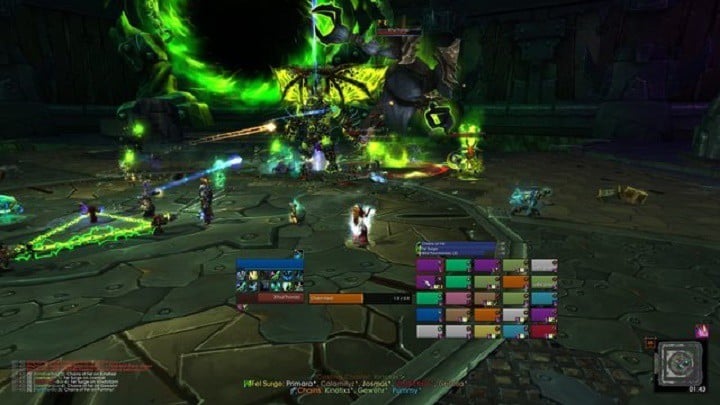
The vanilla game interface is, to some instincts, cluttered. So, many users prefer a more informative UI. It’s a thing of taste and play style.
There are so many different addons, and novices to UI modding can get confused. So, we’ve found some tips for customising your WoW UI on Reddit, in case you want to bring some freshness to your surroundings.
How can I change WOW’s UI? The easiest way to change how UI works is through the game’s settings. Some pro gamers shared their settings and how they work. For even more customisation, download and use addons like OPie, Aura Frames or Prat 3.0.
To download and learn how to use these addons, check the guide below.
Useful tips for customising your WoW user interface on Windows 10
Limit Action Bars
Reduce the number of bars. Use static or modifier paging instead:
- Get OPie to reduce more stuff off your bars (professions, mounts, raid marking, etc)
- Set bars to hide until mouse-over, or hide in combat if you don’t like OPie.
- Consolidate your action bars. Use something like TellMeWhen or Watcher to manage rotations/CDs.
- Additionally, you can hide hotkeys.
Remove buff/debuff prompts
Use an addon to remove clustering buff/debuffs prompts:
- Use an aura addon, like Aura Frames, and set up the buff filtering to only show long duration buffs on the edge of your screen. Short duration (less than 60 seconds) buffs and all debuffs should be showed in the middle.
- Remove duplicate auras. Each buff/debuff should only appear in once place at a time.
Chat Window
You should make it simple and stick to the essentials:
- Use Prat 3.0 to optimise your chat window. Remove all unnecessary features like fonts modifier, buttons and other.
Cooldowns
- Your cooldowns are very important, so place them in a visible place.
- Best-suited for the job are WeakAuras, TellMeWhen, or a well placed/tweaked Bartender4 action bar.
Damage Per Second Meter
- Get Skada with Skada Chat Frame Integrator and have it hidden.
- The other possibilities are:
– Change DPS Meter colours to 0 opacity title/background.
– Shrink Damage Meter. Reduce it to yourself, raid DPS and top 3 DPS.
– Get rid of the healing meter.
Frames
- Don’t use both frames and Personal Resource Display. Either use PRD and KUI nameplates or hide PRD and use unit frames like HealBot Continued or Shadowed Unit Frames.
- Remove portraits, as they add distraction to a frame.
- Get rid of Combat Text from frames.
- Remove Raid Leader/Masterlooter/Assist (unless you are the raid leader).
- Customize your raid frames. For Tank/DPS place frames to on side of the screen and show the less possible info (only HP, name, buffs/debuffs). For Healer place frames in the middle as they are important for your tasks.
- The target of target frame only needs to display the unit name (and health bar), remove all the other text from it.
Mini-map
- Make sure you set all mini-map icons to hide unless you point the mouse.
- Remove the sub-zone on your mini-map.
- Get rid of bag bars and micro menu. You can bind keys.
Miscellaneous
- Use eAlign to create alignment grid and create order.
- When aligning, be sure to leave screen edges empty for better orientation.
- Hide/remove EXP bar.
- Always use same fonts.
Scrolling Combat Text
- Remove Scrolling Combat Text, as it is expendable.
- On the other hand, if you want to keep it, use matching fonts and limit its output. We don’t want inputs on every hit.
ToolTip
- Use TipTac to move your ToolTip, hide auras and set font and bars.
As we already mentioned, UI tweaks are better suited for advanced users. However, the newcomers can customise UI, as well. But keep in mind that there are a lot of addons and thing can get confusing fast.
For starters, we advise using an addon pack, like ElvUI. Later, when you get accustomed, you can pick individual mods.
Other addons and addon packs that might interest you are: Deadly Boss Mods, Move Anything, Dynamic Cam, Omen Threat Meter, and Details ! Damage Meter.
If you want to clean up you interface, add new things, or change the way that WoW feels on Windows 10, feel free to try any of theses addons to take your gaming to the next level.
For more information on WoW issues and how to solve them, check these awesome Windows 10 guides:
- World of Warcraft sound issues: Here’s how to fix them
- Fix: World of Warcraft add-ons reset after update
- How to fix high latency and frequent disconnects in World of Warcraft
We hope you’ll find these tips helpful. What are your favourite UI addons for World of Warcraft? Leave the answer along with any other question you may have in the comments section below.
[wl_navigator]

User forum
0 messages